What Are Dark Patterns in UX? (With Examples)
You or your acquaintances have been in such situations: you scroll the website, find a tempting offer, everything sounds so appealing, even strange, decide to buy a subscription for the service, and end up being charged another amount. When you research what happened, you discover that you were trapped in placing an order because of a misleading design. So, what are the chances you will even use the purchase without talking about returning to the company? Honestly, they are the lowest. This is what 60% of users do: they don't return to websites after facing a bad user experience (UX).
The situation above contradicts the nature of good UX design, which aims to make interaction with the product enjoyable and easy. The Head of UX and Design at the BBC, Jane Murison, says it doesn't matter how good your services are if people are disengaged. However, many companies still take advantage of people's behaviors by using dark patterns in UX.
Let's see what these practices are and how the use of deceptive intentions in product design causes more trouble than profit.
The Dark Side of Digital Design: What Are Dark Patterns in UX?
A dark pattern in design is a way to manipulate people with the intent to take actions they didn't want or didn't recognize they were doing. These are immoral practices for achieving business results with uninformed and unprepared customers.
The definition of "dark pattern" emerged in 2010. It was created by Harry Brignull, a UX design expert who created a website explaining the types of deceptive practices. Since then, Harry has been chasing deceitful companies and revealing them.
Types of Dark Patterns in UX
As far as creativity goes, companies come up with new ways to make users do what they want. However, there are certain types of dark UX patterns companies can recognize using.

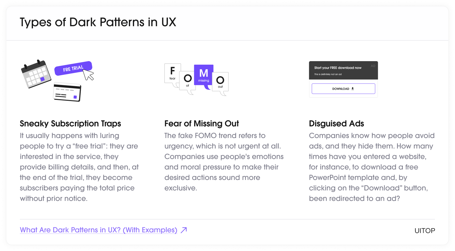
Sneaky Subscription Traps
It usually happens with luring people to try a "free trial": they are interested in the service, they provide billing details, and then, at the end of the trial, they become subscribers paying the total price without prior notice. This forced continuity practice often doesn't show all crucial details at the registration, making a focus on the free service usage.
Fear of Missing Out
The fake FOMO trend refers to urgency, which is not urgent at all. Companies use people's emotions and moral pressure to make their desired actions sound more exclusive. Many companies use this tactic to make their offers sound more exclusive. But the fake urgency doesn't let customers read the details carefully, and they end up signing up for something unknowingly.
Disguised Ads
Companies know how people avoid ads, and they hide them. How many times have you entered a website, for instance, to download a free PowerPoint template and, by clicking on the "Download" button, been redirected to an ad? This sneaky practice hides offers from ordinary content.
Ethical Problems From the Use of Dark Patterns
Using dark patterns in UX development and intentionally misleading practices can negatively affect the company's status and relationship with the current audience. It starts with a decrease in the company's reputation and the deterioration of your product's demand. In this section, we have collected some pitfalls that hide behind implementing dark UX patterns into your integral business development processes.

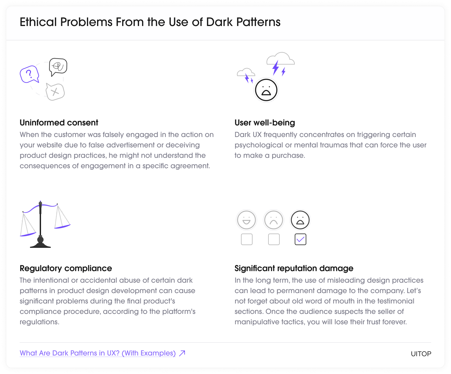
- Uninformed consent. When the customer was falsely engaged in the action on your website due to false advertisement or deceiving product design practices, he might not understand the consequences of engagement in a specific agreement.
- User well-being. Dark UX frequently concentrates on triggering certain psychological or mental traumas that can force the user to make a purchase. For instance, if the program aims to help the user cope with excess weight, the advertisement can specifically induce negative emotions concerning current weight, appearance, or physique.
- Regulatory compliance. The intentional or accidental abuse of certain dark patterns in product design development can cause significant problems during the final product's compliance procedure, according to the platform's regulations. The company that abuses the dark patterns in development should be ready to cope with significant legal challenges shortly.
- Significant reputation damage. In the long term, the use of misleading design practices can lead to permanent damage to the company. Let's not forget about old word of mouth in the testimonial sections. Once the audience suspects the seller of manipulative tactics, you will lose their trust forever.
Dark UX: Examples
Even though most companies use ethical design practices, many unscrupulous developers don't care about implementing dark UX patterns. Unfortunately, there are still a lot of companies that prefer to trick users into engaging with their service. Due to the abuse of misleading practices over the deliberate users' consent, certain companies and developers may choose short-term acquisitions over long-term relations with the audience. Below, we have collected some examples that perfectly represent the terrible practices in the UX.
Confirshaming
This dark design practice is the opposite of an ethical UX design approach. It is usually represented by a particular product feature that forces the user to take a specific action with the help of immoral practices. Typically, the user is offered to complete an action, and in case of refusal, the customer may face a particular phrase or wording aimed at inducing a feeling of shame. A typical example of confirm shaming can be observed below.

https://builtin.com/articles/confirmshaming
Forced Continuity
This approach is one of the favorites of unscrupulous developers. Usually, forced continuity is implemented on a subscription basis. For instance, the user chooses the free trial plan activation, which requires the entry of card details. Afterward, when the "free" trial ends, the user gets charged for the whole application use period. Moreover, that happens without sending auto-renewal notifications or a straightforward way of canceling the subscription before the end of the trial.

https://www.evidentid.com/resources/dark-ux-patterns-what-are-they/
Bait and Switch
This approach is another deceptive practice frequently used to force the audience into a particular activity or service they never intended to do in the first place. For example, when the user is looking for a cheap service and finds a specific page that provides a certain good for a low price. However, afterward, due to a specific combination of advertising and design, the user is forced to purchase the more expensive product. Below is an excellent example of bait-and-switch tactics forcing users to upgrade to the Windows operating system.

https://www.shopify.com/partners/blog/dark-patterns
How to Avoid Dark Patterns in UX
Relying on transparent patterns in both development and advertisement is crucial to creating a reliable and effective establishment. By being honest with customers and building trusting relationships, the company can win much more instead of receiving a short-term benefit from deceptive practices. Therefore, in this section, we would like to share some advice on how to exclude those patterns once and for all.
Ethical Practices in UX Design
Fortunately, dark UX patterns can be avoided easily by following simple tips and prioritizing customer satisfaction. Below, we have collected the main principles that would help include ethical practices in UX development.

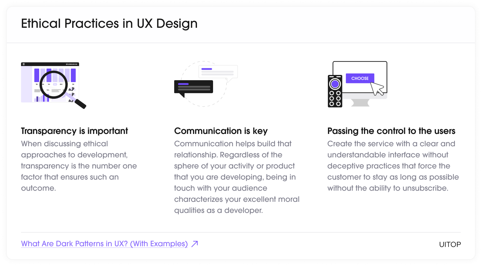
- Transparency is important. When discussing ethical approaches to development, transparency is the number one factor that ensures such an outcome. Therefore, if you want to build trustful relations with clients, it's essential to be as transparent as possible at each stage of the cooperation.
- Communication is key. Communication helps build that relationship. Regardless of the sphere of your activity or product that you are developing, being in touch with your audience characterizes your excellent moral qualities as a developer.
- Passing the control to the users. Another helpful tip that can be used as a principle during the implementation of the user's design is passing the torch of control over to the user. It's crucial to let the user decide whether they want to stay with your service or move forward to another product. Create the service with a clear and understandable interface without deceptive practices that force the customer to stay as long as possible without the ability to unsubscribe.
The Strength of Ethical UX Design
So, what interests should push entrepreneurs and designers to exclude dark UX patterns from product development? Firstly, an ethical approach to creating your product would help you achieve success in the long term. Implementing the ethical patterns during the development stage of the UX design would strengthen your position in the eyes of your current clients, increase interest in potential leads, improve your legal positions, and contribute to the establishment of your brand on the market. Implementing ethical patterns during the development stage and maintaining them thereafter is the key to better product performance and company success.
Conclusion
The abuse of dark patterns in UX design is a huge ethical problem that requires a lot of attention and action from digital companies. Despite awareness of the issue, the abusive power of misleading design and deceptive practices causes a lot of harm to users in most different spheres of digital products. This approach leads to significant damage to the company, a decrease in customer loyalty, and a drop in the company's reputation. However, implementing ethical design solutions could easily avoid such an outcome.
FAQ
01/ What is the definition of dark patterns in UX?
Dark patterns in the UX are a set of deceptive practices that could be used in the product development process to manipulate customers into taking actions they didn’t intend to take.
02/ Why are dark patterns in UX bad for your product?
Implementing dark patterns in design will have many negative effects on your business in the long term. Firstly, the company’s reputation will suffer, leading to a decrease in customers’ trust and position in the market.
03/ What are the principles for ethical UX implementation?
Several principles should be followed to increase the efficiency of ethical UX implementation. Firstly, it’s the absence of deceptive practices, complete transparency with the audience, and convenient communication channels with the current clients.
04/ What are some examples of dark patterns in UX?
The diversity of the dark patterns invented is quite impressive since they include dozens of different misleading practices. Still, some patterns, like bait and switch, disguised ads, or confirm shaming, are used more often than others.
 How we use AI in our process