How we use AI in our process

Design, Product
/
Mar 12, 2026

Supply chain and logistics systems don’t operate in a neat, predictable environment. They deal with constant load, real-time data, and a steady stream of aspects that constantly need attention. As orders change, shipments get delayed, data updates every second, the system is supposed to keep up.
If UX wasn’t thought out correctly, it may lead to a situation where the system technically works, but people using it don’t. They may hesitate, double-check, improvise, or just avoid certain features altogether because it’s faster to work around them than to deal with them.
In this article, we list the top UX mistakes in supply chain software, how they end up shaping everyday workflows, and how to avoid these mistakes.
Get started
Need a partner who can replace manual tracking with a system that shows you exactly where your cargo is?
Contact usOperational and logistics systems deal with real-time updates, which means the interface is never static. Data changes constantly, statuses shift, as well as priorities.
At the same time, these systems aren’t exactly simple. You may be managing inventory, shipments, or routes, with dependencies, exceptions. All connected, all affecting each other. One small action in the interface can trigger a chain of consequences in a different area.
So when the logistics software UX isn’t clear, this is an obstacle for the entire process.
Then there’s responsibility. The people using this software make decisions that affect deliveries, stock levels, timelines, sometimes entire operations. If the interface makes them stop and think, that’s already a problem.
Inventory management software, especially, doesn’t tolerate guesswork. It needs precision and traceability. Users should be able to see what happened, why it happened, and what will happen next.
When UX misses the mark here, this creates friction in places where clarity is non-negotiable. And that’s when people start relying less on the system and more on their own workarounds, notes, or habits. Which, ironically, is exactly what the system was supposed to eliminate.
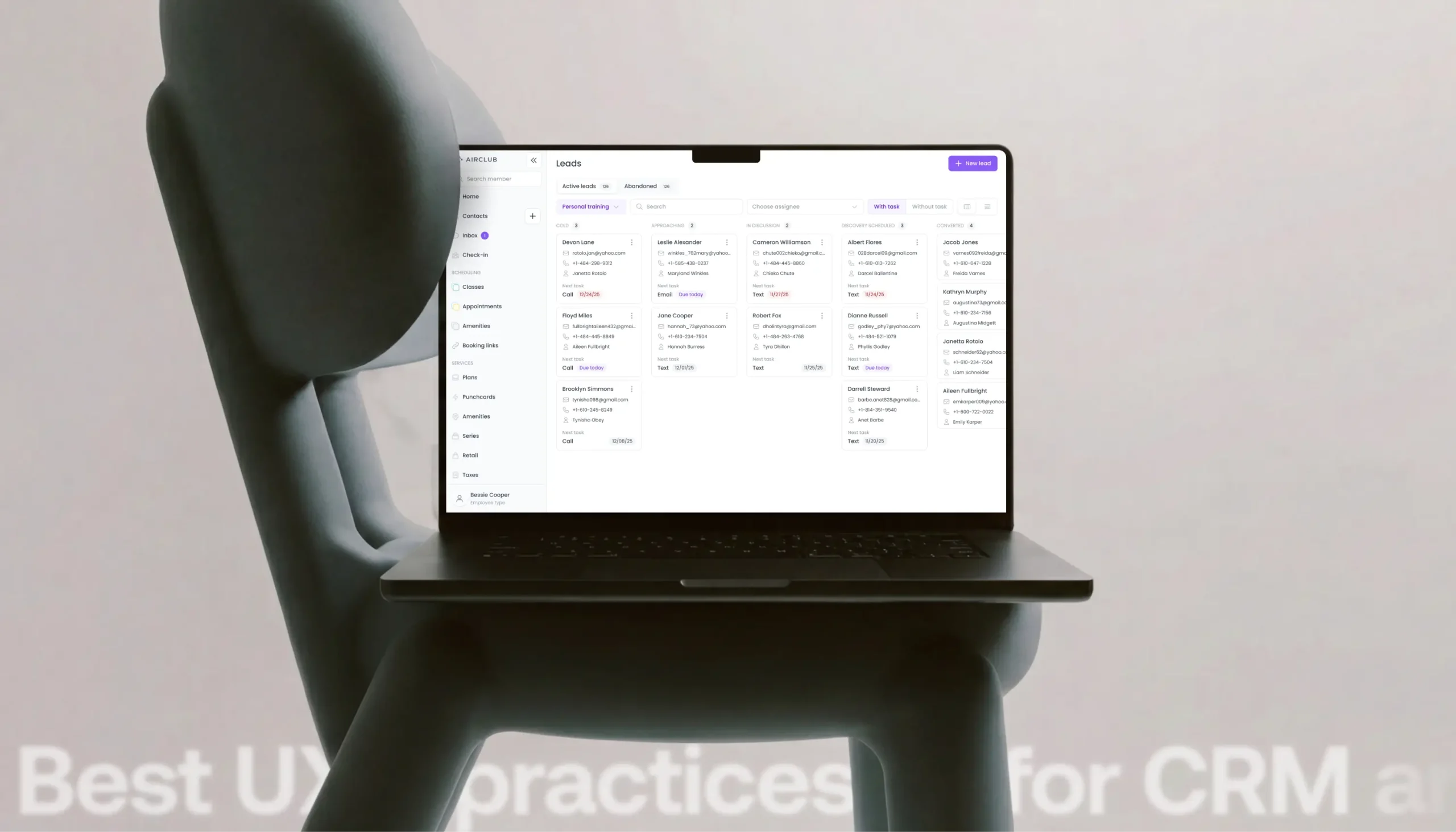
Mistakes also often occur in warehouse management UX. Some warehouse management screens try to be very helpful. They show every KPI, every column, every status, all at once.
High data density on its own isn’t the issue. These systems are supposed to handle a lot of information. The problem is that when all of it is presented with the same weight, visual priority, and no clear structure. Important updates look exactly like routine ones. Exceptions blend in with everything else.

And when this takes too long, people may click into a few records to be sure. Or they recheck something they already saw, just in case, which adds friction to every single action.
That’s also where mistakes come in. When critical information doesn’t stand out, it’s easier to miss.
A lot of these screens come from a simple idea: more visibility is better. In practice, it just means the system leaves that job to the user.
Fixing this starts with hierarchy, as not everything deserves equal attention. Some data points are critical, others are just context. Visual structure - grouping, spacing, emphasis - helps users process information faster.
Progressive disclosure also helps. You can show what’s relevant first and then let users go deeper when they need to. Most of the time, they don’t need the full picture immediately, they just need the part that affects their next action.
If the system is already overloaded, you don’t need to rebuild everything from scratch. Start by looking at actual usage. What do people interact with regularly and what do they ignore?
From there, small adjustments go a long way. You can bring key information forward, push secondary details into expandable views, highlight exceptions, and make it easier to spot core details of each step.
And if you’re designing a system from scratch (or at least early enough to make structural decisions), overloaded screens and high data density is one of the easiest mistakes to avoid. Just start with what users actually need to act on, and build around that.
By the way, UITOP offers Warehouse Management System (WMS) development services for your business. Contact us to avoid mistakes.
It’s usually noticeable when a workflow wasn’t designed for real operations. It may look fine at first, but the moment a shipment is delayed or data arrives out of order, the interface starts to push back.
You try to move forward, but the system requires a step that no longer fits the situation. Or it enforces a sequence that already broke earlier in the process. This is poor workflow mapping in practice.
Operations don’t follow a clean sequence, and users need to adjust constantly. But when the interface is built around a rigid, ideal version of the workflow, it doesn’t leave much room for adjustment.
So users compensate. They may enter temporary values or skip steps and return later. They repeat actions because the system doesn’t allow corrections in place. None of this is part of the intended flow, but it becomes routine.
Efficiency decreases, because each action takes longer than necessary. Ultimately, the system technically supports the workflow, but it just doesn’t match how the workflow actually runs. Over time, users stop expecting the system to reflect reality. They rely on their own logic instead.
If you’re designing from the start, avoiding this is mostly about not trusting the “perfect flow” too much. Real workflows include interruptions, exceptions, and quick adjustments. That’s the part worth designing for.

Spend time understanding how operations actually run. This is how you can build flows that allow updates mid-process. Users should be able to move forward even if some inputs are incomplete.
If the system is already live and this problem exists, you’ll usually see it in the same places: steps users avoid, fields filled with placeholder values, actions repeated more often than expected.
Fixing it doesn’t always require a full product redesign. Often, you just can remove unnecessary rigidity - allow steps to be edited after completion, reduce strict dependencies between actions, and let users correct data where it appears.
Eventually, since logistics workflows aren’t linear, trying to force them into a perfectly ordered structure usually just creates more work for everyone involved.
In logistics systems, users rely on the interface to confirm what’s happening. When they update a shipment, assign a task, or change a status, they need to see the result immediately and clearly. When this doesn’t happen, it’s another issue.
For instance, you make an update, but the system doesn’t clearly reflect it. So you check again, often refresh or repeat the action just to be sure. This is because the system didn’t give a clear response the first time. As a result, users can’t fully rely on what they see, so they compensate. Therefore, in logistics web design, feedback is critical.
It also affects how reliable the system feels. Even if it works correctly in the background, the lack of visible feedback makes it seem inconsistent. If users can’t tell what changed, they assume the system might be delayed or that the action didn’t go through at all.
If you’re creating a logistics app design from the start, every action should have a clear and immediate response. The system must show what changed, where it changed, and what the current state is.
If the system already lacks this, you can add feedback where actions occur. Make state changes visible without extra steps and replace vague statuses with ones that explain what’s going on.
Errors in warehouse systems aren’t rare edge cases as well. They happen constantly - wrong quantities, incorrect locations, missed scans, duplicate entries, and this is normal. What’s not great is when the system either allows these errors too easily or makes them unnecessarily hard to fix.
Some interfaces take a passive approach here. They let users enter almost anything, click through steps without much friction, and only flag issues later. By that point, the mistake has already moved further into the process, and fixing it is no longer a quick correction. It turns into a chain of adjustments.
If the system doesn’t guide users toward correct input or catch obvious issues early, accuracy becomes dependent on attention and memory. That’s not a reliable strategy in environments where people complete repetitive tasks all day.
Then comes the second part - recovery. Even in well-designed systems, mistakes will happen. The difference is how easy it is to fix them. In some warehouse management tools, correcting an error may feel like starting over. You can’t edit a value directly, so you have to reverse an action, go back through multiple steps, or contact someone with higher permissions.
At this point, what users start avoiding is corrections, unless they’re absolutely necessary. Or they find workarounds that technically solve the problem but leave the system slightly out of sync with reality.
Consequently, inventory counts become less reliable, or statuses don’t fully reflect the processes.
Prevention should be built into the flow. You should be able to validate inputs where they occur, highlight unusual values, and use constraints. Just as important - make recovery simple. Let users edit entries, allow corrections in place, and keep a clear history so changes are traceable.
If the system is already live and this is an issue, you’ll usually notice these patterns: repeated mistakes in the same fields, users hesitating before confirming actions, or avoiding certain workflows.
Fixing it often begins with small improvements: add validation earlier, make error messages clear and specific, reduce the number of steps required to correct data, and give users a safe way to fix issues without breaking the process.
Logistics platforms are used by very different people: warehouse staff, dispatchers, managers, analysts. Each with their own responsibilities, priorities, and level of detail. And yet, it’s surprisingly common to see one interface trying to serve all of them at once.
The result is predictable: screens packed with options that only make sense to a subset of users, actions visible to people who don’t need them, data that’s either too detailed or not detailed enough, depending on who’s looking at it. It's extra nice for warehouse operators. For a manager, it’s the opposite.

This is what occurs when role-based system complexity is ignored. The system treats all users the same, even though their tasks are completely different. This also affects scalability. As the platform grows and starts including more features, data, and use cases, the interface becomes harder to navigate. New elements may be added, but without clear separation by role, they don’t assist with the task much. Over time, usability drops, and onboarding new users becomes harder than it should be.
From a UX perspective, this is avoidable. If you’re designing from scratch, roles should be defined early. Not just in terms of permissions, but in terms of how users interact with the system.
From there, interfaces can be structured around these needs. For instance, different dashboards, tailored views, simplified flows. These shouldn’t be completely separate systems but clearly adjusted experiences.
If the platform already exists and this wasn’t considered, you could start by segmenting visibility: hide or collapse elements that aren’t relevant for a given role, prioritize the information that actually supports their tasks, introduce role-based dashboards or entry points where possible.
Even small adjustments reduce cognitive load significantly.
There’s a point where a product stops being shaped by user needs and starts being shaped by its feature list. Feature-heavy logistics platforms often grow without a clear structure behind them. While each addition may make sense on its own, together these additions still may not form a coherent flow.
As a result, users end up navigating between sections that don’t quite connect, repeating steps, or trying to remember where a specific function was last time. Moreover, as complexity grows, scalability starts to suffer. Adding new functionality becomes harder because there’s no clear place for it.
If you want to avoid this UX mistake initially, this is mostly about discipline. Features should follow workflows, not the other way around. Thus, before adding new functionality, it’s worth asking where it fits in the existing structure.
You should group related actions logically, keep navigation predictable, make sure users can complete common tasks without jumping between multiple sections. But if the system already suffers from feature overload, the first step is usually simplification by reorganizing functionality.
Identify overlapping features and move rarely used options out of primary views. Additionally, create clearer entry points for common workflows. Even small structural improvements can reduce the feeling of complexity.
Designing logistics interfaces that will be able to hold up over time requires keeping structure under control from the start. Especially in supply chain software development, where complexity grows fast. Here are a few principles that help keep the system usable as it scales:
Pakket, the platform developed by one of our clients, is a good example of a system that technically worked and still didn’t help much. The interface was minimal, so it barely supported any actual decisions. You could see where trucks were, but not whether they were used efficiently, not where delays were building up, not what needed attention. So the data existed, but it didn’t do much.
Our UITOP team stepped in and rebuilt the interface around how the platform should be used. We turned raw GPS and telematics data into clear, actionable insights and introduced custom visualizations that showed load status alongside historical performance.

On top of that, we replaced basic location updates with a proper alert system based on performance thresholds and added a second data layer focused on loading times and cargo density, making inefficiencies visible.
We helped change how the system worked day to day:
Learn how it works
Supply chain software should make your entire operation feel like it’s happening in one room
Contact usAt UITOP, we start each project with the bigger picture: how the operation works, where the friction is, how decisions are made, and what actually slows teams down. This allows our team to design interfaces that support real workflows and our clients to improve their business results. If your platform doesn’t keep up with how your business operates or you want to avoid the core UX mistakes initially, contact us!
UX is critical since users rely on it to make fast, accurate decisions. If the interface is unclear or slow to respond, it directly affects operations – delays, mistakes, and extra manual checks start to appear.
Poor UX slows down routine tasks, increases errors, and forces people to rely on workarounds. Instead of supporting the workflow, the system adds extra steps and uncertainty.
Logistics software UX is how users interact with systems that manage shipments, inventory, and operations. Good UX helps users understand what’s happening, act quickly, and stay in control without overthinking each step.
Start by aligning the interface with real workflows. Reduce unnecessary steps, make system feedback clear, prioritize important data, and allow flexibility for exceptions.