Design, Product • Feb 25, 2026
 How we use AI in our process Learn more
Product growth doesn’t always slow down because of the market, pricing, or weak marketing. Sometimes everything looks fine on the surface: traffic is coming in, the product works, the UI looks “clean enough.” And yet growth stalls. Activation is low. Retention doesn’t improve. Sales cycles get longer.
In many of these cases, the real issue sits inside the product itself. Not in the colors or typography, but in the way the product is designed to be used.
When UX design fails, it often doesn't look like an obvious mistake. It doesn't crash the app or break core functionality. Instead, it creates friction in user behavior, slows down adoption, and quietly damages product metrics over time. Teams spend months optimizing acquisition while churn keeps rising for reasons no one can fully explain.
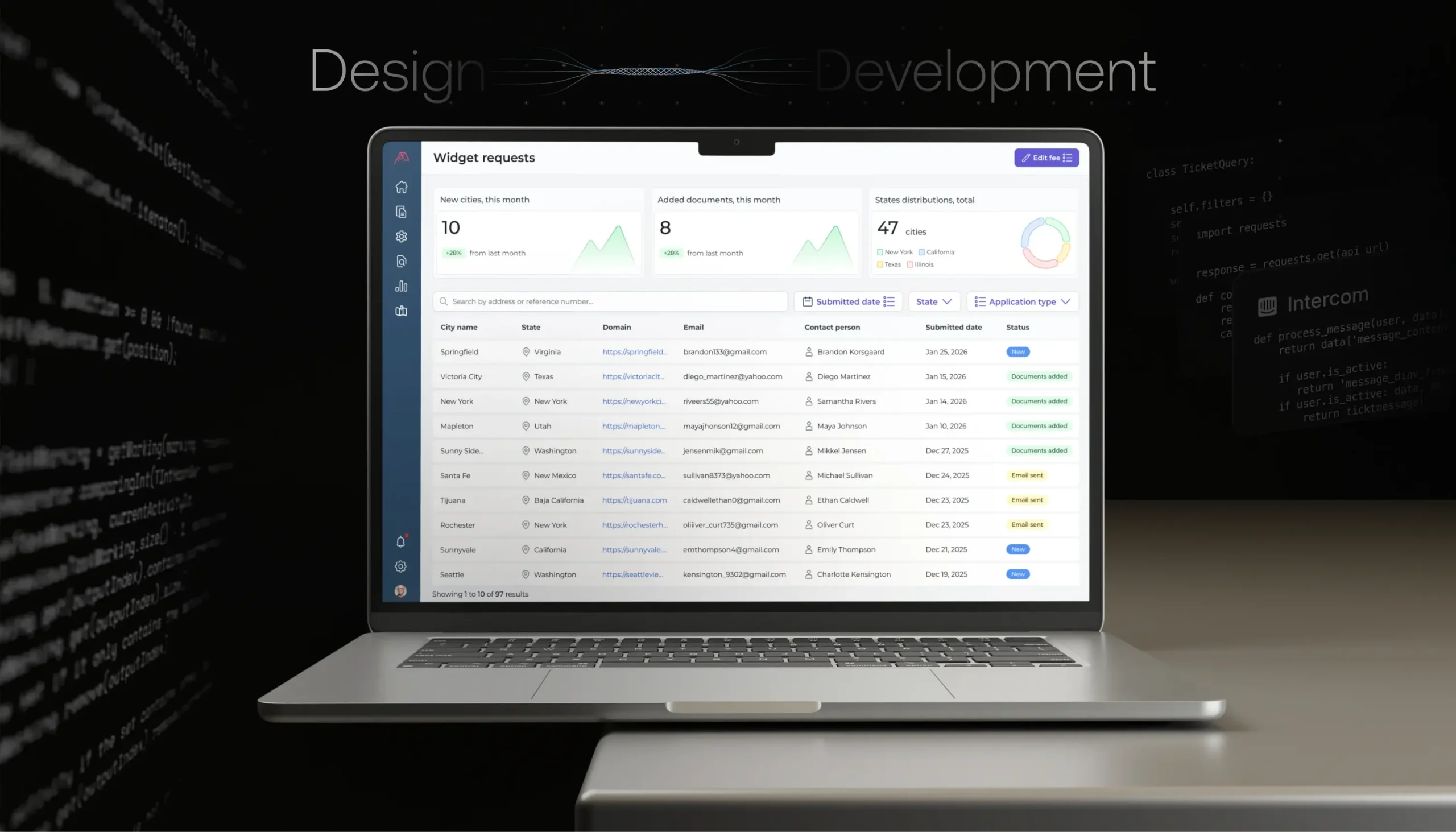
This article looks at real business scenarios where product design failure hurts SaaS and digital product growth. We won’t talk about visual polish or trendy UI patterns. The focus is on systemic design problems: onboarding flows that never deliver value, feature logic that increases friction, UX decisions that block scalability, and design misalignment that kills enterprise deals.
If you feel like “we have a product, but growth doesn’t match expectations,” there’s a good chance the problem isn’t marketing. It’s design.

When bad product design fails, it shows up really quietly. Rarely does a team wake up to a dashboard screaming, “UX is broken.” Instead, the signals are subtle and easy to misinterpret. Growth slows gradually. Engagement plateaus. Support tickets increase, but nothing feels urgent enough to trigger a redesign. Here are some examples when UX design fails, but it’s not obvious immediately:
Common symptoms that often get ignored include:
None of these looks like emergencies on its own. Together, they are classic signs that product design failures are actively hurting growth.
Many product teams think they have onboarding because they show tooltips, walkthroughs, or a checklist. But onboarding is not about explaining the interface. It’s about getting users to value as fast as possible.
When onboarding logic is broken, activation suffers. When activation suffers, early churn follows. No amount of lifecycle emails or retargeting will fix that.
Here’s what poor onboarding usually looks like:
From the user’s perspective, the experience feels heavy. There’s friction at every step. They don’t feel guided - they feel tested.
From a business perspective, this creates a predictable pattern:
Teams often respond by adding more onboarding steps, more tips, more modals. This only increases friction.
Activation is one of the most important product metrics in SaaS. If users don’t reach value early, retention curves flatten before they even begin. A weak onboarding experience:
This is one of the most common UX design failures because it’s rooted in assumptions. Teams assume users understand the product context. In reality, users only care about solving their immediate problem.
Fixing this usually requires stepping back and redesigning the onboarding flow as a value-delivery system, not a UI tour. This is where experienced web application design services providers focus less on screens and more on user scenarios.
Each feature makes sense on its own. Each one has a use case. But together, they create cognitive overload. The product becomes harder to learn, harder to navigate, and harder to explain.
This is not a feature problem. It’s a design logic problem.
Feature complexity usually creeps in slowly:
The result is friction at almost every touchpoint. Users hesitate. They click less. They rely on trial and error. Over time, this changes user behavior in measurable ways.
Here’s a simplified view of how complexity affects metrics:
| Feature | User action | Metric impact |
|---|---|---|
| Advanced settings panel | User ignores it | Low adoption |
| Multi-step workflows | User abandons halfway | Drop in activation |
| Overloaded dashboard | User checks fewer areas | Reduced engagement |
| Rarely used options | User feels overwhelmed | Lower retention |
None of these is dramatic failure. Together, they explain why growth stalls even when the product keeps improving “on paper.”
Users don’t churn because a product is missing features. They churn because using it feels hard. High friction leads to:
This is especially dangerous for SaaS products targeting multiple segments. Without clear prioritization, the interface tries to serve everyone and ends up serving no one well.
Fixing this requires strong product design services that focus on:
Without that, even well-built products slowly turn into examples of bad product design failures.
Sometimes, the product design failure doesn’t show up when the product is small. In fact, early on, everything may work just fine. The team is small, customers are similar, and workflows are relatively simple. The problems start when the product grows.
Scalability issues caused by UX design failure are especially dangerous because they hit at the exact moment when growth should accelerate. Instead of enabling expansion, the product becomes harder to sell, harder to support, and harder to operate.
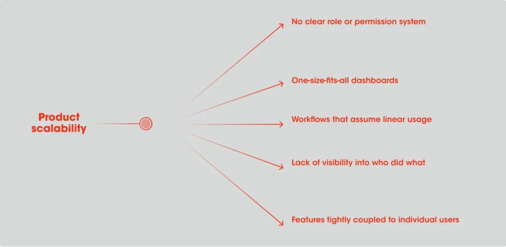
Many SaaS products are designed around a “single user” mindset. One person, one account, one set of actions. That works early. It completely falls apart when teams, departments, or enterprises enter the picture.
Common design decisions that block scalability include:
At a small scale, these feel like reasonable shortcuts. At larger scale, they become hard blockers.
For example, a product might technically support multiple users, but the UX doesn’t clarify responsibilities. Admins can’t control access properly. Managers can’t see progress. Teams start building workarounds outside the product. This is not a technical limitation. It’s a design one.
When UX blocks scalability, the business impact goes far beyond usability. You start seeing:
From a metrics perspective, this affects:
What makes this worse is that these problems often surface late in the sales cycle. A deal looks promising until the product is tested by multiple stakeholders. Then concerns appear: Who controls this? How do we manage access? How does this fit our workflow? At that point, no amount of feature promises can fix the underlying UX design failures.
This is why experienced teams involve a SaaS UI/UX design and development agency, like UITOP, early, not to redesign screens, but to rethink user roles, scenarios, and system logic before scalability becomes a bottleneck.
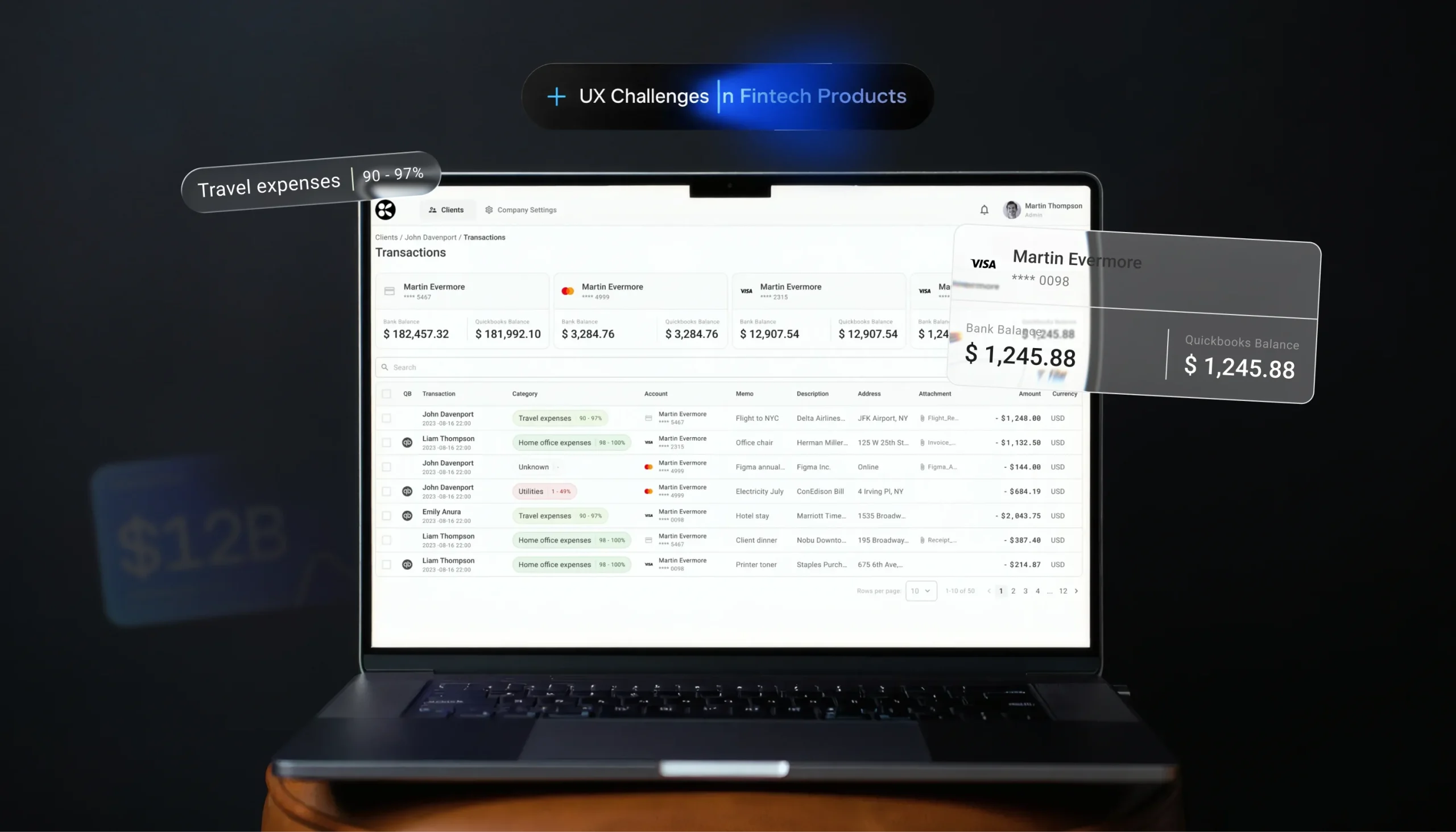
Enterprise customers buy differently. Their decision-making process is slower, more structured, and far more risk-averse. And product design plays a much bigger role in that process than many teams expect.
Design misalignment doesn’t mean the product looks unprofessional. It means the UX fails to support how enterprise buyers evaluate, trust, and adopt software.
Enterprise sales often stall for reasons that sound vague:
Behind these statements are very concrete UX problems. Common examples include:
For individual users, these issues are annoying. For enterprise buyers, they signal risk.
If decision-makers can’t quickly understand how the product fits into their organization, trust drops. If managers can’t see oversight and control, adoption feels dangerous. If basic workflows aren’t self-explanatory, rollout costs look high.
Enterprise buyers don’t just buy features. They buy clarity. They look for:
When the product worst design fails, the business impact is immediate:
This is where a targeted UI/UX redesign service often becomes a growth lever . By aligning the product experience with enterprise expectations, teams reduce friction in the buying process itself.
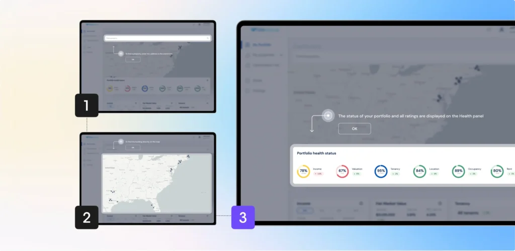
A clear example of design misalignment affecting enterprise growth came from TimeXpress, a product that had been on the market for almost 25 years. While it was stable and trusted by existing customers, attracting new enterprise clients had become nearly impossible.

The product was outdated: it couldn’t even be opened in a browser, which immediately raised concerns for modern teams working across different devices, operating systems, and setups. For enterprise decision-makers, this limitation alone created friction and reduced trust, regardless of the product’s core functionality.
Rather than make a simple refresh of the UI, we were rethinking the product at a system level. The product has been redeveloped as a browser-based React application, with key workflows preserved to not disrupt existing customer bases. Through a defined product process of audit, requirements, iterative design, and development, we made the product simple to understand, simple to use, and flexible again. The UX no longer acted as a barrier to entering the enterprise space.

We at UITOP made sales conversations easier, proving that if you take a B2B product, the limiting factor to market growth is not necessarily the functionality, but the design principles that were flawed.
Often, UX design fails across products and industries, and you start seeing the same patterns happening over and over again. Sure, the scenarios will look totally different on the surface, but amazingly, the causes are quite similar.
Product design failures are not about bad taste or weak designers. They are about how decisions are made and what gets ignored along the way.
Here are the most common patterns behind bad product design failures that hurt growth:
Product design failures often appear logical at the moment they’re made and destructive later on.
One of the biggest mistakes teams make is treating UX as something you “feel” instead of something you can measure.
In reality, UX problems leave clear traces in product metrics. You just need to know where to look.
Here’s a simple checklist teams can use to spot early warning signs:
Good teams don’t ask, “Does this screen look right?” They ask:
When UX is connected to decision-making and business impact, problems surface earlier, before they turn into growth blockers.
There’s a reason experienced companies stop treating design as a cosmetic layer.
Strong product design services don’t start with UI kits or visual concepts. They start with understanding how growth actually happens inside the product.
When done right, design becomes a growth tool. It helps users succeed faster, stay longer, and expand naturally.
This is the difference between “making the product nicer” and fixing the kind of UX design failures that quietly limit revenue.
When product growth doesn’t meet expectations, it’s tempting to look outward - at the market, pricing, or marketing channels.
But many times, the real problem is already inside the product.
Often, product design fails, and it doesn't usually announce loudly. It shows up as friction, hesitation, confusion, and slow erosion of product metrics. It affects adoption, retention, scalability, and enterprise decision-making long before anyone calls them a “UX problem.”
Bad product design fails, and it's the most dangerous when it looks acceptable. Treating UX as a growth lever changes how products evolve. It forces teams to connect design decisions with real business impact.
If growth feels harder than it should be, it might be time to stop asking “What are we missing?” And start asking, “Where is our design getting in the way?”
Because users don’t grow products by looking at them – they grow them by using them. Even visually clean interfaces can hide friction that blocks adoption and retention.
Usability issues affect individual interactions. Product design fails, and it affects entire user scenarios and business outcomes, like activation, churn, and scalability.
Yes. Enterprise buyers are highly sensitive to clarity, control, and predictability. UX misalignment increases perceived risk and slows decision-making.
Not always. Many issues can be fixed by rethinking flows, logic, and prioritization without changing the entire interface.
When growth stalls despite demand, when feature adoption is low, or when scalability and retention become challenges. These are strong signals that design is limiting business impact.