Money Transfer Platform
TangoPay is a SaaS platform for fast, secure, and user-friendly global money transfers.
The main goal was to balance intuitive interfaces with complex functionalities. The app connects different financial systems. It also needed to have a simple interface. So we needed to provide an engaging user experience.
We made an app for Tangopay that focuses on what users want and makes it easy to use. The app helps users send money to almost any country. Our design makes sending money easy. This content reads as if it is human-written.
Description
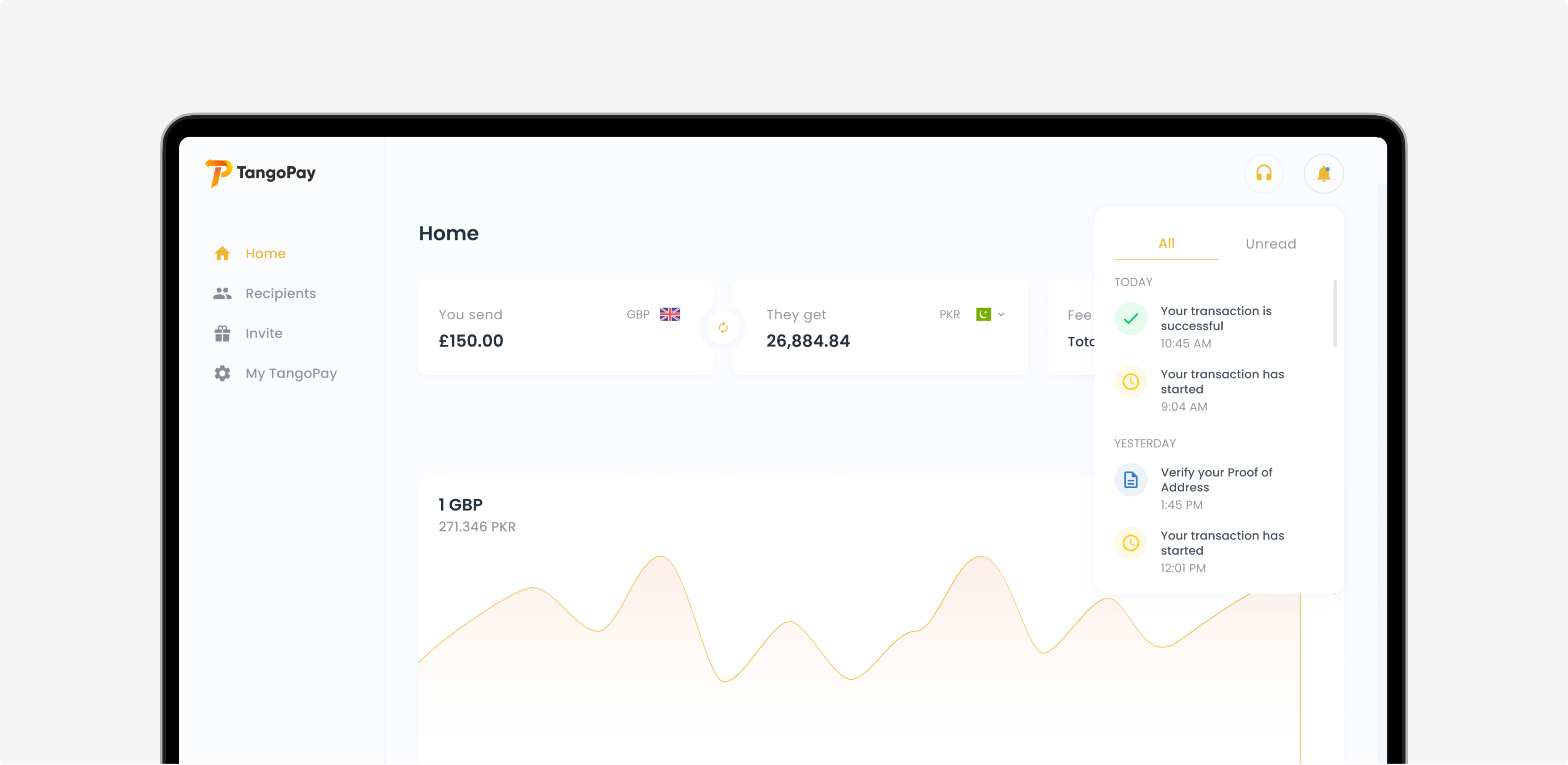
TangoPay is an intuitive app for global money transfers. Users can easily send money across borders using the app. With its clear and user-friendly interface, TangoPay makes managing financial transfers straightforward. TangoPay also keeps users updated with instant notifications on the status of their money transfers.
Rate Calculator
Problem
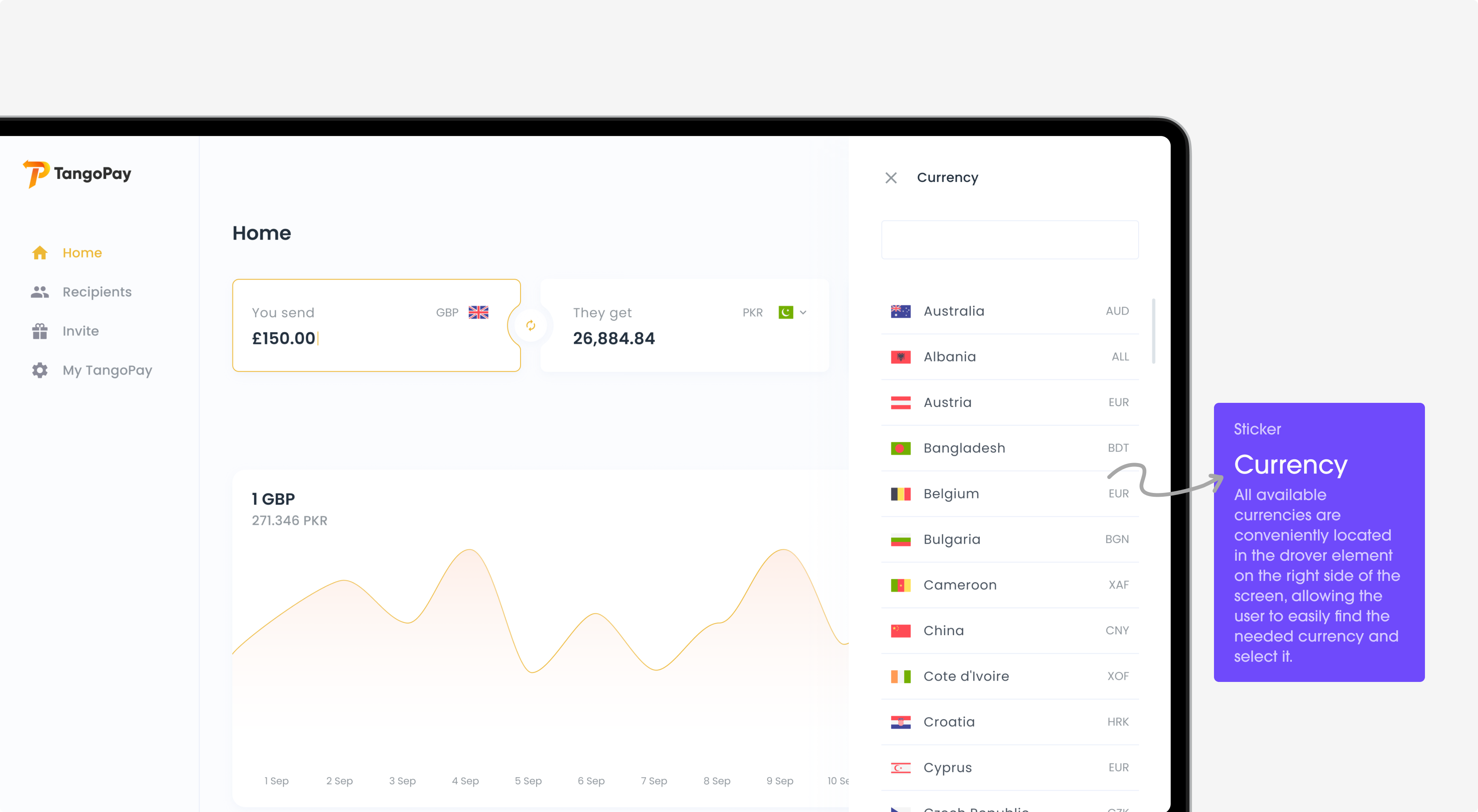
Sending money to another country can be confusing for users. Money values vary between countries, making it difficult to know the exact amount received in another currency.
Solution
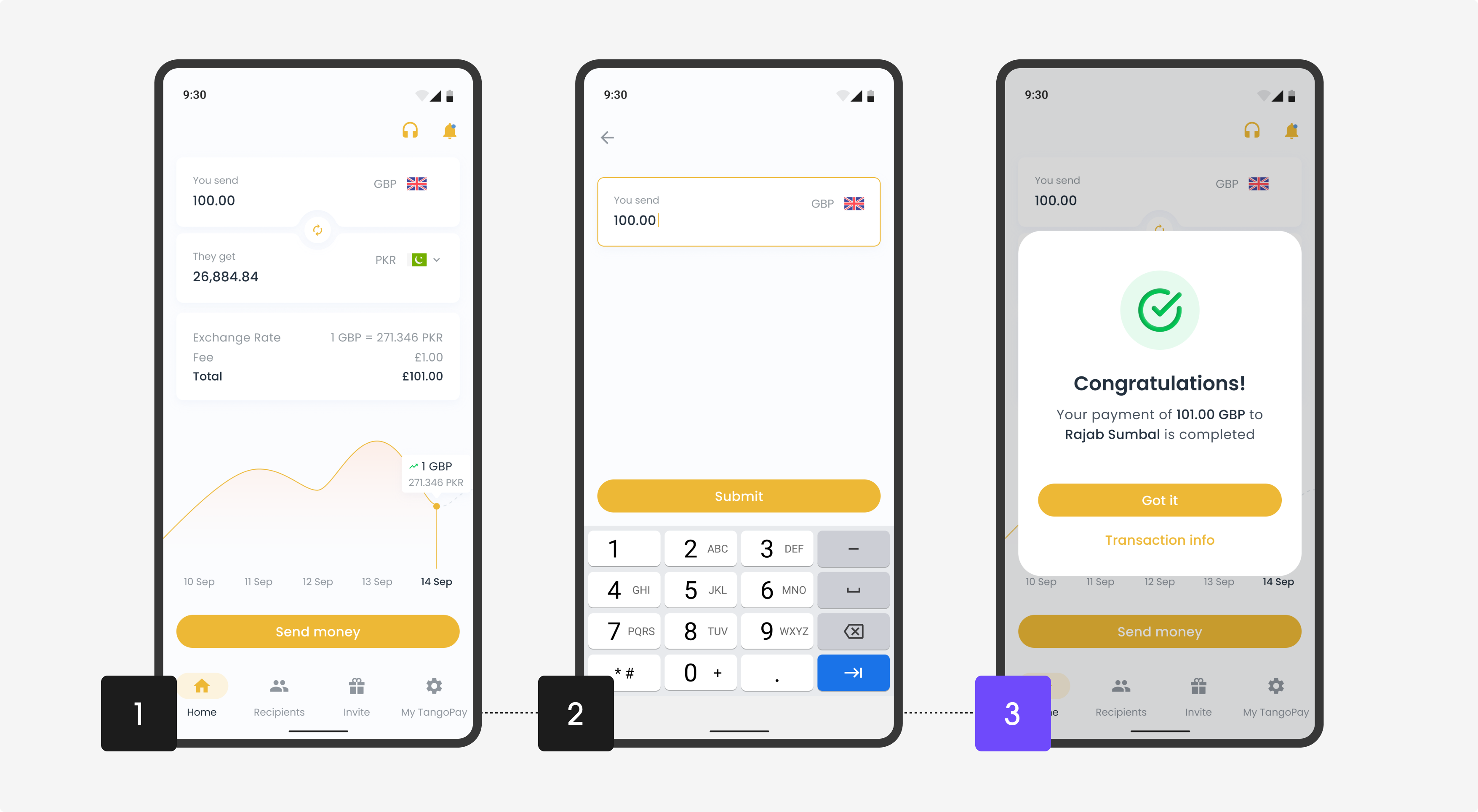
Now it is easy to find right when you open the app. It’s simple to use: users just pick the currencies and type in how much they want to send. The calculator then quickly shows how much money will be received in the other currency. It uses the latest exchange rates. This makes the whole process much simpler and helps users understand better.
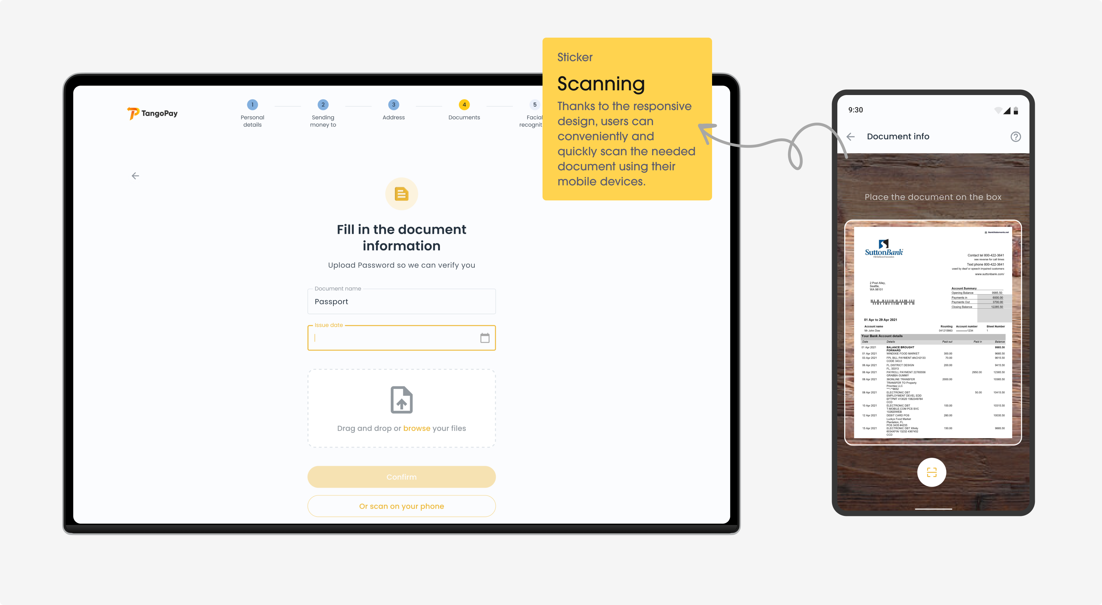
Document scanning
Problem
Users often struggle with uploading documents on TangoPay. Scanning and uploading documents can be confusing and time-consuming. Users need an intuitive way to scan and submit their documents.
Solution
We have created a simple way to use their phone’s camera to scan it. The app automatically adjusts the picture to make sure the document is clear and readable. It also checks if the document is the right one and if all the needed details are visible.
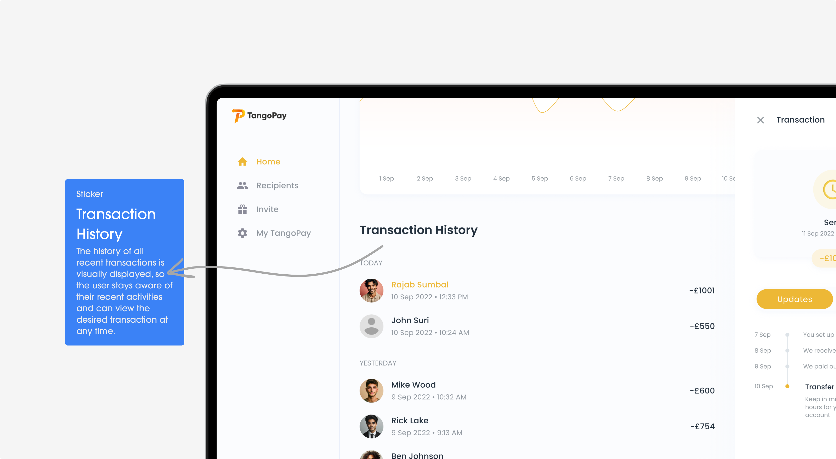
Transactions
Problem
Users sometimes have trouble keeping track of their money transfers. This can be confusing, especially when they have many transactions to remember.
Solution
Each transfer on the list shows important details. Users can look up their transfers by date, amount, or person. Plus, they can tap on any transfer to see more about it. This makes it easy for users to check their money transfers.
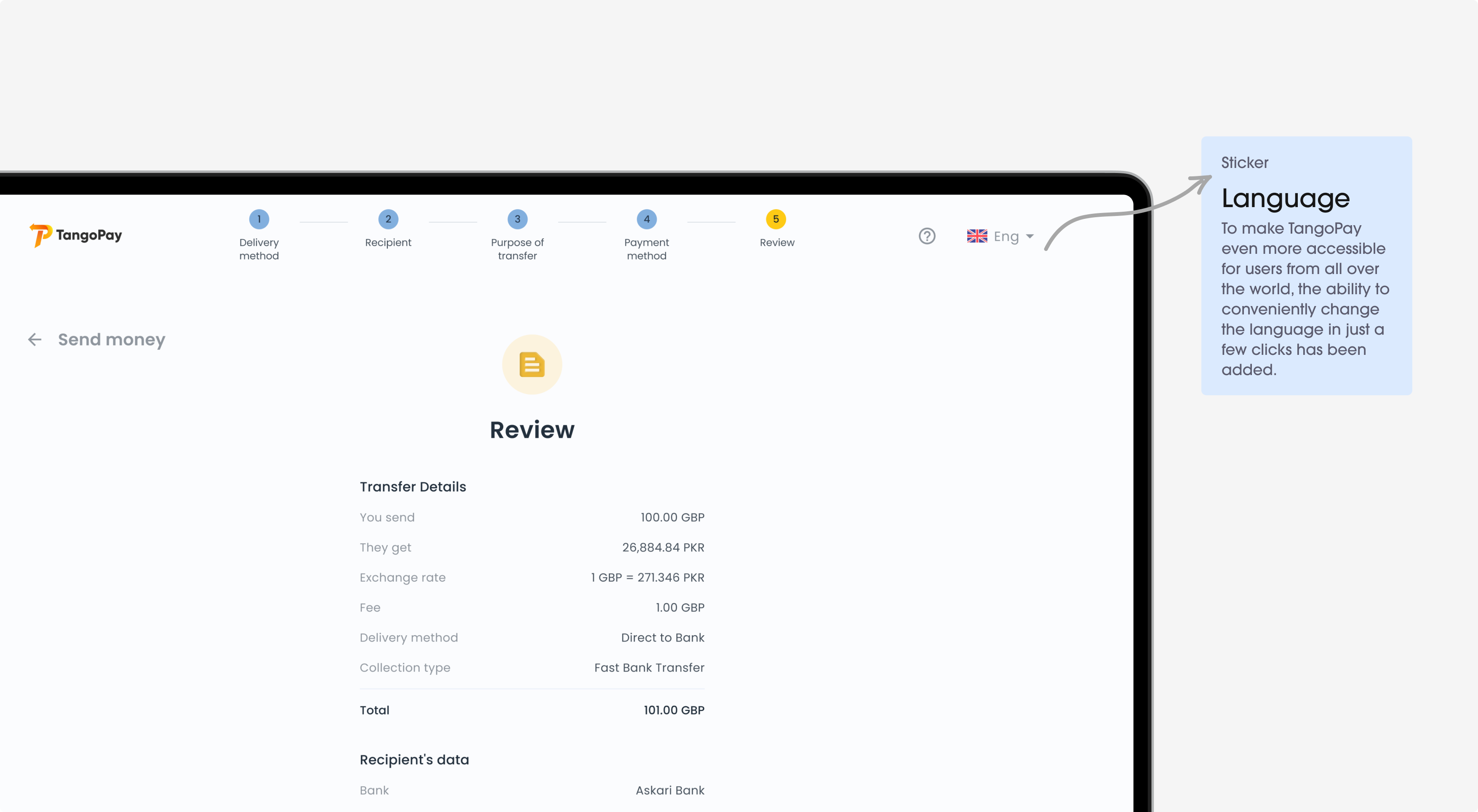
Money Trasnfer
Problem
Users can feel confused when there are many steps to send money. For instance, they must choose the recipient, enter the amount, and double-check everything. This can make sending money seem like a big hassle.
Solution
Users can now send money in just a few easy steps. The app guides them through each step, making it simple to pick a contact or add a new person. Everything is displayed clearly and simply to avoid confusion.
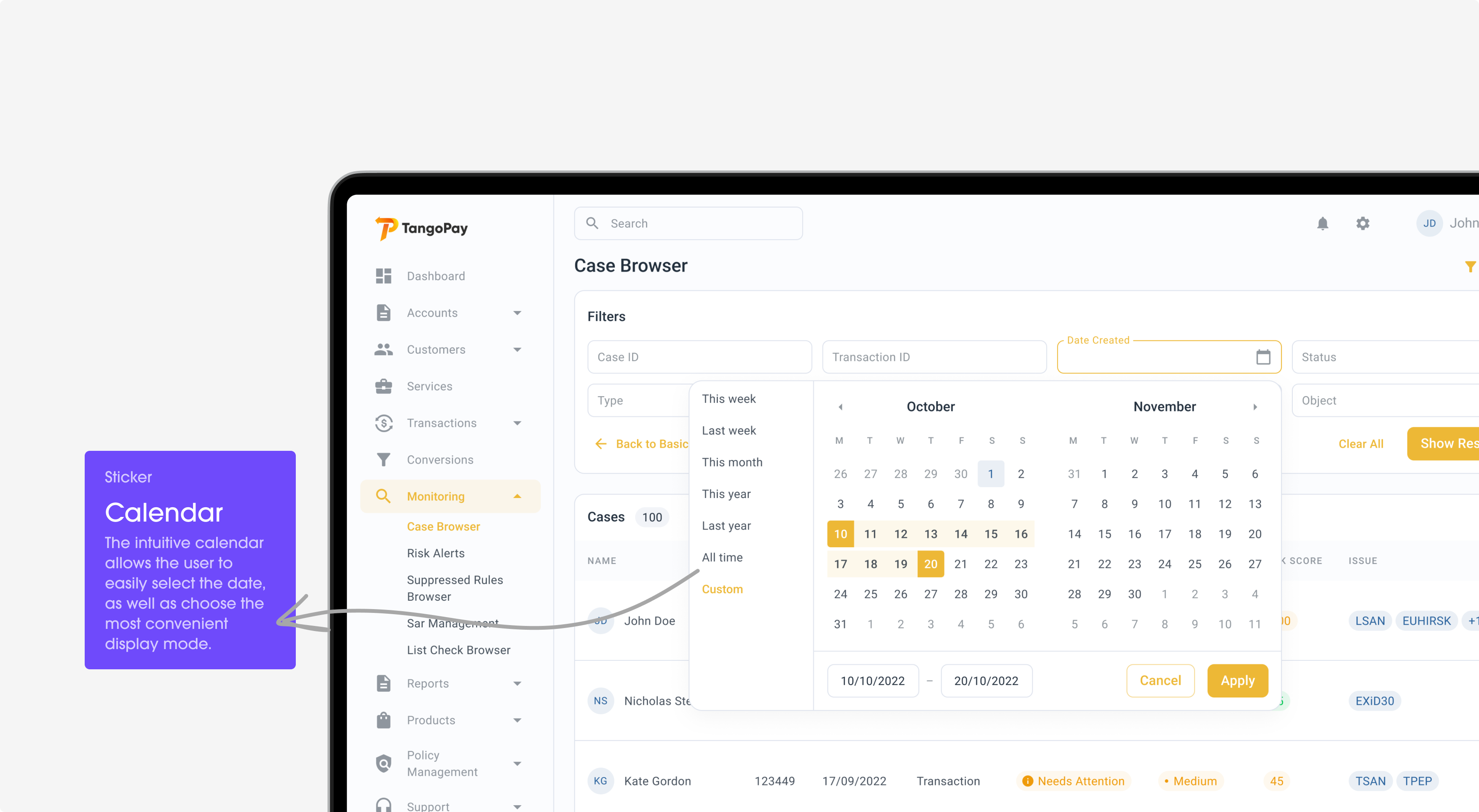
Back Office
Problem
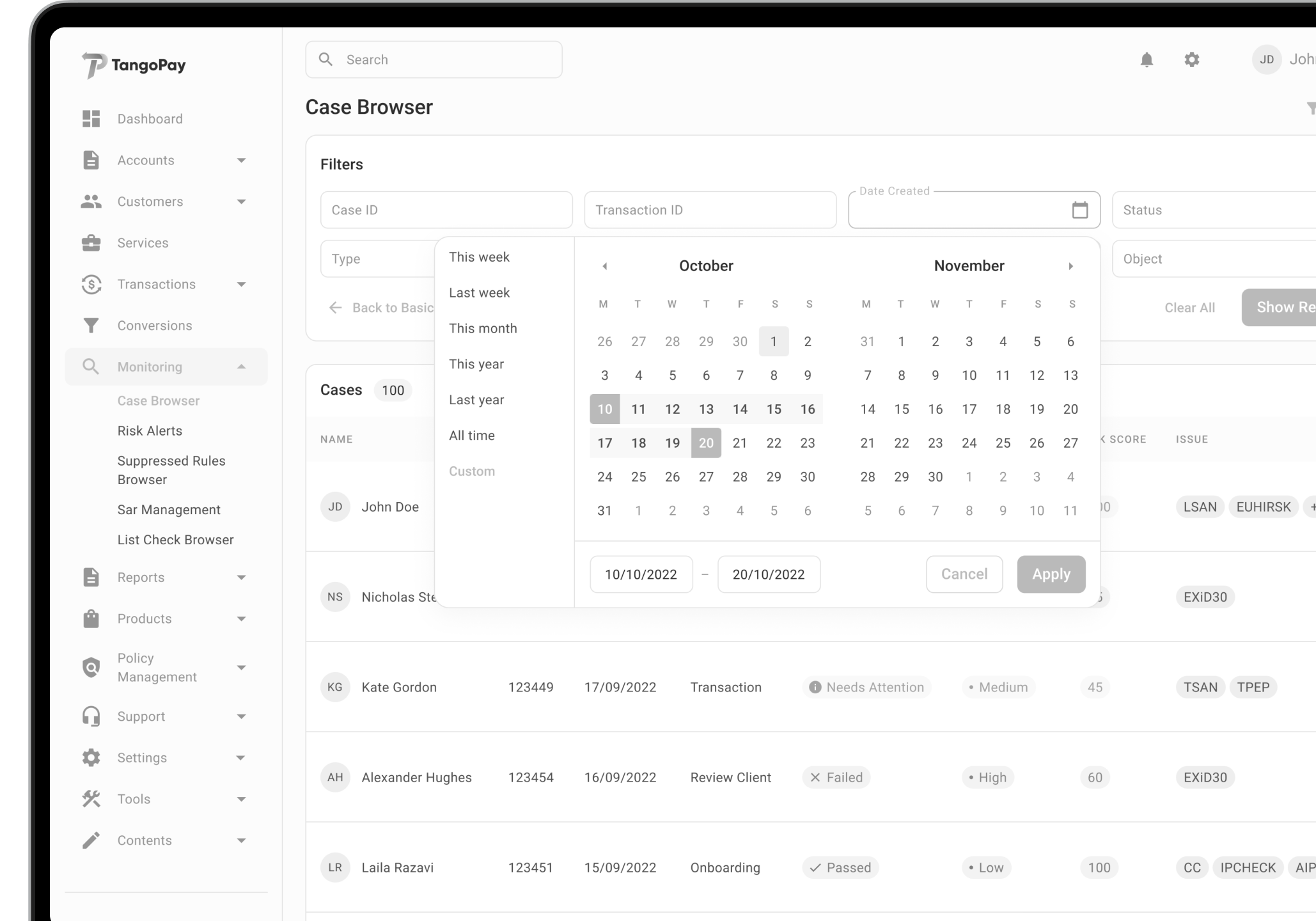
TangoPay’s back-office features can be difficult for business users to use. They get confused by the detailed reports, transaction lists, and account settings. This is especially tough for small business owners or people who aren’t familiar with complex financial tools.
Solution
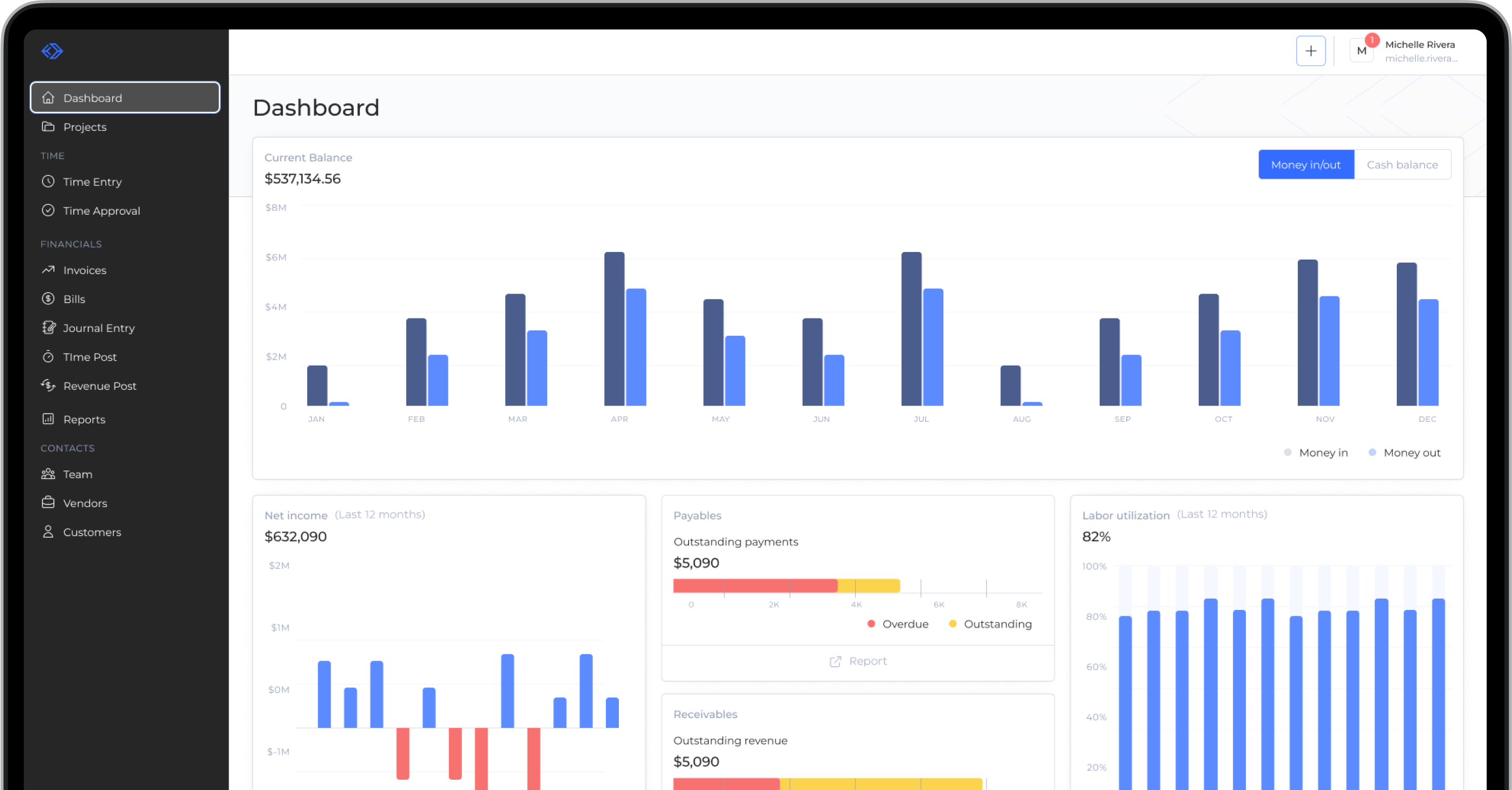
Now, business users can easily handle their money matters in the app. The new design has a clear dashboard. Users can see all their important financial information at one glance. The dashboard has easy sections for past transactions, reports, and managing different accounts.
Technology
The interface matches well with the development frameworks. This ensures that the experience is easy for users.
Material UI 3
AUTO-LAYOUTS, COMPONENT DESIGN SYSTEM, CUSTOMIZATION
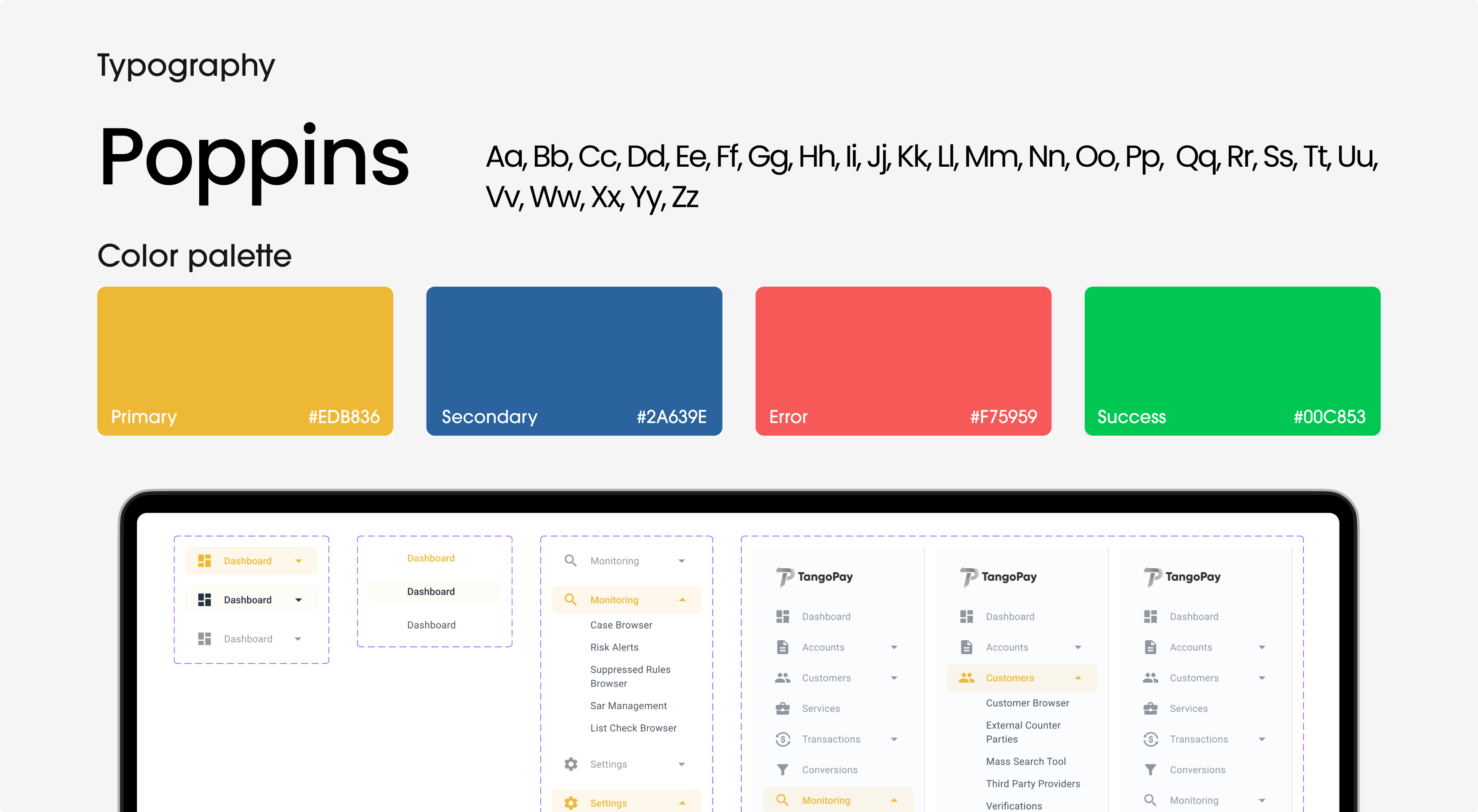
Components Library
Challenge
The developers and designers at TangoPay struggle to keep the app’s development process consistent and efficient. It takes a long time to create the same elements, which leads to inconsistent design.
Solution
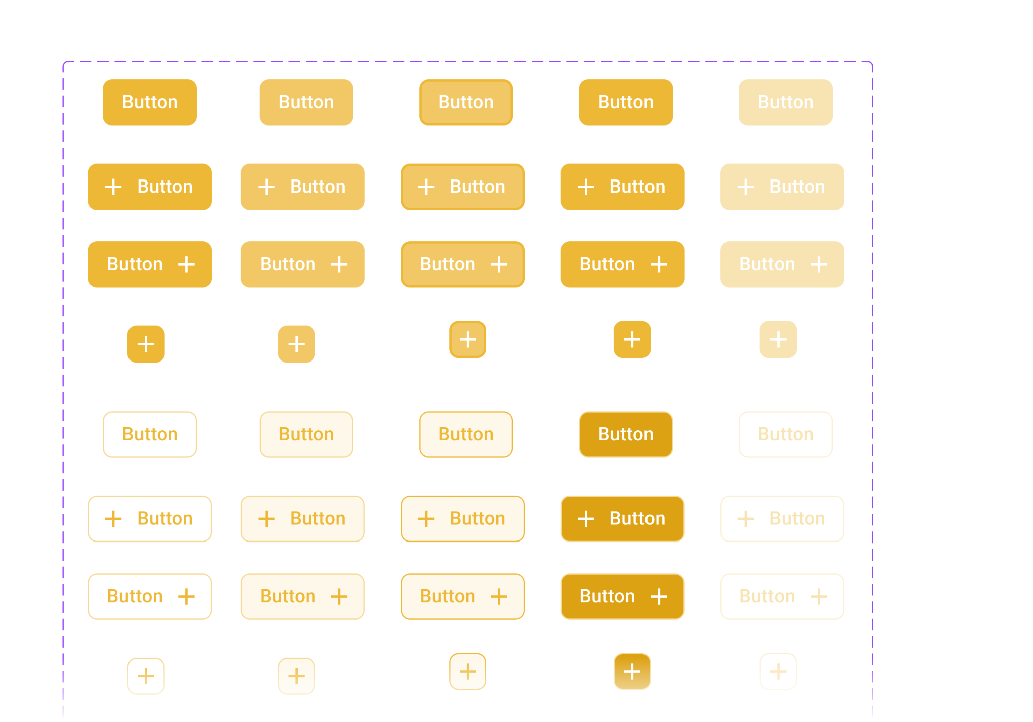
The library is a collection of standardized UI components. It includes buttons, input fields, icons, and navigation elements. Each component aligns with TangoPay’s guidelines for looks and function.
Problem solving
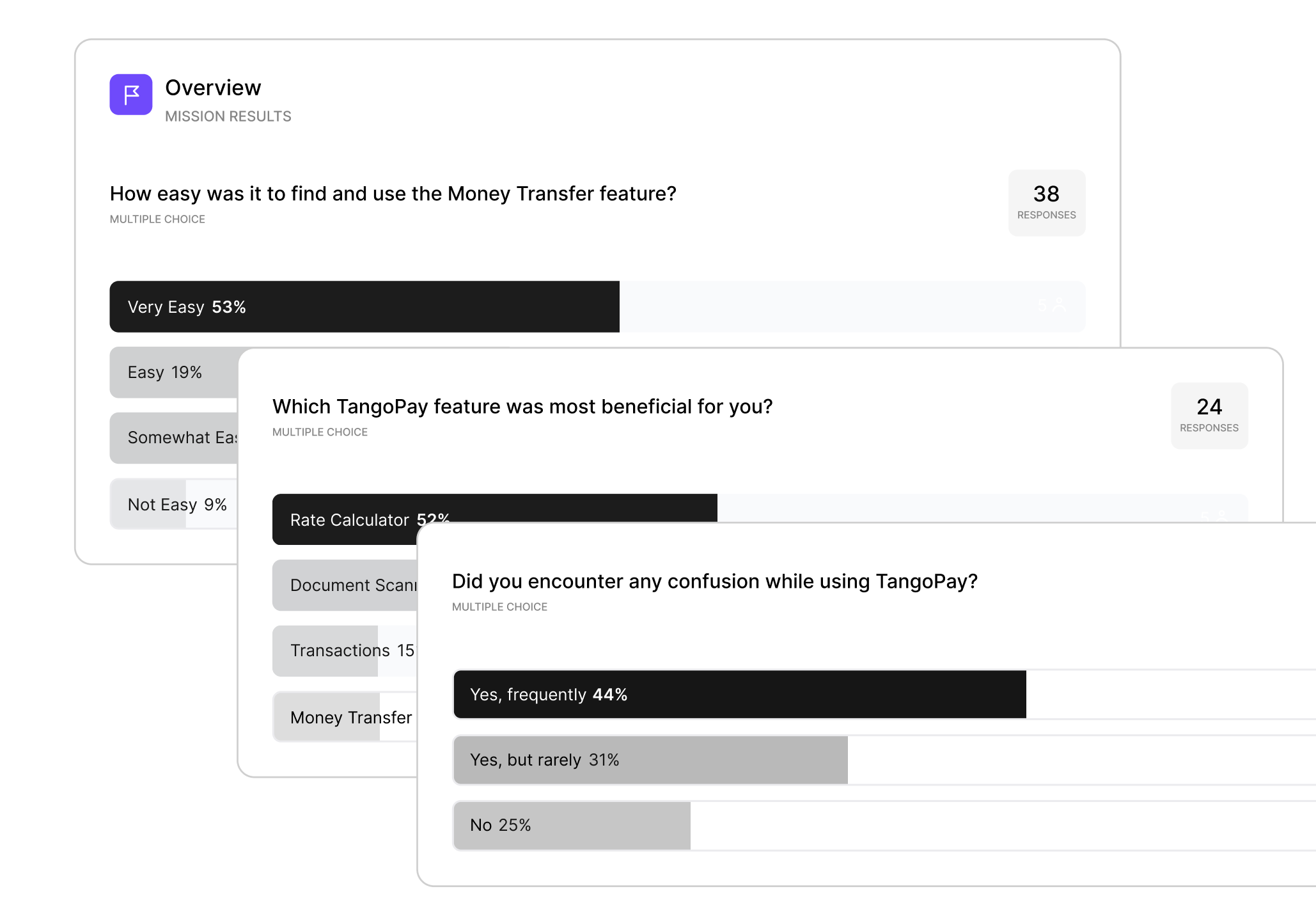
We spoke with users and heard their problems and ideas. This helped us improve the platform’s design.
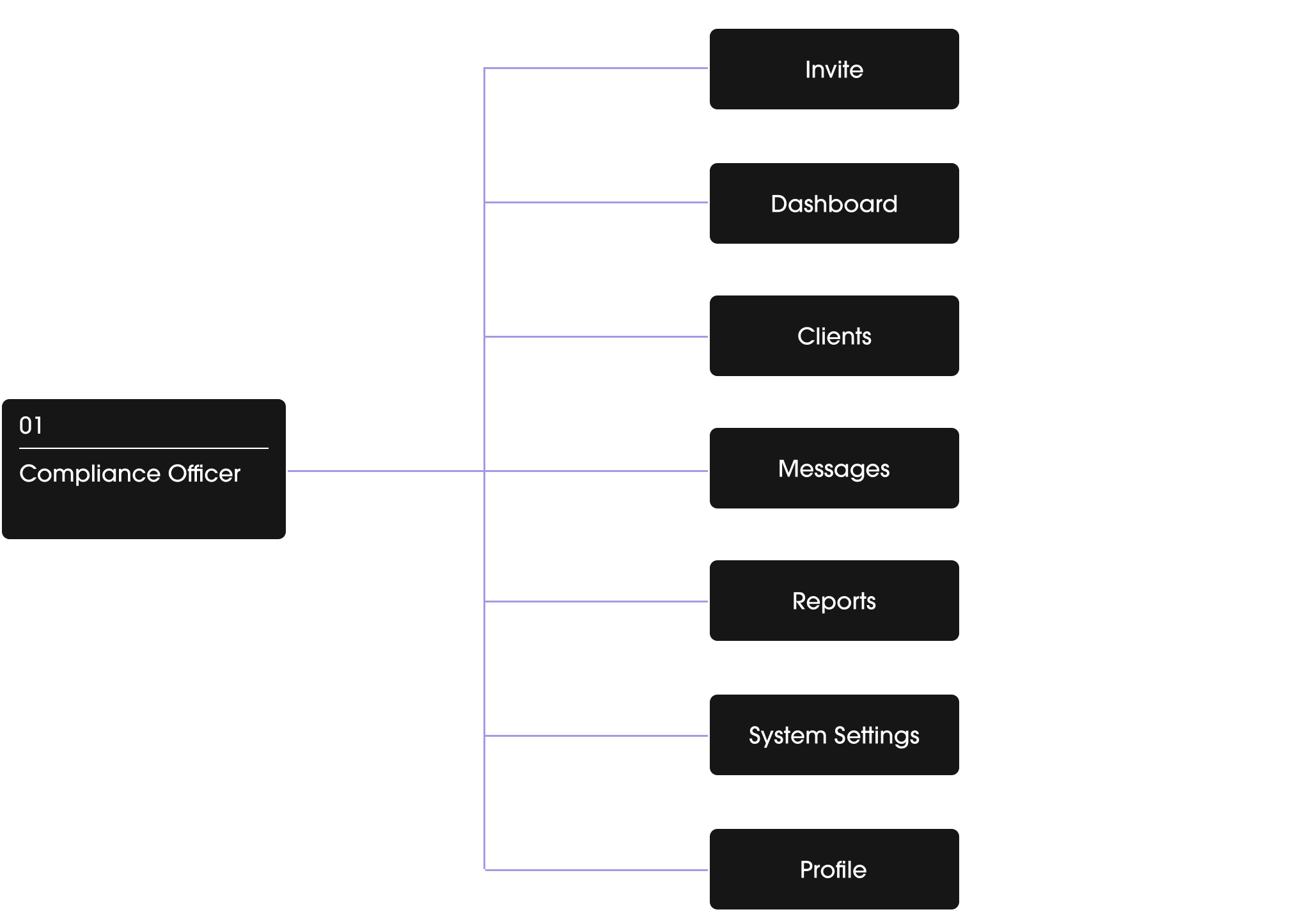
Architecture
Wireframing
Design system
Prototype & Testing
Ready to redesign your product?
A great product is the one designed with the client’s business goals in mind!

