Design, Development, Product • Feb 14, 2026
 How we use AI in our process Learn more
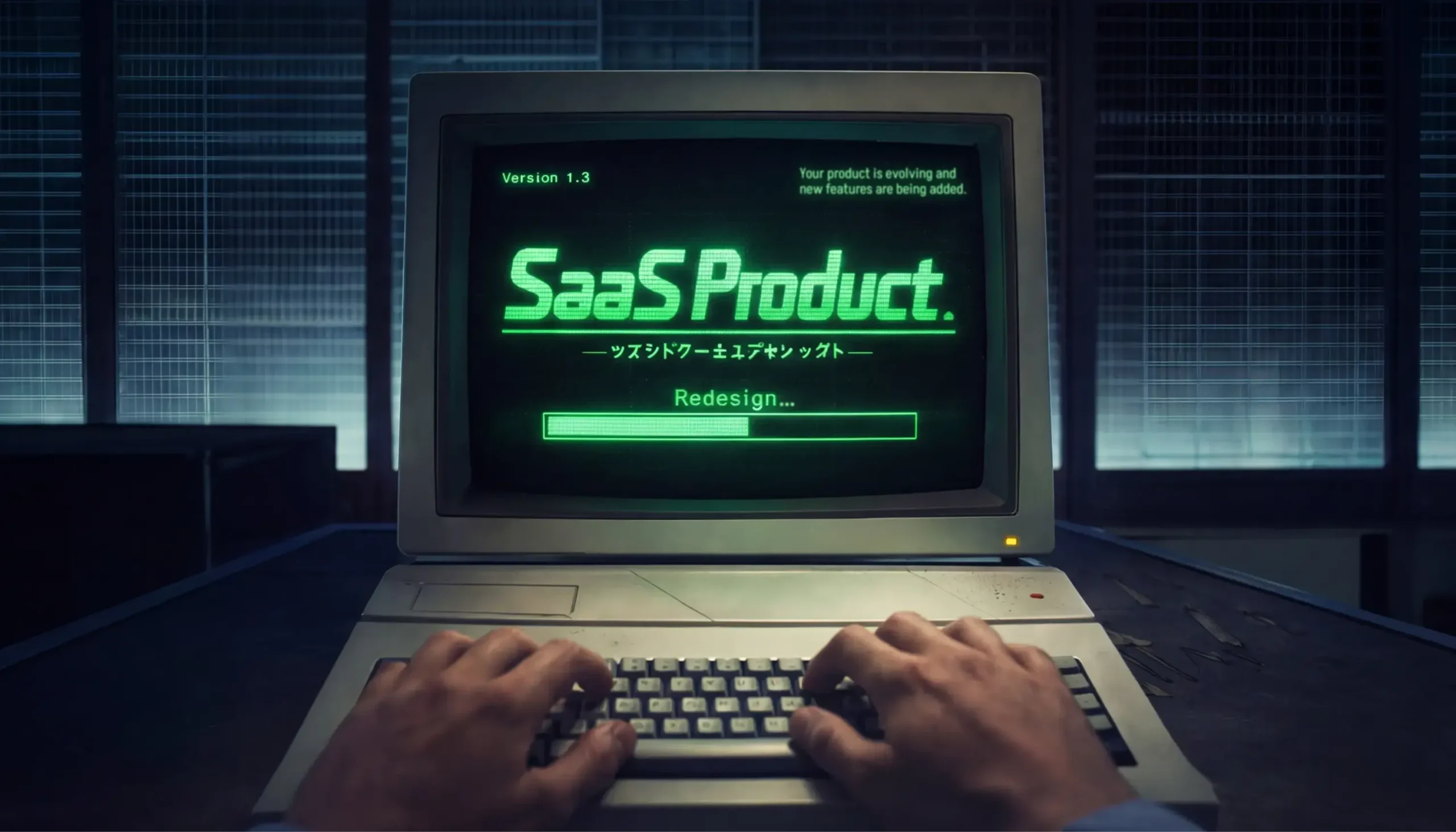
Every SaaS product eventually faces the need for redesign. This may not be because something went wrong - products just grow, features are added.
Sometimes, one change may be needed - to clarify the key flow or improve how the information is presented. Other times, the whole interface may need to be changed.
Whatever the scope of the change, a common mistake in the redesign process is treating redesign as a goal in itself. A redesign done “because it’s time” or “because it looks outdated” is risky.
So, the first question isn’t how to redesign. It’s when. How do you recognize the moment when a redesign is actually needed? Only once you’re there, you can define what you should change.
In this article, we’ll break down the main signals that point to a real need for redesign and show where to start, so you can upgrade your product without losing the users who rely on it. Product redesign examples included.
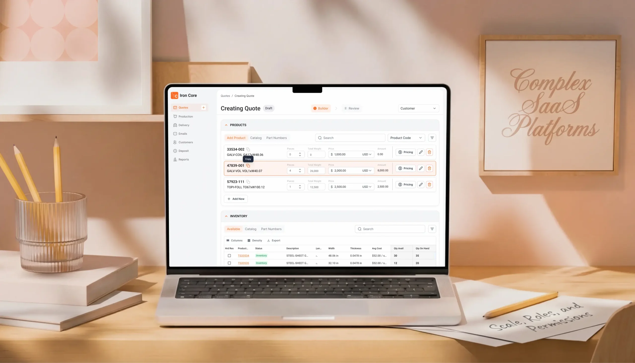
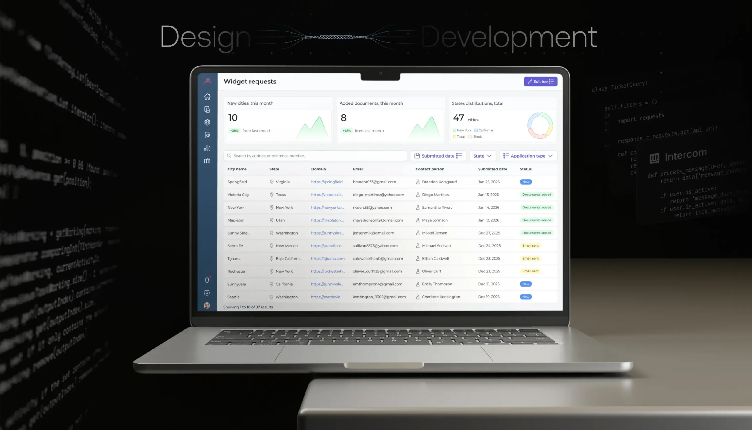
Let’s begin with the product redesign definition. A SaaS product redesign means changing how the product looks, works, or feels for the user. The purpose of this process is to make the product easier to use and better aligned with what users require and expect today.
Redesign can be different:
In practice, a SaaS redesign is often a combination of all three.
So what are the main signs that a redesign is critical for the successful future of the entire product? Let’s take a look:
This is the exact point where many SaaS product companies start looking into product redesign services to bring in a fresh, structured perspective on what needs to change.
Particularly speaking of the scaling issues, here’s how we assess the need for redesign at the beginning:

Of course, there also should be clear metrics that help confirm whether business problems are tied to the product’s design, not the market or the strategy.
User behavior usually shows it first. If you see drop-offs in the main flows, this is a strong signal. Users start an action but don’t finish it.
Churn can tell the same story. If users leave shortly after signing up or after hitting a specific feature, it often means they didn’t reach value fast enough or got stuck trying.
Then there’s feature avoidance. You build something important, but users barely touch it. Or they keep using older, less efficient paths. This usually means the feature is hard to find, hard to understand, or doesn’t fit the existing flow.
So, once you determine why redesign a product, this is already a good place to be. It means the problems are visible and acknowledged.
But this is also where the real work begins, and it’s important to take into account some aspects that also impact whether the results of your redesign will be positive.
Below, we’ll look at several common mistakes that cause SaaS redesigns to miss their goal (even when the decision to redesign was the right one in the first place).
The first critical issue is breaking familiar user flows.
Most people don’t resist change because it’s bad. They resist it because it slows them down. In SaaS products, users build habits fast. They know exactly where to go and what to do to get their work done.
But redesign can introduce friction to users’ familiar processes. Even a better solution can feel worse if it interrupts that flow.
And if users feel lost, they lose confidence in the product. Adoption can drop because people avoid exploring what’s new, and retention may suffer because some users decide it’s easier to switch tools than relearn one they already had figured out.
That’s why redesigns work best when change is gradual. Redesign works best when you keep core flows recognizable, let users adapt step by step.
Then there’s the less visible part of a redesign - UX debt. This is what occurs when product decisions pile up over time. When you add features fast, when flows are adjusted again and again, but never fully rethought.
A redesign that only changes the surface won’t fix this. You can clean up screens and still leave users unsure about where to start or what to do next.
That’s why, before any upgrade, it’s important to look under the hood of the experience itself and answer the following questions:
So how do you redesign a product without losing the people who already rely on it?
Below, we’ll walk through how to redesign a product in a way that’s practical and safe. We’ll look at a product redesign process that helps you improve the experience without breaking habits or hurting key metrics.
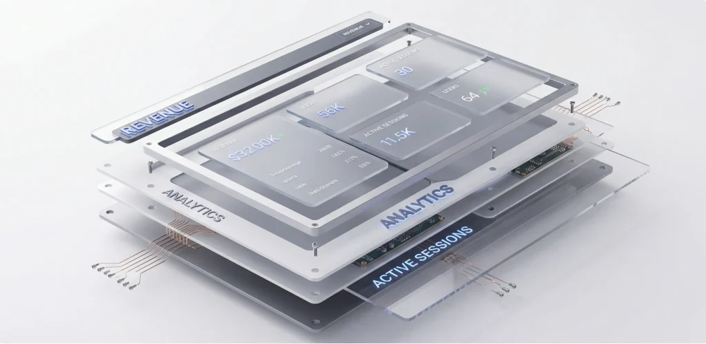
A redesign should start with understanding how people actually use the product. It’s essential to begin with product metrics, as they may show where things break down. For example, users may drop off during setup, or some features are barely used.
User research also adds context. It explains what feels unclear, what users avoid.
This is why many design companies offer discovery phase services for product development before any redesign work is initiated. The goal here is to confirm which problems are real and make sure the redesign focuses on the right aspects.
In one of our recent projects, WingWork, we ran into a very common redesign mistake.
The previous design team started with visuals without first understanding who actually uses the product. They didn’t consider daily work patterns. Neither was the users’ technical background evaluated, nor was how users perceive the interface during real work.
As a result, the design looked fine on paper but didn’t fit the real needs. Users didn’t accept it, and adoption never happened. We had to step back and rethink the product almost from scratch, starting with user roles and real scenarios. Further in the article, we share our results.
Doing everything at once is tempting. You clean up the UI, rethink flows, deliver the redesigned version, and move on. However, when too much changes at the same time, users can get lost.
Incremental changes are calmer and safer. You can improve one flow, watch how users respond, and then adjust based on their feedback. On top of that, this approach gives people time to adapt.
This is how we usually work as a SaaS product design agency. This approach protects users and gives the team real feedback while the product evolves.
We start by picking one high-impact area. This can be a core flow, onboarding, or a feature users touch every day. Our team first looks for the part that causes the most friction.
Next, we change as little as possible to solve that problem, but keep the rest familiar. Then we release the change to a small group and watch what users do, look at completion rates, time spent, and drop-offs. And once the change proves itself, we move on to the next area.
When you redesign a SaaS product, you’re not starting from zero. You’re working with people who already know the product, rely on it, and have their own habits. That’s why it’s best to transition to the new design version smoothly.
A smooth migration to the new, updated version is the one that starts with respect for what users already do. This means saving their scenarios and keeping existing data, settings, and workflows intact. If something must change, make sure there’s a clear reason and a clear benefit.
Good onboarding helps bridge the gap. You can provide short tips, contextual hints, and simple explanations. Importantly, show users what’s different at the moment they need it, not all at once.
Communication matters just as much. Tell users what’s changing and why. When people understand the reason behind a redesign, they’re far more patient with it.
Some products go a step further and let users choose when to switch to the new interface. You’ve probably seen apps ask whether you want to try the new version. This gives users control, reduces frustration, and lets teams gather feedback before making the change permanent.
Let’s look at how real companies handle redesigns.
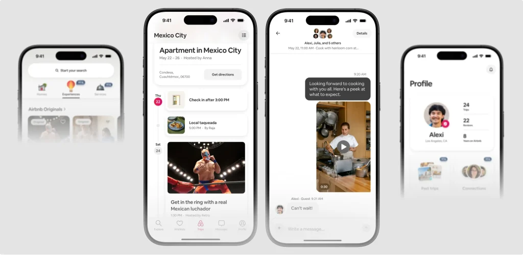
Airbnb isn’t a traditional SaaS product, but its experience and interface have evolved many times and are very different from what they were in the early 2010s.
With this product as an example, we want to show that even small changes can be beneficial for the user experience.
For years, Airbnb showed only the nightly price up front. But the total cost, including service fees and cleaning charges, appeared much later, usually at checkout. This often led to confusion or surprise for users as they reached the final step of booking. Many users felt misled when the real total wasn’t clear early in the process.
Recently, Airbnb made a big change: they now show the full price up front as users browse listings, including all mandatory fees, right from the start of the search process. You first see the real total cost before you even click into a listing.
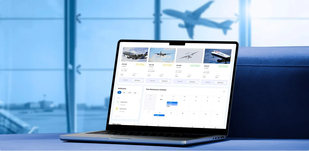
Another example, this time of the full redesign, comes from our portfolio - the WingWork project we already mentioned earlier.
Here, our agency started the redesign by rethinking user logic, not visuals. WingWork is used in aviation maintenance, where users repeat the same actions daily, and mistakes are expensive. The original design didn’t reflect these realities, which led to very low adoption.
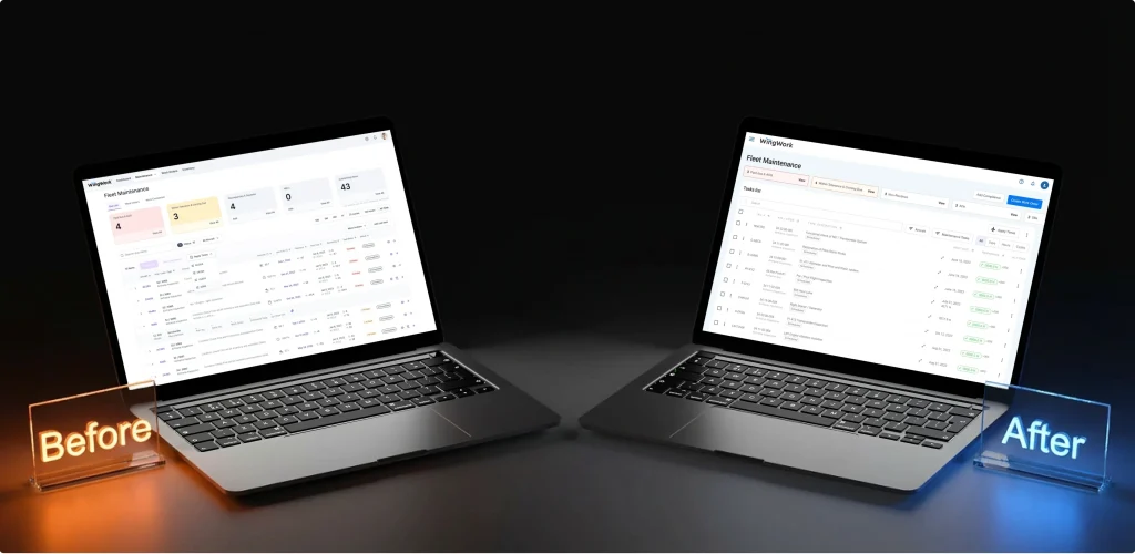
Our team reworked the core scenarios, kept familiar action patterns, removed elements that slowed users down, and introduced a design system to support future scaling. All key flows were validated at the design stage before development.
As a result, basic operations became about 23% faster, user errors dropped by 41%, and onboarding time decreased by nearly 62%.
As we’ve said, a redesign shouldn’t happen just for the sake of it. And in some cases, it’s simply not the right decision. Or this can be the right decision, but not yet.
Sometimes the problem isn’t how the product looks or works but what the product offers, who it’s for, and how it’s positioned. If users don’t see value, no interface will fix that. A clearer UI won’t solve a weak value proposition or a confusing pricing model.
Or if the product strategy keeps shifting, requirements aren’t stable, or core features are still being figured out, redesigning too early just creates more rework. In these situations, it’s better to fix the underlying issues first.
A redesign becomes much safer when it’s treated as a controlled process. This is where working with a reliable SaaS product design agency, like UITOP, can make a difference. Here’s what such experts usually do:
Redesign is needed when a product outgrows earlier decisions. Usage changes, edge cases appear, workflows become heavier, but the interface lags behind? A clear sign that it’s the perfect time to consider redesigning your product and adjusting it to the new reality.
Handled well, the redesign brings the product back into balance. And when users simply feel that the product works better than before, the redesign has done its job.
If users struggle with basic tasks, adoption drops, these are strong signs. A redesign makes sense when problems repeat, and small fixes stop helping.
No. In many cases, small changes work better. If one flow or feature causes most of the friction, fixing just that can be enough. A full redesign is only needed when problems are spread across the product.
Always with structure. Visuals come later. If flows, logic, and priorities aren’t clear, a new interface won’t fix the real problems.
When the product strategy isn’t clear yet. If the target audience, value, or core features keep changing, redesigning too early usually leads to wasted effort and more rework later.