Advanced Real-Estate Investment Platform
Whiterock is a cutting-edge platform for investors, lenders, and brokers. It optimizes the real estate investment process with advanced analytics and forecasts.
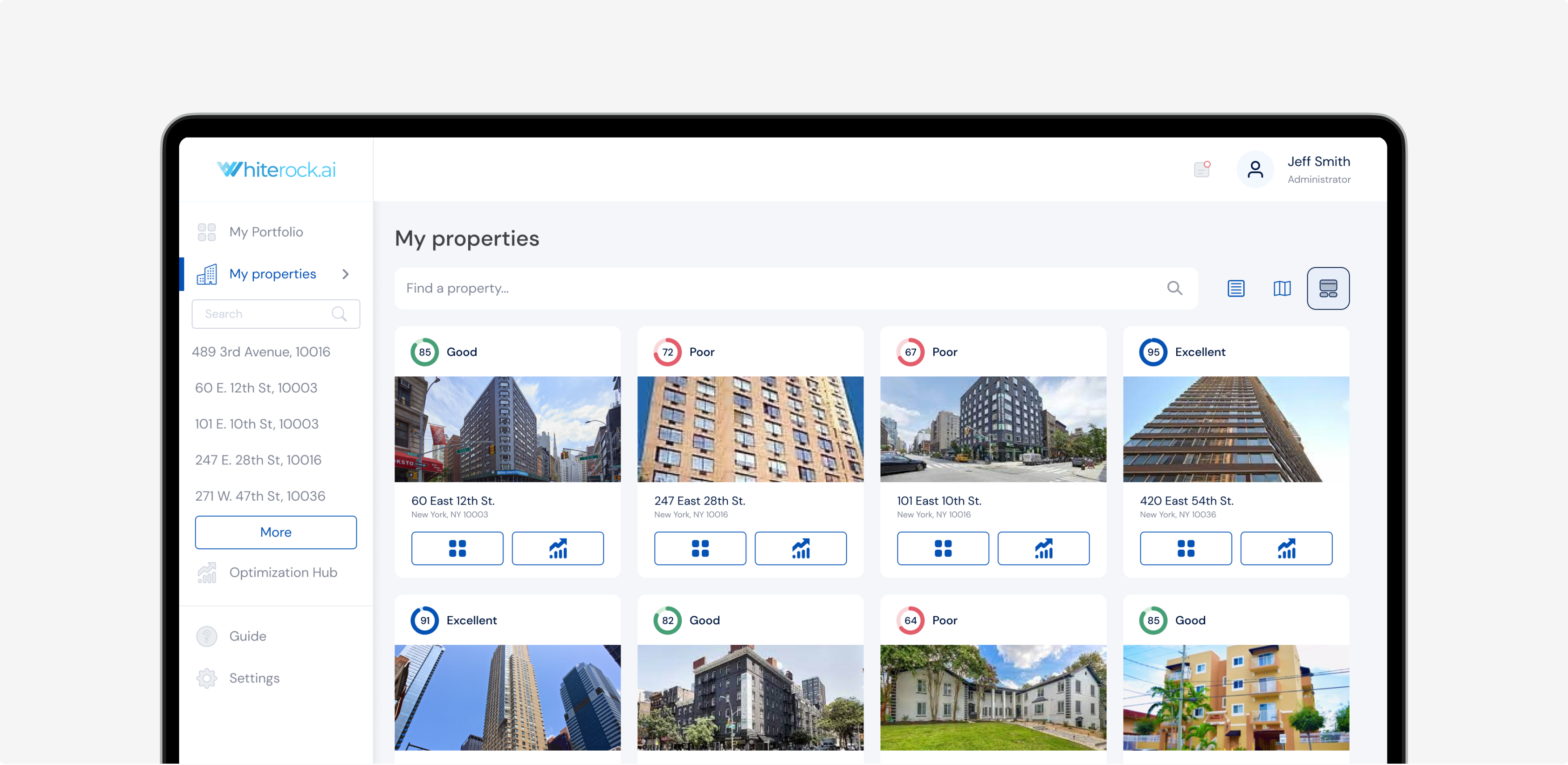
Investing in properties can be confusing. With so many numbers and facts to look at, people can miss good opportunities or make mistakes.
Whiterock helps to find better property deals and make more money. The app brought all the information they needed into one place with a clear interface.
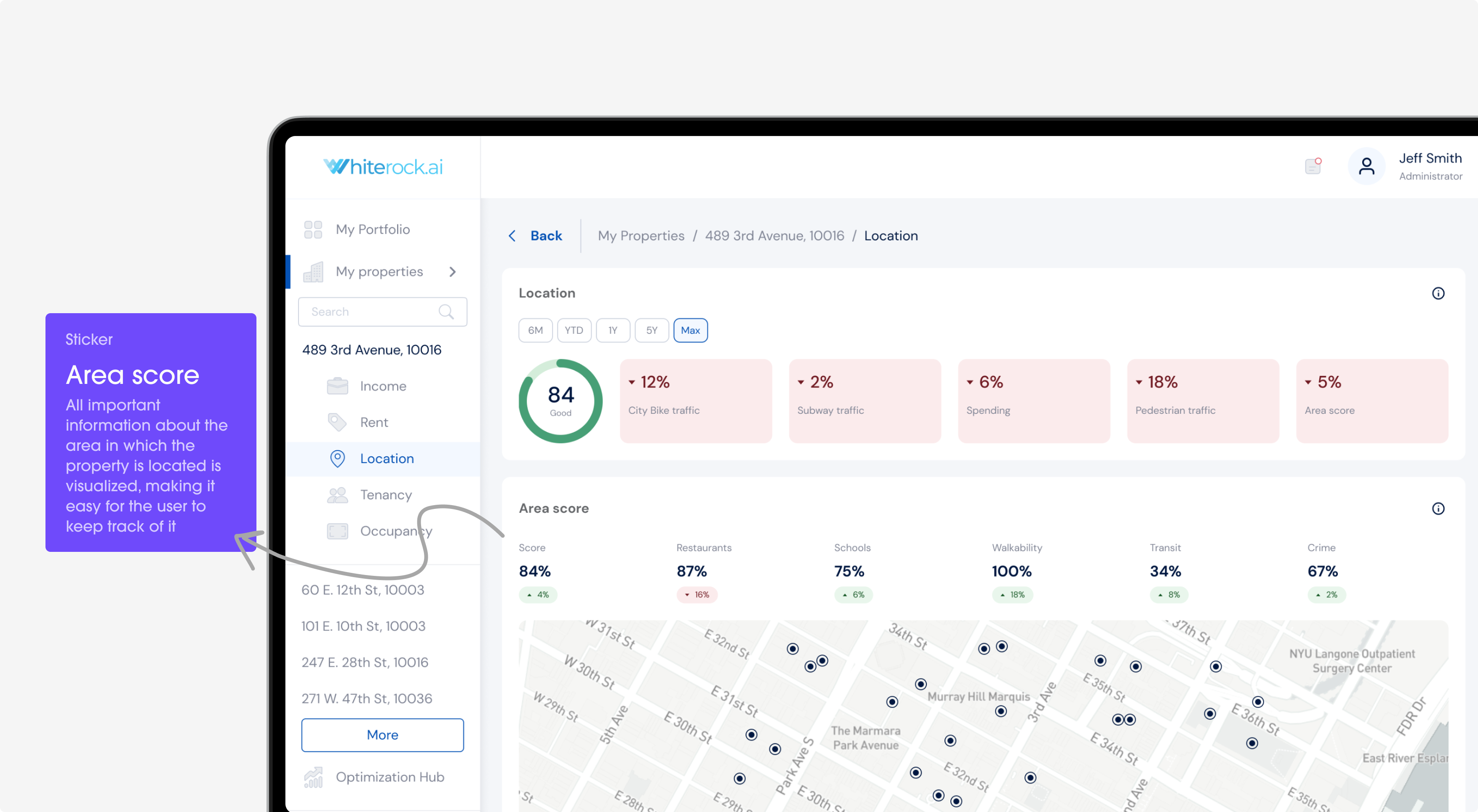
Description
Buying and selling homes can be tricky because there's so much to look at. Whiterock is like a helpful friend for property investors, lenders, and brokers. In the big world of real estate, it can be hard to find the best deals. It's simple design helps people see and understand the important stuff. This means less confusion and smarter choices when dealing with properties.
Onboarding
Problem
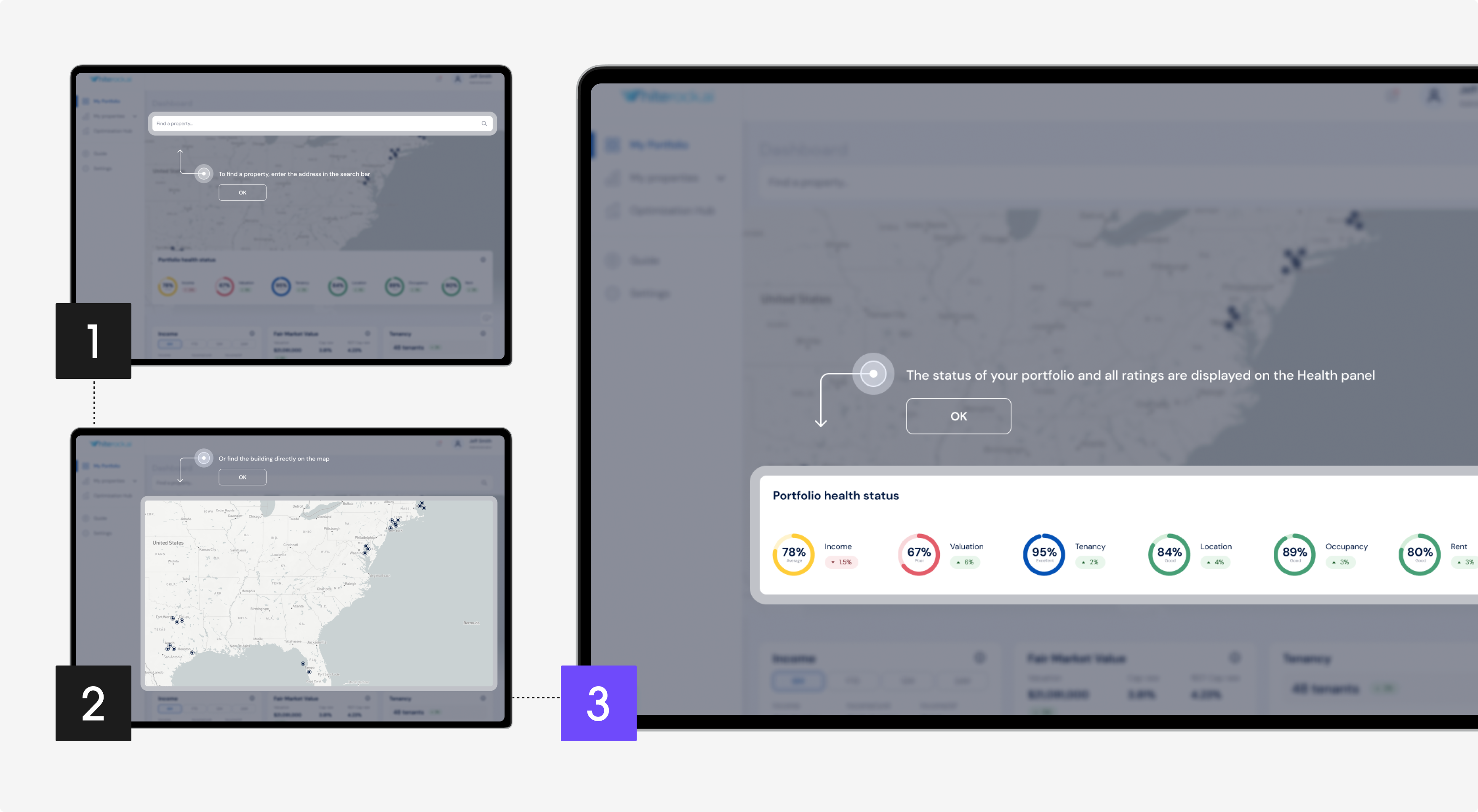
New users might find it overwhelming to start using a real estate app, unsure of where to begin or what to do. They may even give up before fully exploring its capabilities.
Solution
The onboarding offers a step-by-step introduction. The app’s primary functions are easy to use, so users feel confident and informed.
Dashboard
Problem
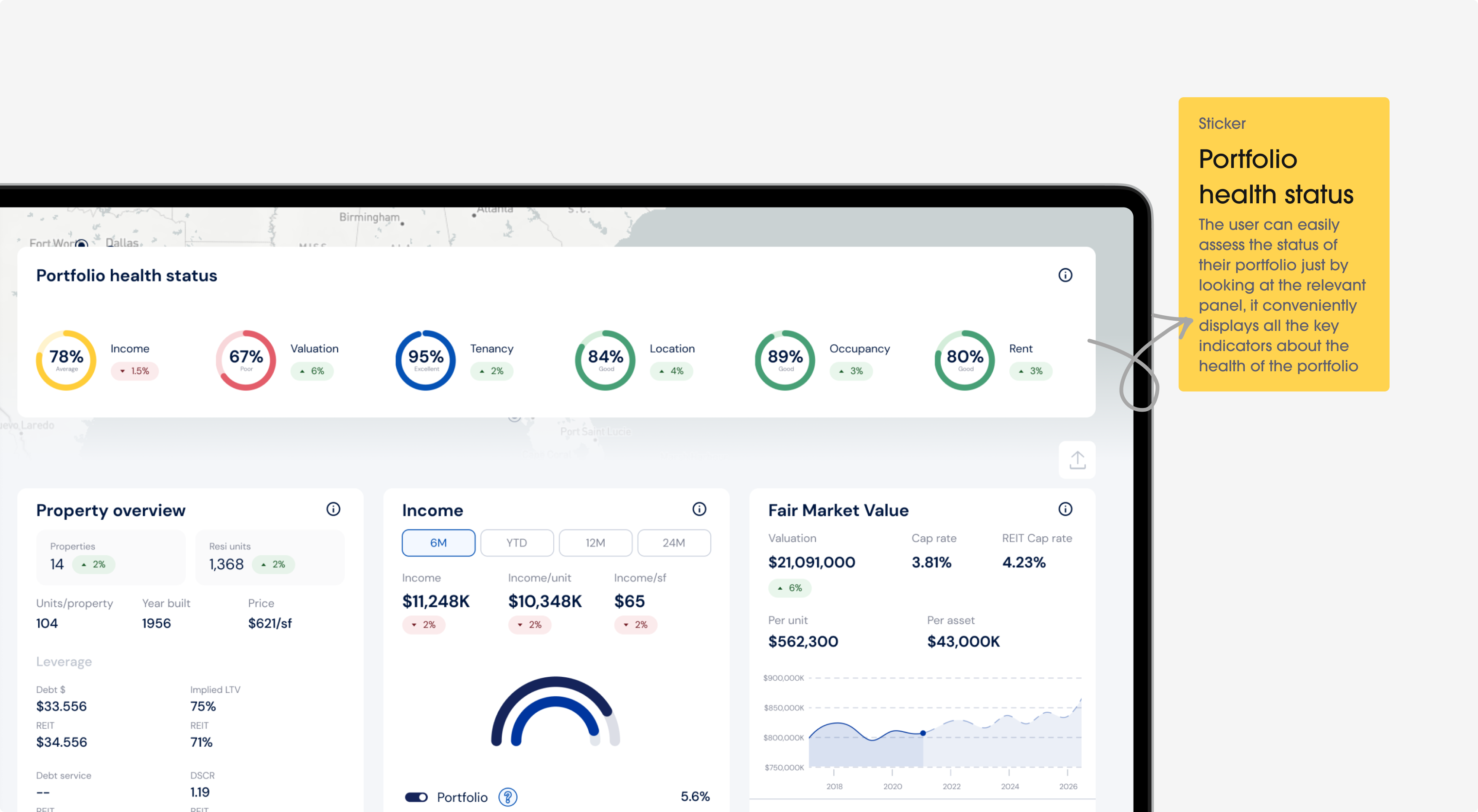
Users want a quick summary of their real estate activities, but going through lots of numbers takes time. A disjointed interface can hinder quick decision making.
Solution
The dashboard centralizes all user portfolios and vital metrics in one spot. Users can quickly understand their real estate situation, making decisions faster. This clear layout increases efficiency and reduces the risk of overlooking crucial data.
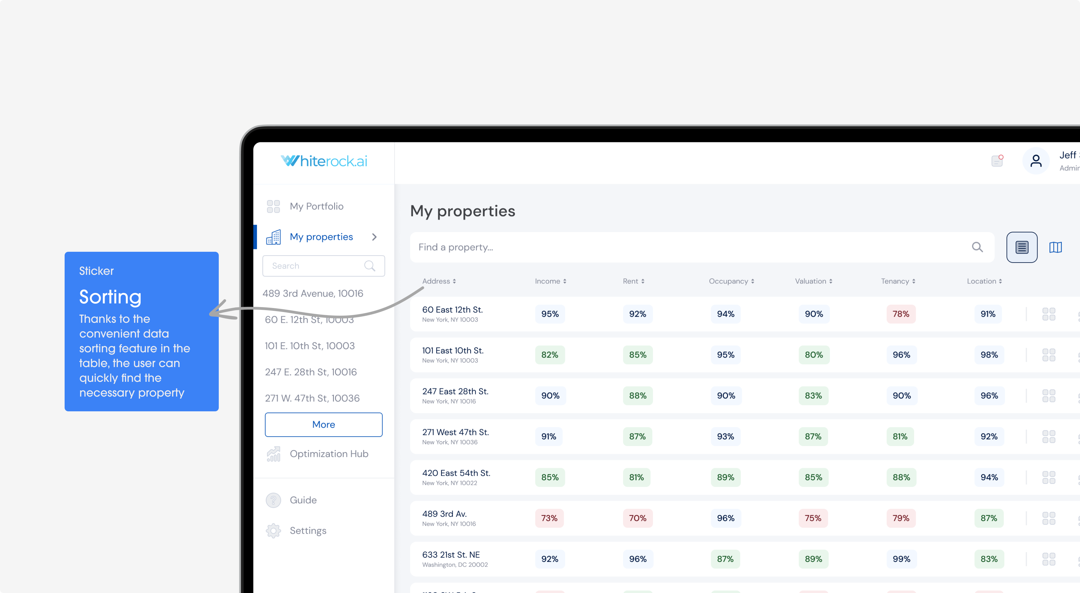
My properties
Problem
Keeping track of individual properties, with their specifics and updates, can become disorganized. Missing an update or detail can lead to missed opportunities.
Solution
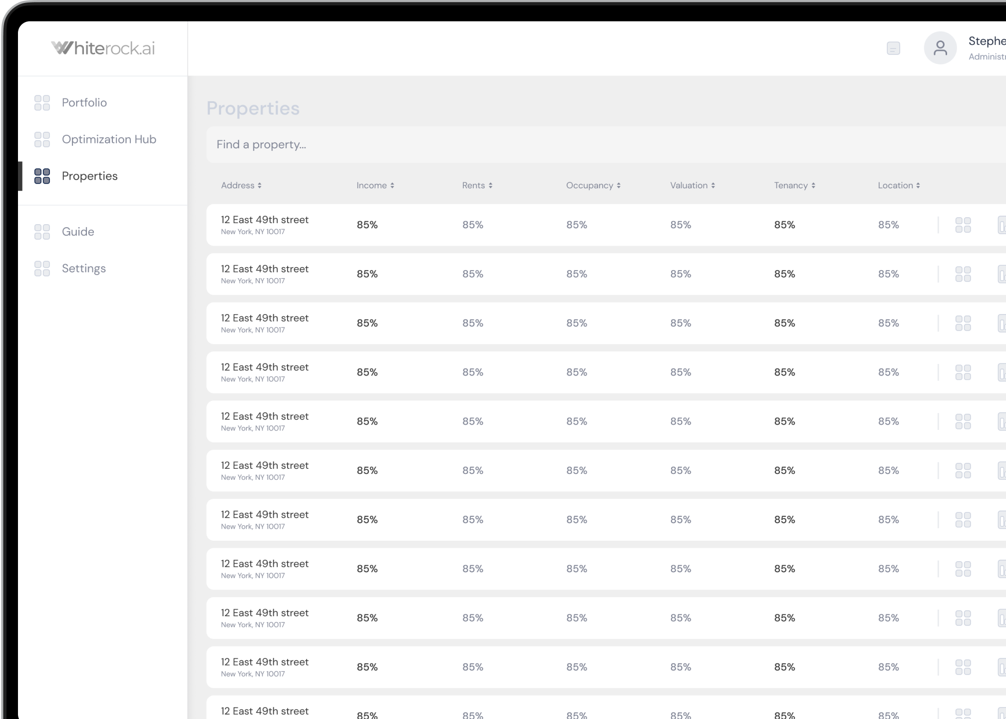
The "My Properties" section acts as a personal organizer. Users can easily see the details, status, and updates of each property, so they stay informed and manage their properties effectively.
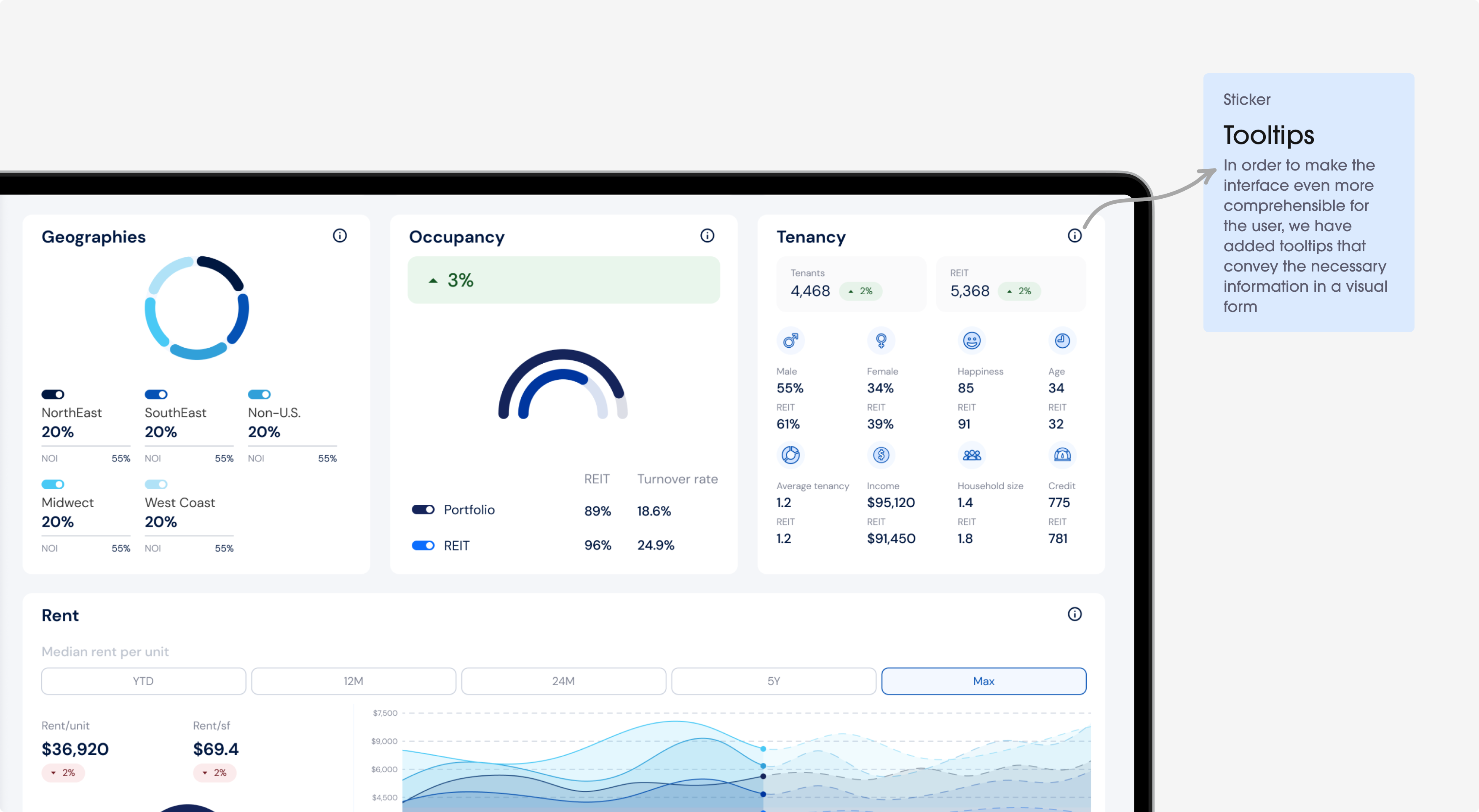
Portfolio
Problem
To manage various investments, you need a clear perspective for stability and progress. Without this, users may struggle to see the bigger picture.
Solution
Users can easily keep track of the health and diversity of their entire real estate portfolio. This bird's-eye view is essential for effective long-term planning and strategy.
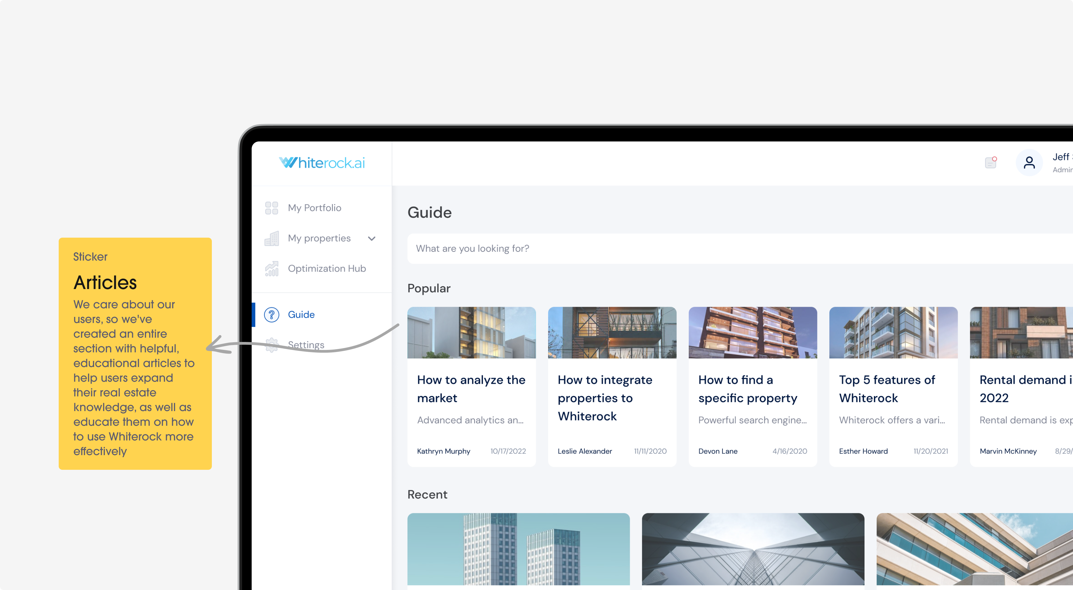
Guide
Problem
The world of real estate investment is vast, and users may need advice or information to navigate it. Making uninformed decisions can be costly.
Solution
The Guide offers valuable insights about real estate investment. No matter if you're new or experienced, you can find helpful tips and articles to make smart choices.
Technology
We used special tools to make designing the app straightforward and seamless.
MATERIAL DESIGN 2
AUTO-LAYOUTS, COMPONENT DESIGN SYSTEM, CUSTOMIZATION
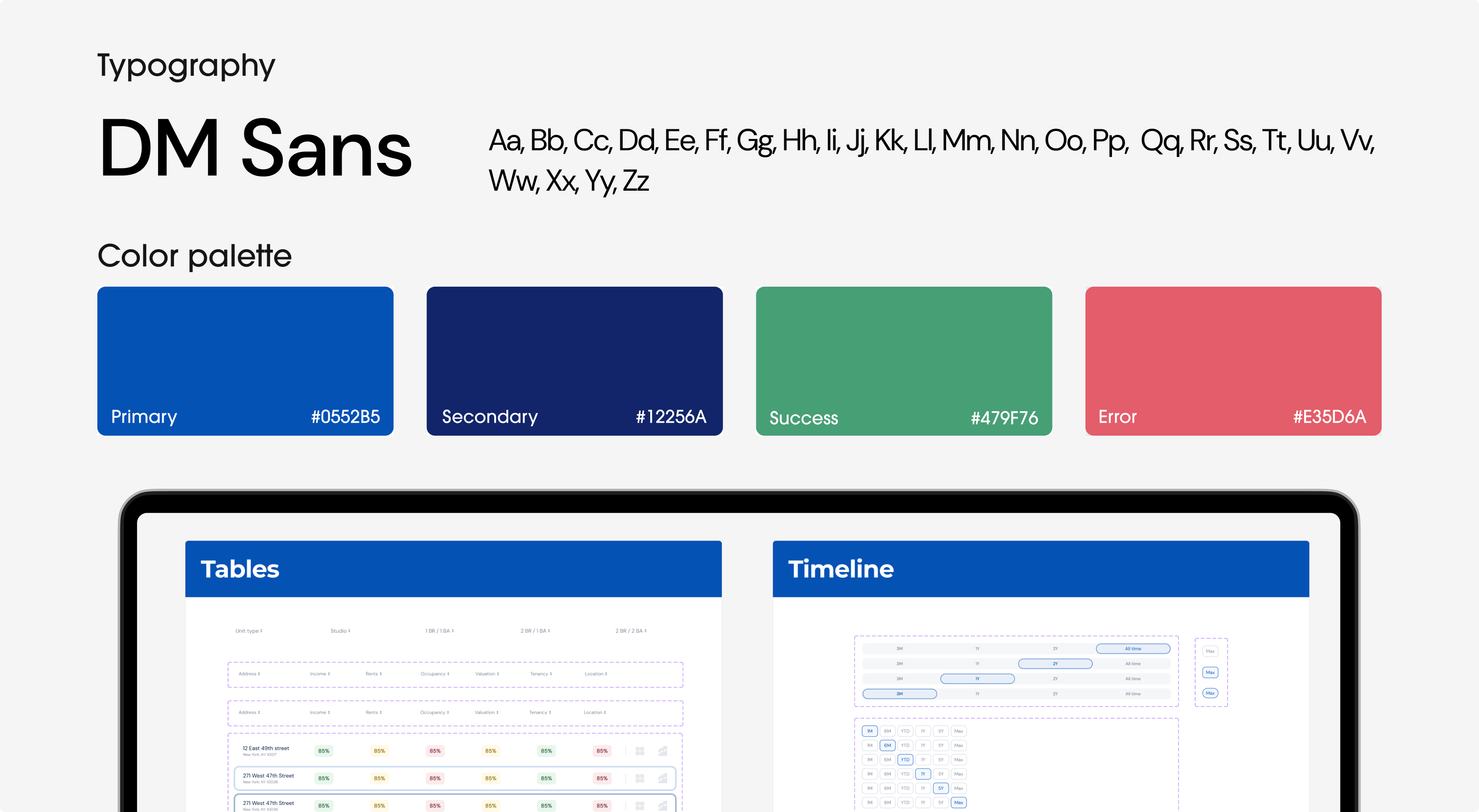
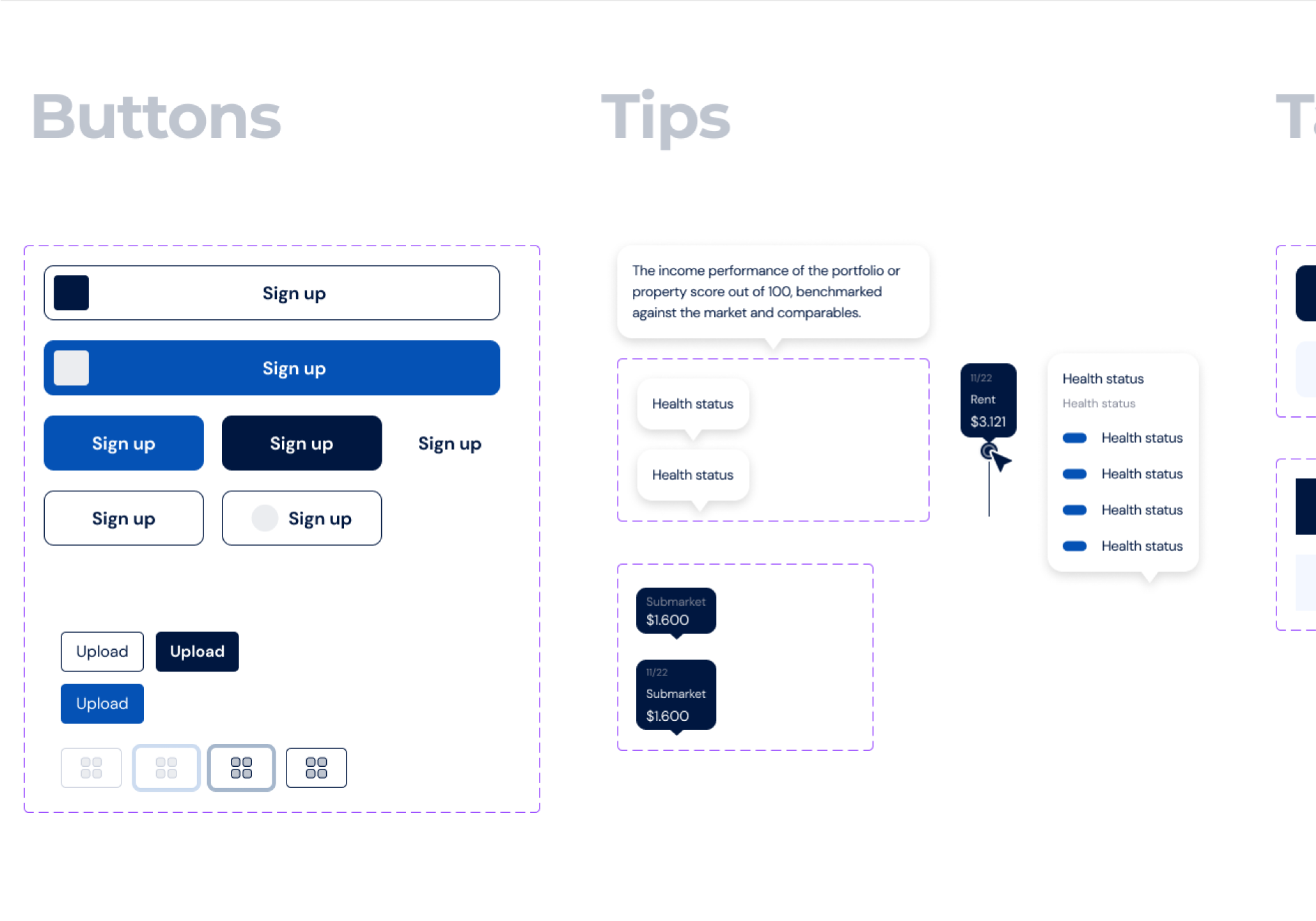
Components Library
Challenge
For Whiterock, creating a consistent and easy-to-use app was tricky. Every screen and button needed to look and feel the same, but pulling it all together was a big task.
Solution
The Components Library has all the design pieces you need in one place. This makes it easy to pick and use them, keeping the app looking neat and working smoothly.

Problem solving
The design process was all about finding the right way to make life easier for medical staff.
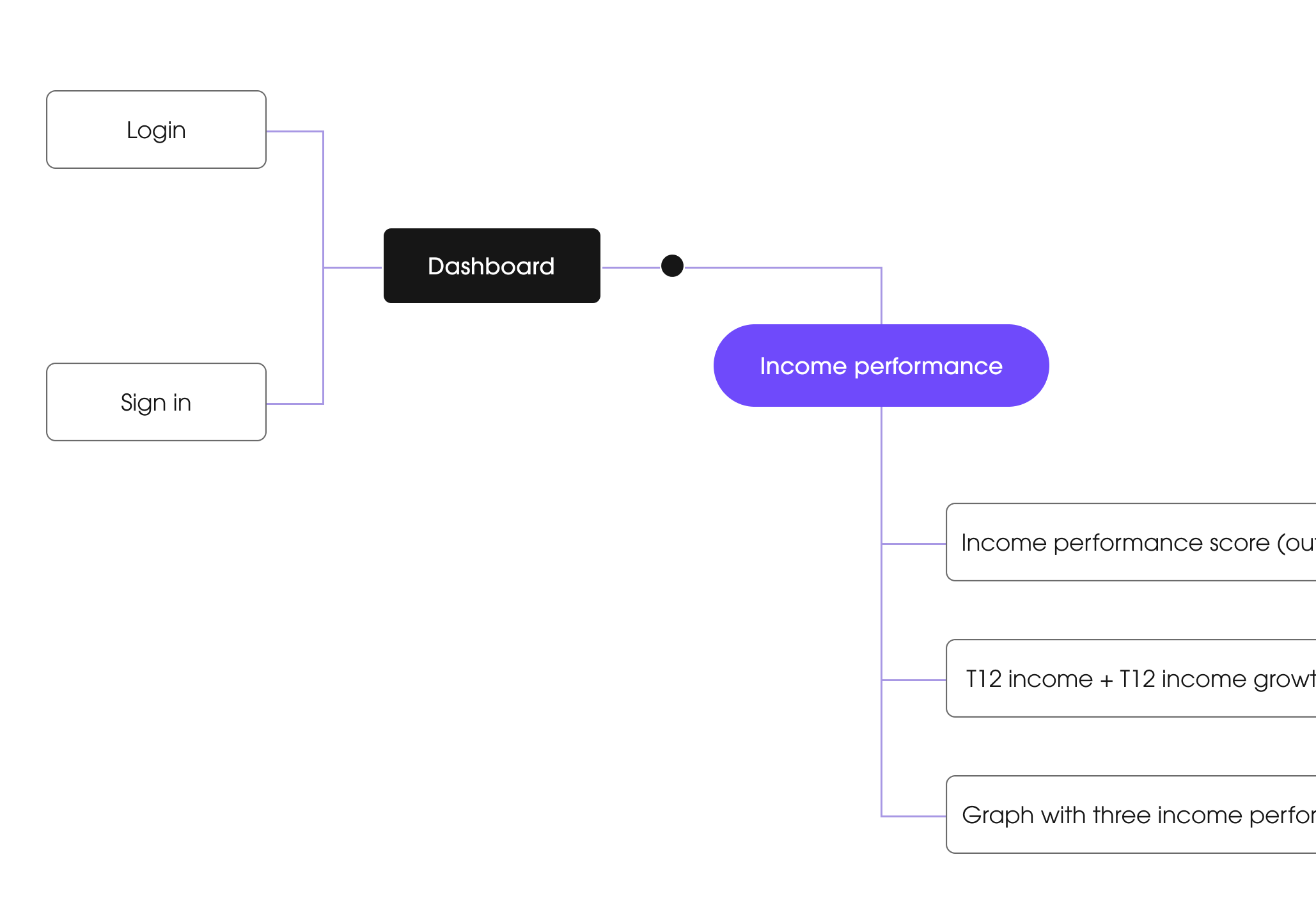
Architecture
Wireframing
Design system
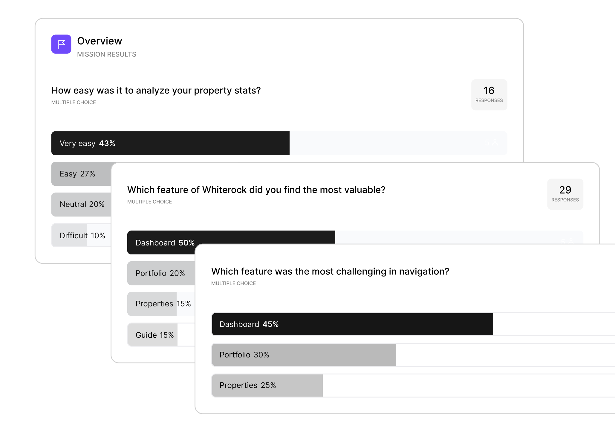
Prototype & Testing
Customer’s feedback
"We’re most impressed with Uitop’s ability to come up with a system to be able to bring design solutions."

Ready to redesign your product?
A great product is the one designed with the client’s business goals in mind!
Contact us How we use AI in our process

