How we redesigned ERP for fitness and wellness studios
AirClub is a B2B software used by famous New York gym chain that streamlines gym management operations, saving time and boosting profits.
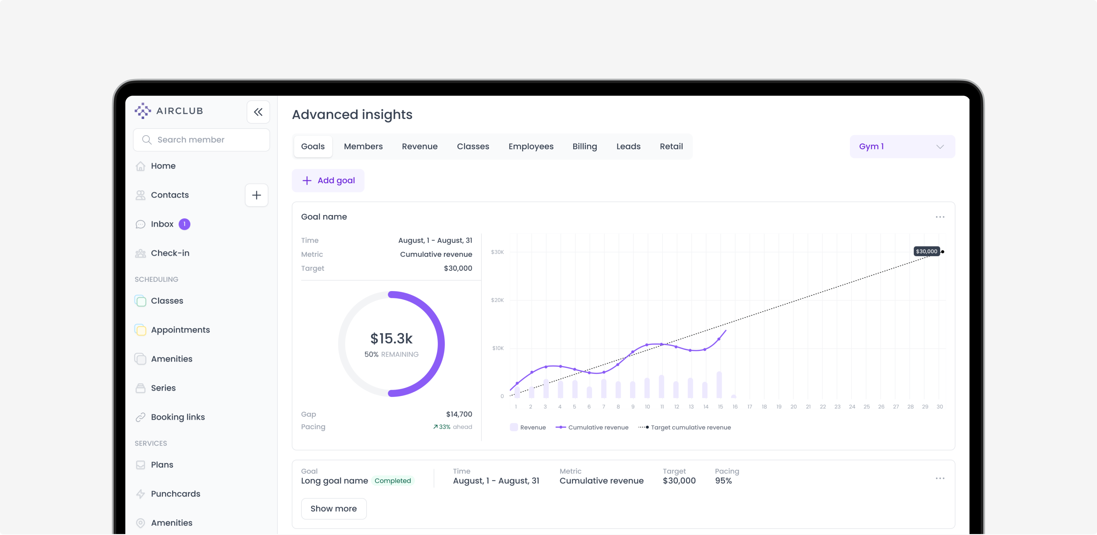
The previous UX design required excessive clicks for member details, document retrieval, payment updates, and active membership status. It made it hard to find B2B clients for the Airclub team that would be ready to pay for such a product.
Uitop has done a B2B software redesign that streamlined gym operations with simplified member management and payments, boosting efficiency and growth through enhanced analytics and improved interface.
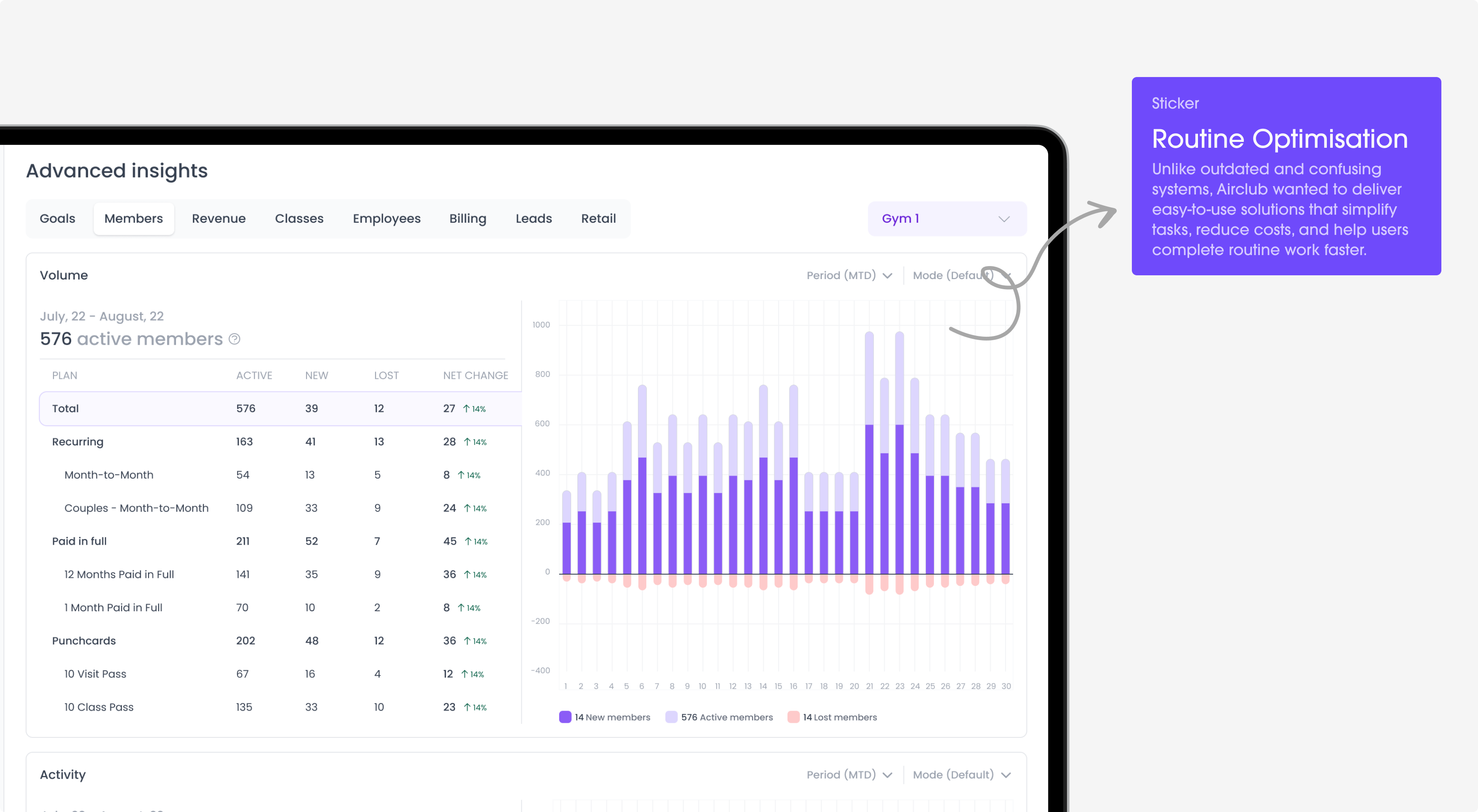
Project Brief
The Airclub is a B2B SaaS platform that transformed the fitness and wellness administrative and operational processes. It offers a seamless and efficient solution for member management, class scheduling, insights generation, leads management, and virtual content access. AirClub came to us to redesign the user experience to create modern tools to save time and increase profits for fitness businesses.
Member Management
Problem
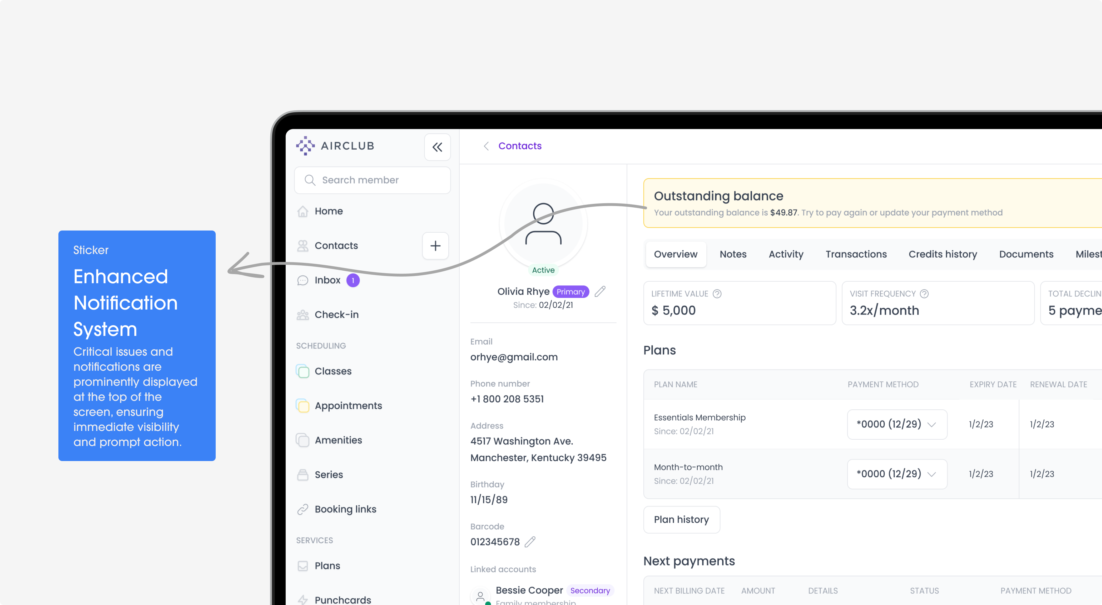
Admins faced inefficiencies with member management due to scattered data across multiple screens. Updating payment methods, viewing memberships, and accessing documents required navigating through complex, time-consuming processes, leading to frustration.
Solution
Consolidated all essential member information on a single, detailed screen. Admins can now easily update payment methods, view active memberships, and access documents with minimal clicks.
Class Scheduling
Problem
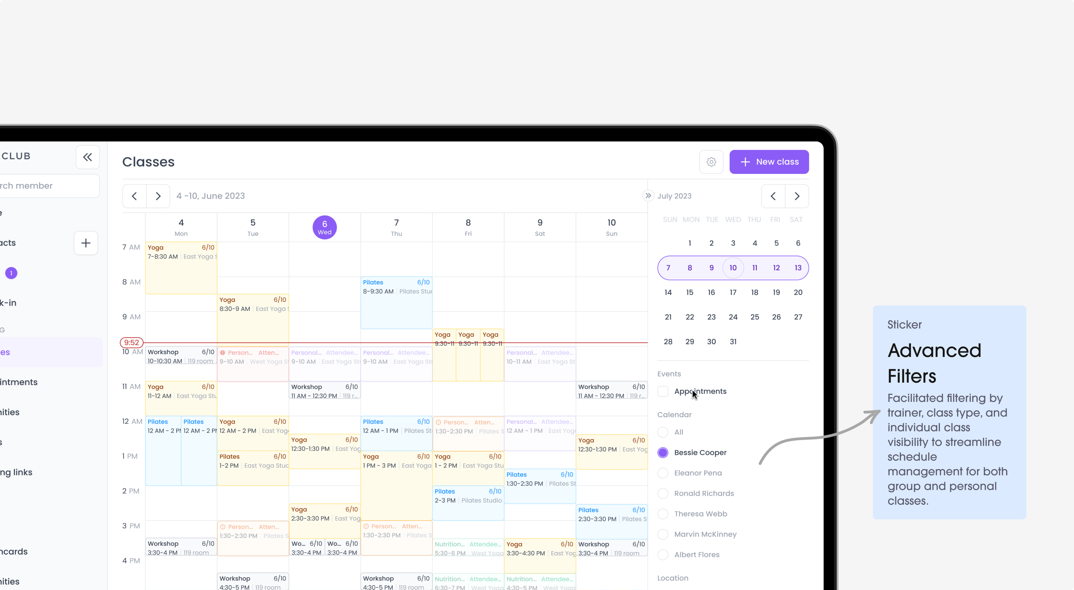
It’s difficult to manage group classes due to scattered schedules. The lack of a centralized view made planning and organizing weekly classes time-consuming and inefficient.
Solution
We created a weekly schedule page for group classes, allowing admins and coaches to view and manage planned classes efficientl
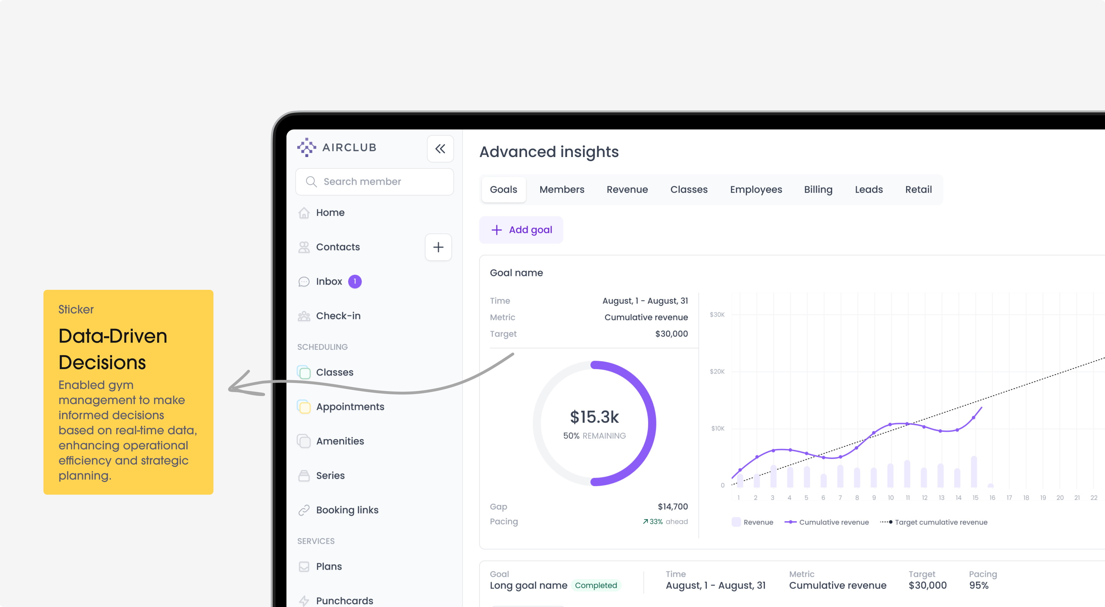
Advanced Insights
Problem
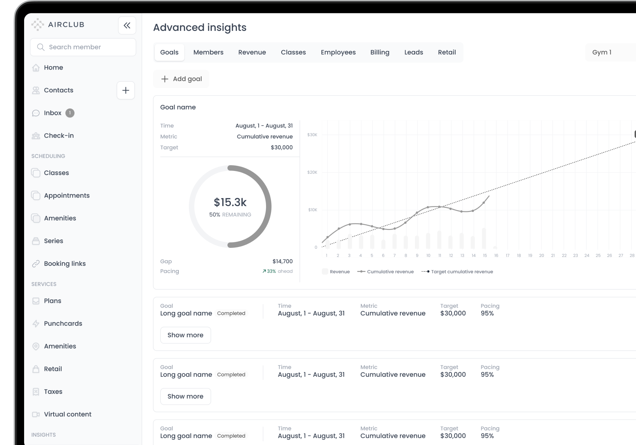
Key metrics like membership statistics, retention rates, and class attendance were scattered in most cases. This made it hard to analyze financial performance, instructor activity, and lead conversion effectively.
Solution
Uitop did a detailed analytics page to provide insights into membership statistics, retention rates, class attendance, financial performance, instructor activity, and lead conversion.
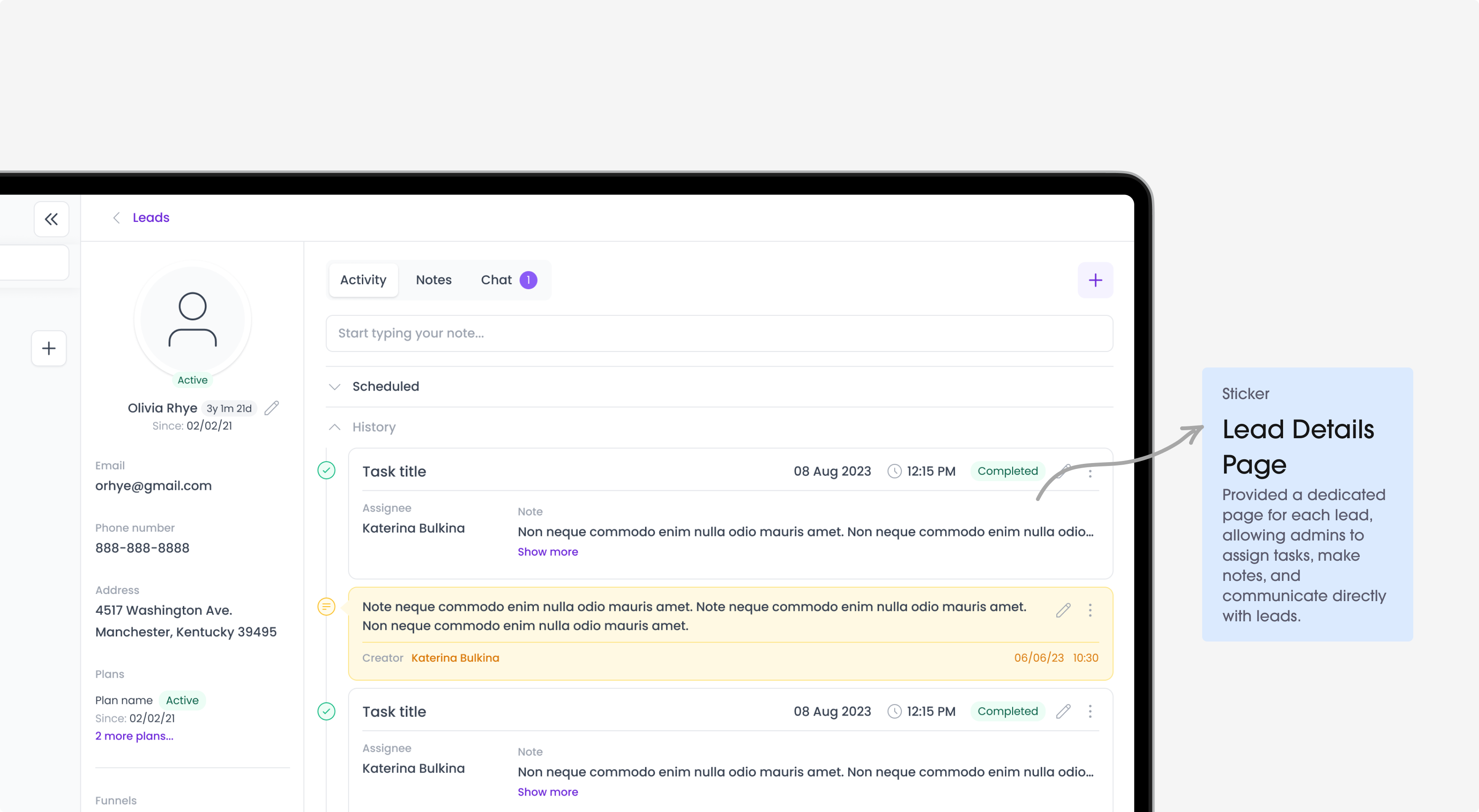
Leads Management
Problem
Tracking customer conversion and necessary follow-ups was disorganized. There was no clear system to monitor leads, making it difficult to manage and improve conversion efforts.
Solution
For this we implemented a leads funnel to track customer conversion progress and necessary follow-up actions.
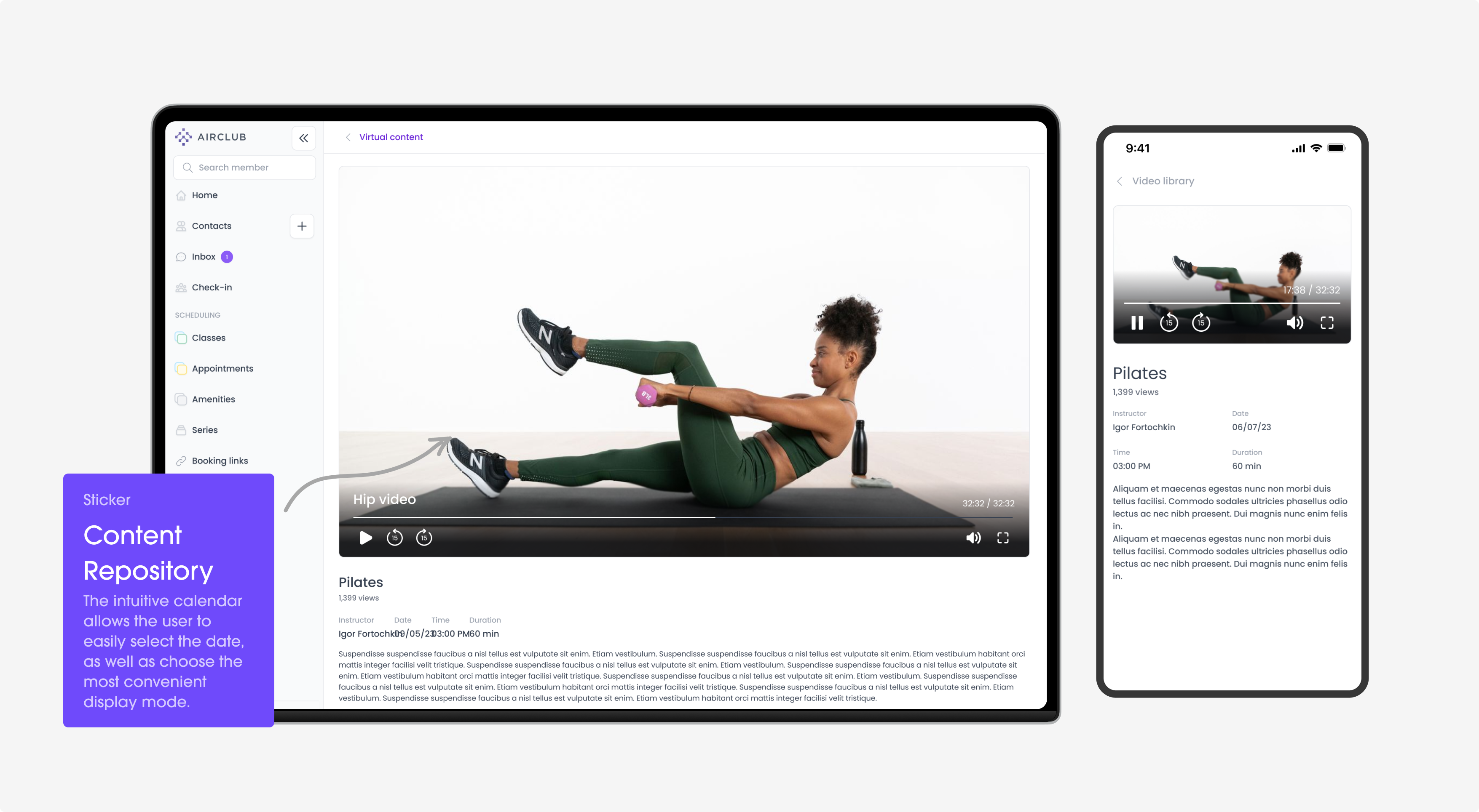
Virtual Content Access
Problem
Members had limited access to virtual content, leading to lower engagement. This hindered their overall experience and weakened their connection with the gym.
Solution
Improved member engagement by providing easy access to virtual content, enhancing their overall experience and connection with the gym.
Technology
The interface matches well with the development frameworks. This ensures that the experience is easy for users.
Material UI 3
AUTO-LAYOUTS, COMPONENT DESIGN SYSTEM, CUSTOMIZATION
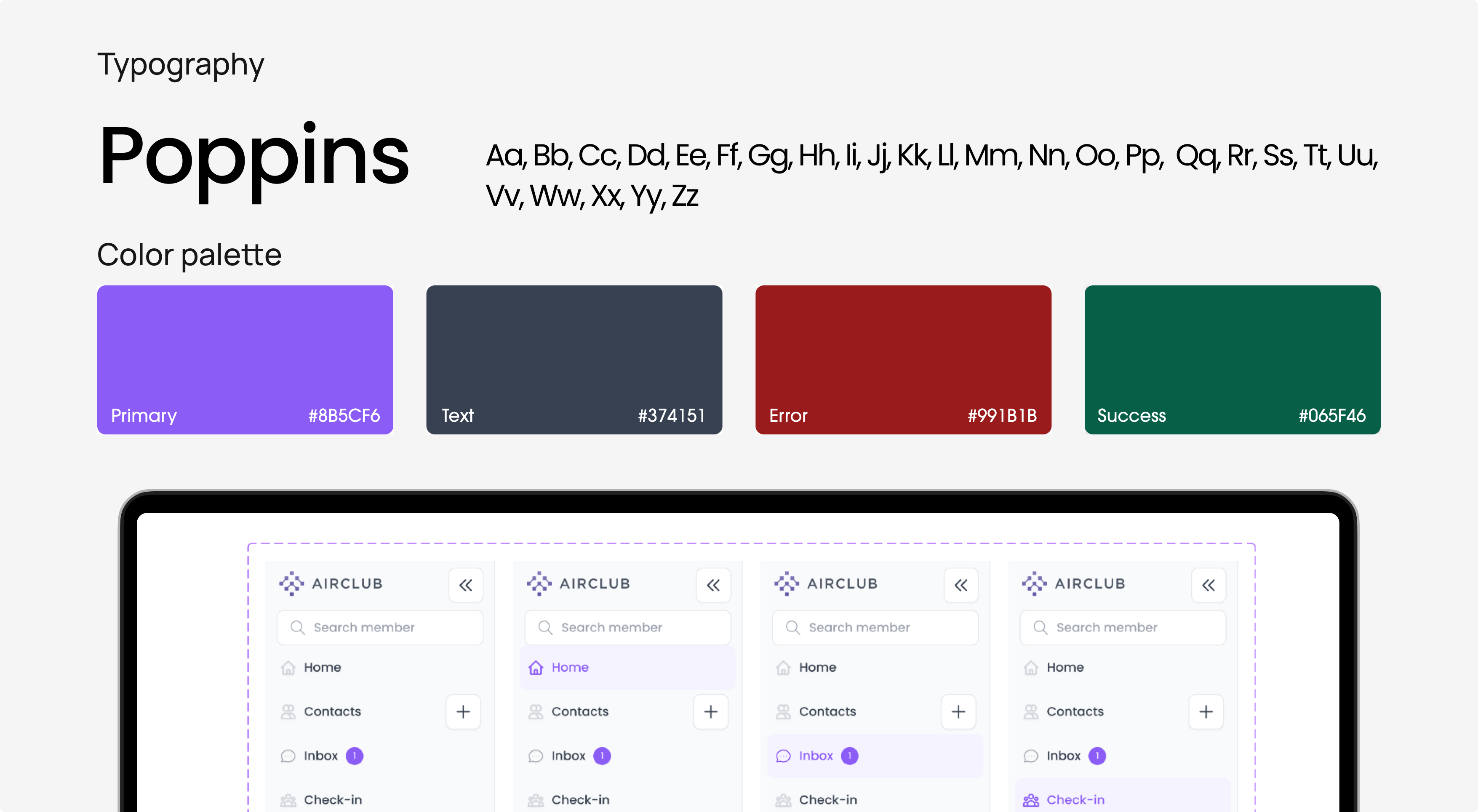
Components Library
Challenge
The platform's inconsistency made development and using the product challenging. Developers and users struggled with a cluttered interface, too many clicks for member details, unclear document access, payment updates, and membership views. Poor font hierarchy worsened navigation.
Solution
We created a unified member screen consolidating all key information into one UI Kit. This accelerated the design and development process by 27%. Users can now easily update payment methods, access documents, and see membership details, with a clear font hierarchy for better navigation.

Problem solving
The design process was a well-organized journey, planned carefully and carried out step by step to make the idea real
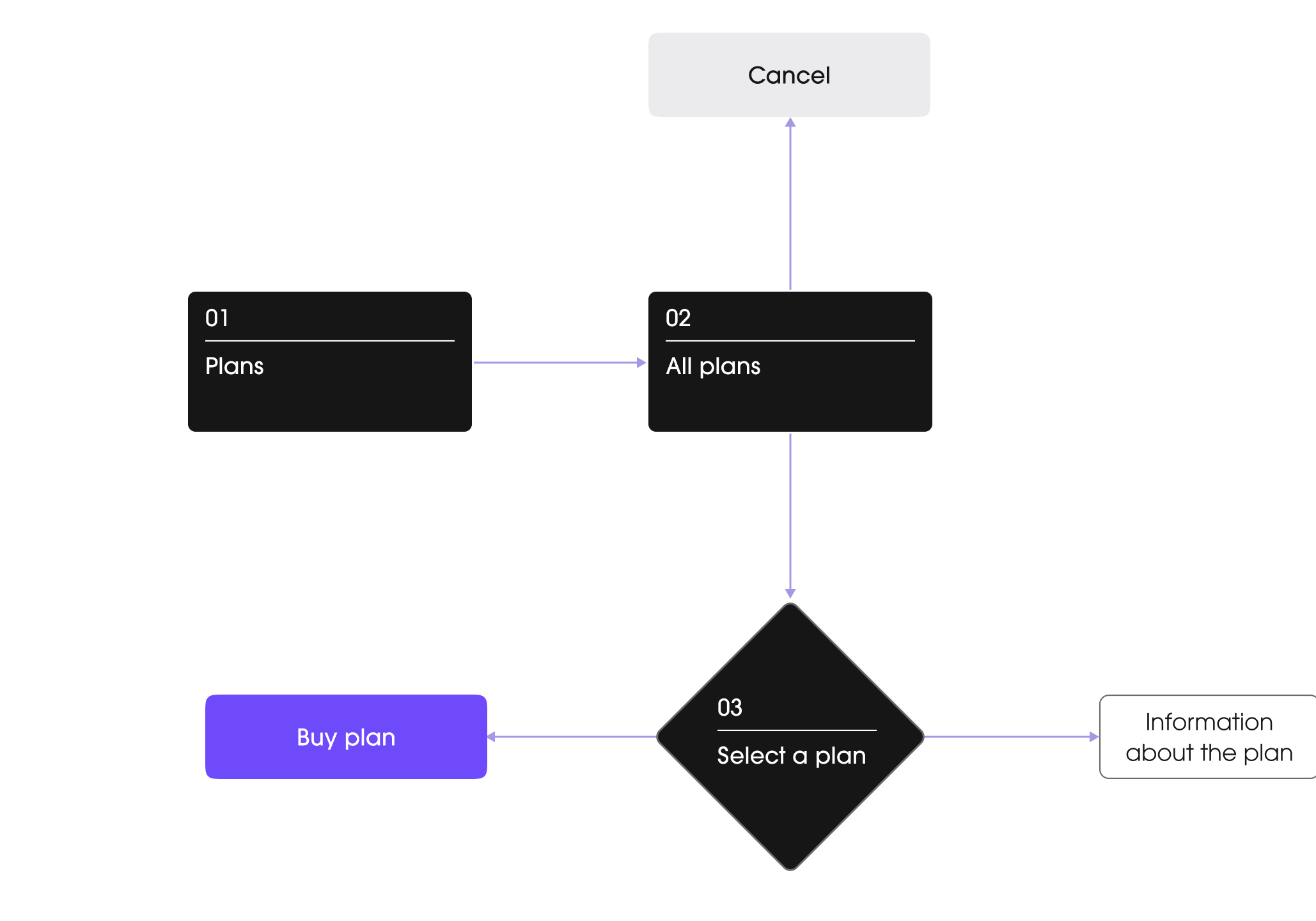
Architecture
Wireframing
Design system
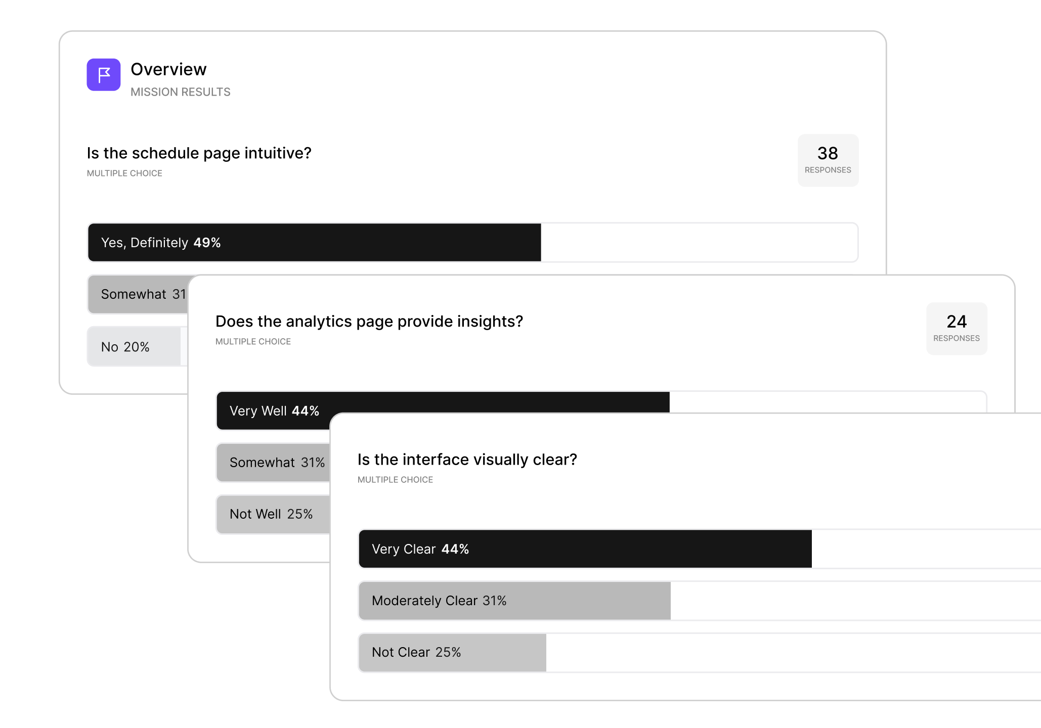
Prototype & Testing

Ready to redesign your product?
A great product is the one designed with the client’s business goals in mind!
Contact us How we use AI in our process


