How we use AI in our process
Mobile Shift & Schedule Management
Redesign for Kenjo

Kenjo is a human resources management platform that combines 12+ HR tools in one place to simplify time tracking,
scheduling, and employee management.

The original Kenjo mobile app had a complex interface that made daily HR tasks slow and hard to use for employees. This was especially challenging for businesses with remote teams, who relied heavily on mobile devices for quick daily updates. The core challenge was to redesign the mobile application into a simple, intuitive, and user-friendly platform that simplified complex HR operations on smaller screens.
With our new mobile app redesign, tracking daily tasks became much faster and simpler for employees. By simplifying navigation and cleaning up the interface, our updated design directly drove higher daily active usage and increased overall platform adoption. As a result, the redesign made Kenjo a far more efficient, practical solution that client companies rely on for managing remote teams.

Project Brief
Kenjo wanted to improve its mobile experience because the original app had a complex interface that made routine HR tasks slow and challenging for users. To solve this, we redesigned and simplified the navigation, making the entire platform clearer and more intuitive. After the redesign, users can find critical features easily and complete tasks quickly. This better experience led directly to an increase in daily active usage, showing strong adoption of the new design.

Overview
Problem
The original Overview screen was complex and difficult to navigate. Users struggled to quickly identify their daily priorities, which often led to missed deadlines, lower productivity, and unnecessary stress. The feature lacked effective task prioritization and scheduling tools, making it inconvenient for on-the-go mobile users who needed a clear view of their workday.
Solution
We redesigned the Overview screen with a clean, structured interface that gives users a clear view of their daily tasks and meetings. The app now highlights high-priority items first to prevent urgent deadlines from being missed, while a simplified calendar makes daily schedule navigation smooth. These updates helped employees stay organized throughout busy workdays.

Scheduling
Problem
Setting up work schedules in the app was complicated and slow. Users struggled to manage their work hours efficiently, which often caused scheduling conflicts and miscommunication within teams. This lack of clear coordination led to wasted time, reduced productivity, and unnecessary stress for employees trying to align their schedules.
Solution
UITOP`s team simplified the scheduling process, allowing users to set up their work hours with just a few clicks. We introduced an easy way to reorder tasks alongside clear availability indicators that show when colleagues are free to meet or collaborate. These updates helped employees plan their days efficiently and work together without confusion.

Shift Details
Problem
Kenjo's original app made it difficult for employees to clearly understand their work shifts. Users were often confused about their exact schedules and daily tasks, which led to operational mistakes, workplace miscommunication, and scheduling errors that slowed down daily operations.
Solution
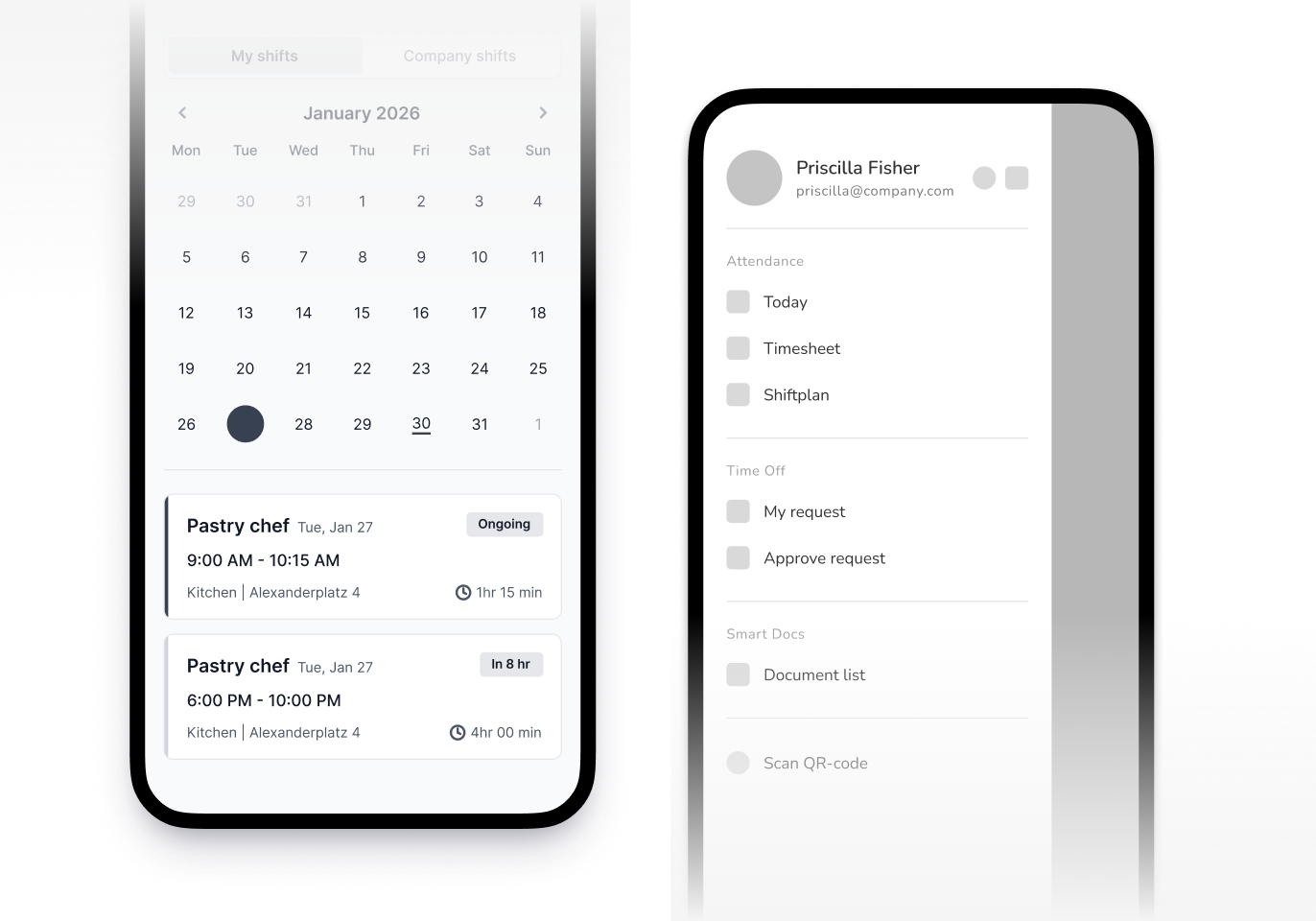
We redesigned the Shift Details feature to make schedules and assigned tasks much easier to understand. Employees can now quickly view their exact working hours and assigned tasks in a clean layout. This helps everyone stay on the same page, reduces confusion, and keeps daily operations running smoothly.

Components Library
Challenge
We faced two main challenges when creating a UI components library for Kenjo’s mobile app. First, we needed to ensure that every UI element looked and functioned with total consistency across the web app. Second, we had to establish a structured and efficient process for updating components so the app wouldn't become messy or difficult to maintain over time.
Solution
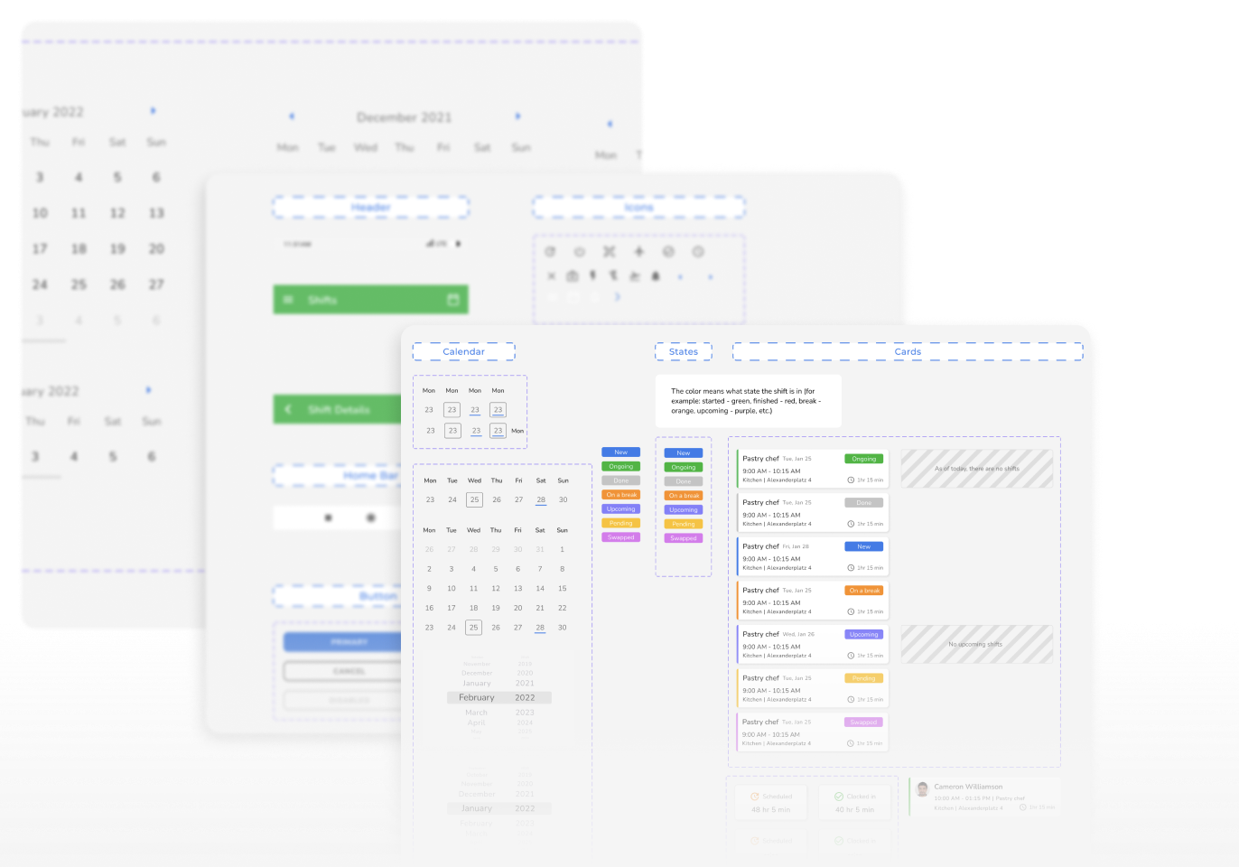
We built a scalable components library containing all essential UI elements and clear guidelines for their design and functionality. This ensured total visual consistency throughout the application. To keep the design system organized over time, we also introduced a process to regularly inspect and update these parts, preserving their appearance and functionality.

Similar cases


Problem solving
We spoke directly with users to understand their pain points and ideas, which helped us create a better platform design.
This feedback guided our decisions to solve their real daily challenges.
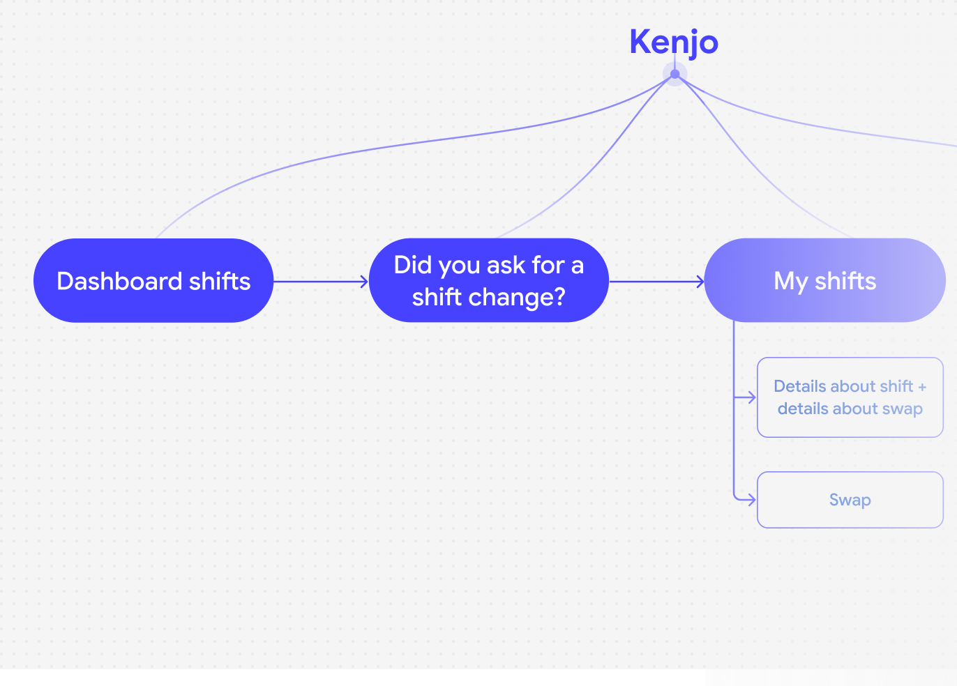
Architecture
Wireframing
Design system
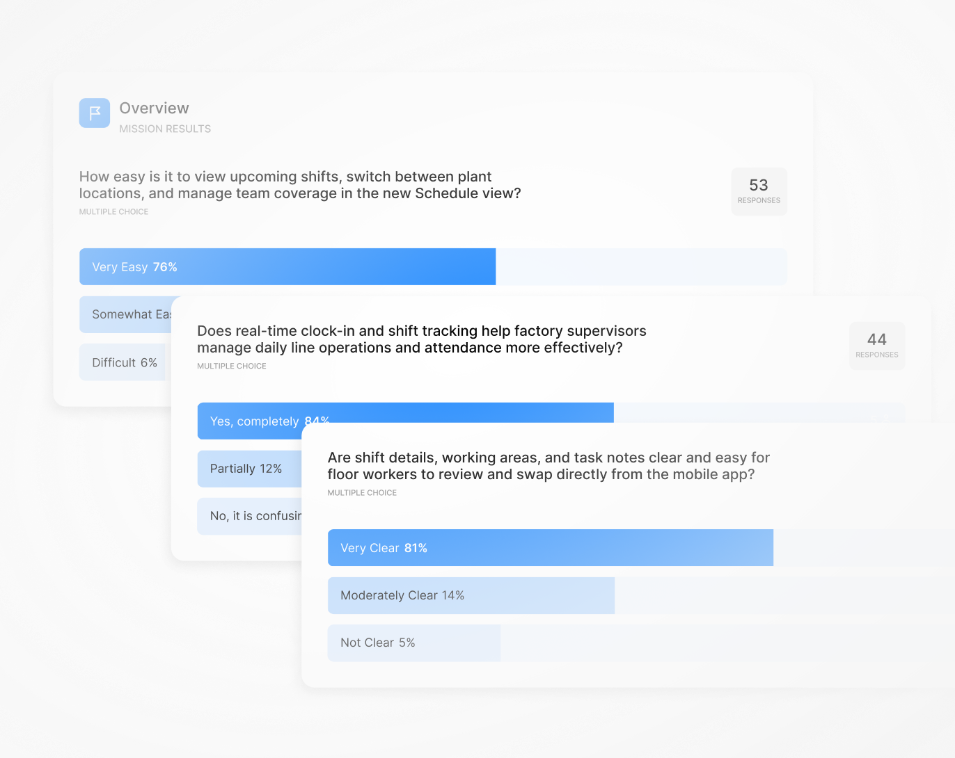
Prototype & Testing