 How we use AI in our process

Design, Product, Startup
/
Apr 13, 2026

Successful SaaS products use well-proven solutions that have already been tested on many platforms and across industries. Such solutions are often referred to as SaaS UX patterns - interaction models that can be reused to help users comprehend complex systems more quickly and interact with them in a more streamlined way.
However, usability goes beyond the look and feel of a product. It’s actually critical to the activation, engagement, and retention of a product. When a user can quickly understand how a product works, they get to the value of the product faster. When a product’s navigation is logical and consistent, they’ll be comfortable using the product as it becomes more and more complex.
That is why SaaS UX design patterns play such an important role in high-performing digital products. They create a structure that allows teams to scale features without breaking usability. Instead of forcing users to relearn interfaces with every update, patterns establish familiar behaviors that remain stable over time.
In this article, we’ll explore the best UX patterns used in successful SaaS platforms. We'll look at onboarding strategies that drive activation, dashboard organization that makes decision-making easy, navigation systems that can accommodate large systems, and interaction models that make the experience seamless as the product scales. We'll focus on the practical: these are patterns that actual SaaS teams use to build successful products.


Get started
Our SaaS design services focus on usability, scalability, and business outcomes
Contact usWhen discussing SaaS product software, patterns are considered to be structural solutions that help manage complex interactions and create predictable behaviors.
As software evolves, it is inevitable that its user interface will become more complex. New features will be added, and more users will have varying levels of access. Without patterns, the user interface will become disorganized. Buttons will behave differently on every page, and users will spend more time trying to understand the software than using it.
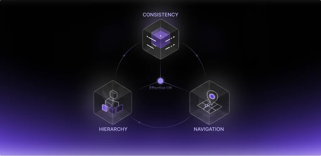
UX patterns for SaaS solve this problem by introducing consistency and hierarchy into the interface. When users recognize familiar structures - navigation layouts, data blocks, action panels - they can predict how new parts of the product will behave.
This predictability significantly reduces cognitive load. Users no longer need to analyze each screen individually; instead, they rely on mental models built from previous interactions. Over time, this leads to faster workflows and fewer errors.
Another reason patterns matter is scalability. A platform that starts with a handful of features may evolve into a large ecosystem with multiple modules, integrations, and automation tools. If the product’s UX foundation is built on solid patterns, new capabilities can be added without disrupting the overall structure.
Patterns also influence navigation clarity. When menus, sidebars, and contextual panels follow a consistent logic, users can easily move between sections of the system. This becomes especially important in enterprise environments where teams depend on the platform daily.
Finally, patterns help teams maintain product growth. Designers and developers no longer need to reinvent solutions for common problems. Instead, they rely on established design patterns that already support usability, guidance, and feedback mechanisms.
In short, SaaS design patterns create a reliable framework for complex products. They ensure that as a SaaS platform evolves, its usability remains stable and intuitive.
One of the biggest challenges facing SaaS products is the first user experience. That is why the first user experience is one of the most significant areas where SaaS UX design patterns make a real difference.
High-performing SaaS products typically rely on structured onboarding approaches. One of the most common patterns is the use of a progressive setup. In most cases, the application starts by asking the user to perform the most critical tasks. Later, the application asks the user to perform other tasks when they are necessary. This reduces the friction experienced by the new user and increases the speed of activation.
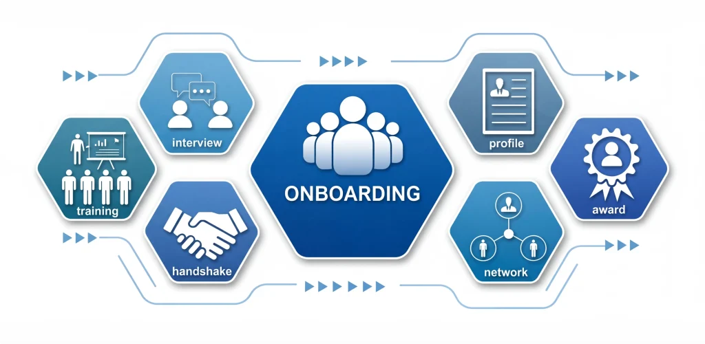
Another common pattern in application onboarding is the use of checklists. A checklist provides the new user with information about the most critical tasks to perform before they can use the application. These tasks are performed one by one, and each task brings the new user closer to the desired outcome. This pattern works well because it simplifies the application into a list of tasks.
Contextual guidance is another powerful onboarding pattern. Instead of showing long instructions at the start, the interface provides tips exactly when users encounter a new feature. These micro-guides appear near the relevant element and disappear once the action is completed.

This philosophy reflects one of the most effective SaaS UX patterns: users should reach the product’s main benefit as quickly as possible. The sooner they experience value, the more likely they are to continue using the platform.
Effective patterns for strong onboarding include guidance, feedback, and progress indicators. When users perceive movement and progression step by step, they will naturally activate their accounts.
Dashboards are the control center of most SaaS applications. A dashboard combines a lot of information in a manner that enables decisions to be made quickly.
Without good design patterns, dashboards can be a messy collection of charts and numbers. Users struggle to identify what matters and where to focus their attention. High-performing SaaS platforms solve this by applying several best UX patterns for dashboard design.
One of the most significant ones is the use of visual hierarchy. The interface has to emphasize the most critical ones in a significant manner.
Another aspect is data grouping. Unlike having multiple widgets of unrelated data, dashboards group related data together. Each group of data focuses on a specific part of the workflow, making it easier to comprehend.
Another feature of a dashboard is actionable blocks. Unlike other visual tools, a dashboard should not only show users data but also help them act on it. A strong example of these principles in practice can be seen in the Booktelligence analytics platform, one of our projects.
Our team at UITOP worked on the development of an advanced analytics dashboard for the Bookintelligence platform, designed to bring a wide range of performance metrics together in one convenient workspace. Instead of forcing users to navigate through multiple reports and external tools, the platform allows publishers to access the most important data from a single interface. The goal was to make it easier to track sales performance, analyze reader feedback, and observe market trends without unnecessary complexity.

A key part of the project was the creation of a custom data prioritization system. This logic helps highlight the most relevant insights first, allowing users to quickly focus on information that actually affects their decisions. As a result, publishers can easily monitor changes in audience sentiment, evaluate the performance of different publications, and understand how their content compares with competitors.
The visual interface was built using a scalable component library based on Material Design principles. This approach ensures visual consistency across the entire system and makes it easier to expand the product in the future. As new features are introduced, the interface can grow without losing its clarity or usability.
Behind the scenes, the backend architecture was structured around real-time benchmarking capabilities. This allows users to instantly compare their performance indicators with market competitors. Instead of relying on outdated reports, publishers can see how their publications are performing at the current moment and react quickly to changes in the market.
Because the system processes large volumes of information, we paid special attention to the way data is displayed. Our design team focused on creating high-density information layouts that present complex datasets in a clear and readable format. Through carefully structured charts, summaries, and visual indicators, even large amounts of data can be interpreted quickly without overwhelming the user.
Another important element of the platform is a centralized feedback engine. It gathers reader reviews and comments from multiple sources and combines them into a single overview. This feature gives publishers a clearer picture of how audiences respond to their content, eliminating the need to manually collect feedback from different platforms.
The final result demonstrates how thoughtful dashboard design can significantly improve usability while also increasing engagement with the platform.
Key outcomes of the project include:
Together, these improvements created a powerful analytical environment where publishers can easily explore data, identify trends, and make informed decisions based on clear and accessible insights. This case illustrates how structured dashboard patterns transform complex analytics into actionable insights.
It is easy to overlook empty states, but they are very important for user guidance.
If a user sees an empty screen, they will most likely be confused. If there is no data on a dashboard or if a list is empty, people will think that something is wrong. The right empty states will turn these into guidance and feedback.
Instead of showing an empty page, the application will inform the user why it is empty and what to do next. This will greatly improve user onboarding.
For instance, a project management application will show a picture and a description, and then a button that will encourage the user to create a new project. This will greatly help user onboarding.
Another feature is contextual feedback. When a user does something, such as uploading files, integrating, and adding team members, it is important to immediately inform them.
These feedback messages, progress indicators, and animations give the user the sense of assurance that the system is indeed reacting to the inputs provided. In complex SaaS systems, these are vital to the user's sense of trust and comprehension of the system.
Empty states combined with smart navigation patterns also give the user an idea of the system's structure. It directs them to meaningful interactions.
Multiple users often work in groups, and various departments of an organization interact with each other. This is where access patterns based on roles become important.
Instead of providing each and every user of a system with similar access rights, access rights are provided based on specific roles defined in the system. Administrators can have access rights to manage system settings, managers can have access rights to manage workflow, and contributors can have access rights to contribute to operations.
This helps in maintaining security as well as simplicity in using the interface.
Role-based logic is especially important in enterprise systems such as SCM software, where supply chain platforms must coordinate multiple teams, vendors, and logistics processes within a single environment.
Clear permission hierarchies guarantee that critical operations continue to be locked down, but workflows continue to be accessible. This is what makes large organizations feel comfortable using SaaS platforms.
Permission patterns can be used for scalability. New features can be easily added to existing role sets as they become available.
One of the biggest issues in SaaS applications is navigation. With new modules being added, the interface has to look organized and logical at all times.
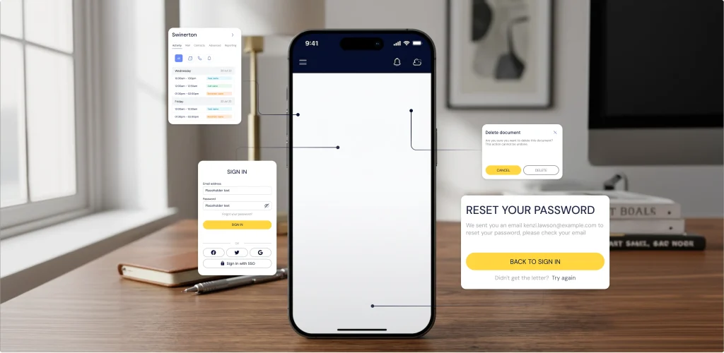
One of the most effective UX patterns for SaaS navigation is the sidebar structure. A sidebar pattern enables the user to navigate between different parts of the application quickly while remaining aware of their position in the application at all times.
Another pattern that is often used in SaaS application navigation is the use of layered menus. This pattern groups different features of the application into categories, thus preventing the navigation from becoming overwhelming for the end user.
The use of contextual navigation is another important aspect of SaaS application navigation. This prevents the end user from having to go back to the main menu to navigate to another part of the application.
A good example of scalable navigation patterns can be seen in the Slabstack ERP platform.
Our team at UITOP designed Slabstack, a module-based ERP system that provides users with access to different areas of operation, such as CRM, production management, and project management, through a unified navigation menu. Each module has been considered as an interrelated system, providing a smooth flow of data through the system.

A custom design system ensures visual consistency even as new features are added. Advanced state management keeps the application responsive when users move between complex modules.
The interface is also designed with a high-density layout for an overall overview of various projects at once. Integrating the backend allows for real-time resource allocation and task delegation, making complex management processes easier and more streamlined.
The platform achieved strong usability metrics shortly after launch:
These results demonstrate how thoughtful navigation patterns support both scalability and productivity.
For early-stage products, implementing such patterns often begins with strong startup UX design, where navigation structures are planned with long-term product growth in mind.
Early versions of a platform may only include a few core features. But over time, integrations, automation tools, and analytics modules appear. Without careful planning, the interface becomes cluttered.
Progressive disclosure is a pattern designed to address this issue.
Instead of exposing every feature immediately, the interface reveals advanced capabilities only when they become relevant. Basic workflows remain simple, while experienced users can gradually access more powerful tools.
This pattern works particularly well in systems that serve different levels of expertise. Beginners see a streamlined interface, while advanced users can explore deeper functionality.
Another important pattern is modular feature scaling. Instead of placing every function inside a single interface, SaaS platforms divide functionality into modules that can expand independently.
Together, these patterns ensure that the product remains flexible even as it grows.
Patterns only function properly if they are applied consistently.
If a design team implements a set of patterns and then fails to maintain them, the interface will become disjointed and fractured. Consistency is a multiplier for usability. If users encounter similar actions and they follow similar patterns, they will pick things up more quickly and use the system more confidently.
This is especially true for large SaaS systems, where features are constantly being added. Consistent patterns help these features feel like they are part of the natural product rather than isolated features.
Design systems are often critical in maintaining these consistencies. They provide a framework of reusable components and structures that guide the development process.
When applied systematically, SaaS UX patterns reduce cognitive load and help teams scale products without sacrificing usability.
To use a pattern effectively, you need to consider the product and its users. Here’s the framework we rely on for evaluating a pattern:
Many teams evaluate these factors during a UX redesign strategy, ensuring that design decisions align with both usability and product growth.
The guiding principle is: patterns should act as a scalable framework for the product, reducing cognitive load while maintaining long-term flexibility.
What we deliver
We design user experiences that reduce friction and support real business goals
Contact usUX patterns help a SaaS product grow without compromising UX. When implemented well, SaaS UX patterns give a complex system a framework. They help users navigate a system and make it easier to add features.
But patterns only work if they are aligned with the overall product strategy. A pattern that works like a dream for one product will not work for another if the context is different.
The best SaaS products use patterns as a starting point. They use them and make them their own, adapting them to their own needs and workflows while keeping them consistent.
Ultimately, great SaaS UX is about applying patterns in the right places to create a system that is clear, flexible, and scalable.
SaaS UX patterns are solutions for common SaaS product usability issues. They include onboarding patterns, dashboard patterns, navigation patterns, and interaction patterns, which help users easily understand complex systems.
SaaS UX patterns help users achieve meaningful actions by providing solutions for common SaaS product usability issues. For instance, onboarding patterns help users easily understand complex systems and achieve meaningful actions, thus improving activation.
Yes, startups should follow the best UX patterns. Startups will benefit from using patterns as they will help in minimizing risks and speeding up development. However, patterns should be adjusted according to the product-specific workflow.
Patterns give a structure for adding more features as they help in creating a structure for navigation, dashboard, and workflow. Adding more features is made easier by SaaS UX patterns as they help in maintaining a uniform interface.

