Documents Platform for Architects
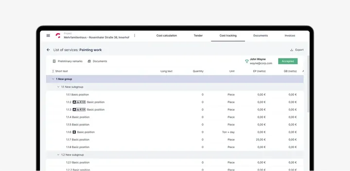
Project details
- Industry
- Architecture and engineering
- Product type
- B2B web platform for documents and project costs
- Market
- B2B
- Services
- UX/UI design, user testing, component design system
- Timeline
- 1 month to launch
- Team
- Budget
- Results
- Ease of use score: 92
- 93% user retention
- 41 screens designed
Challenge
UITOP’s Solution
Project Brief
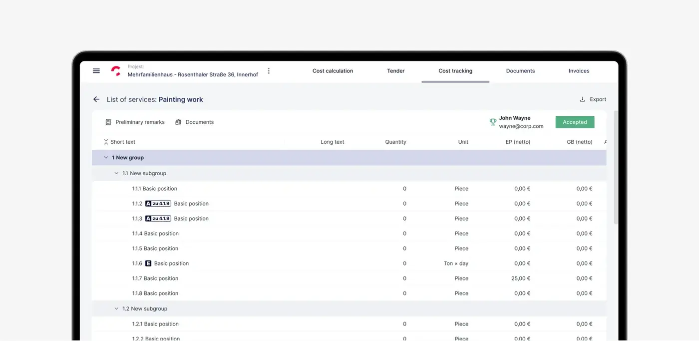
Compa focused on simplifying the complexities faced by architectural and engineering firms. We made the design more focused on users. We fixed important problems like managing project costs and doing repetitive tasks. So things became more efficient and profitable. With a lot of testing and designing, we make the interface better. Now interface saves time on administrative tasks and helps with making decisions.
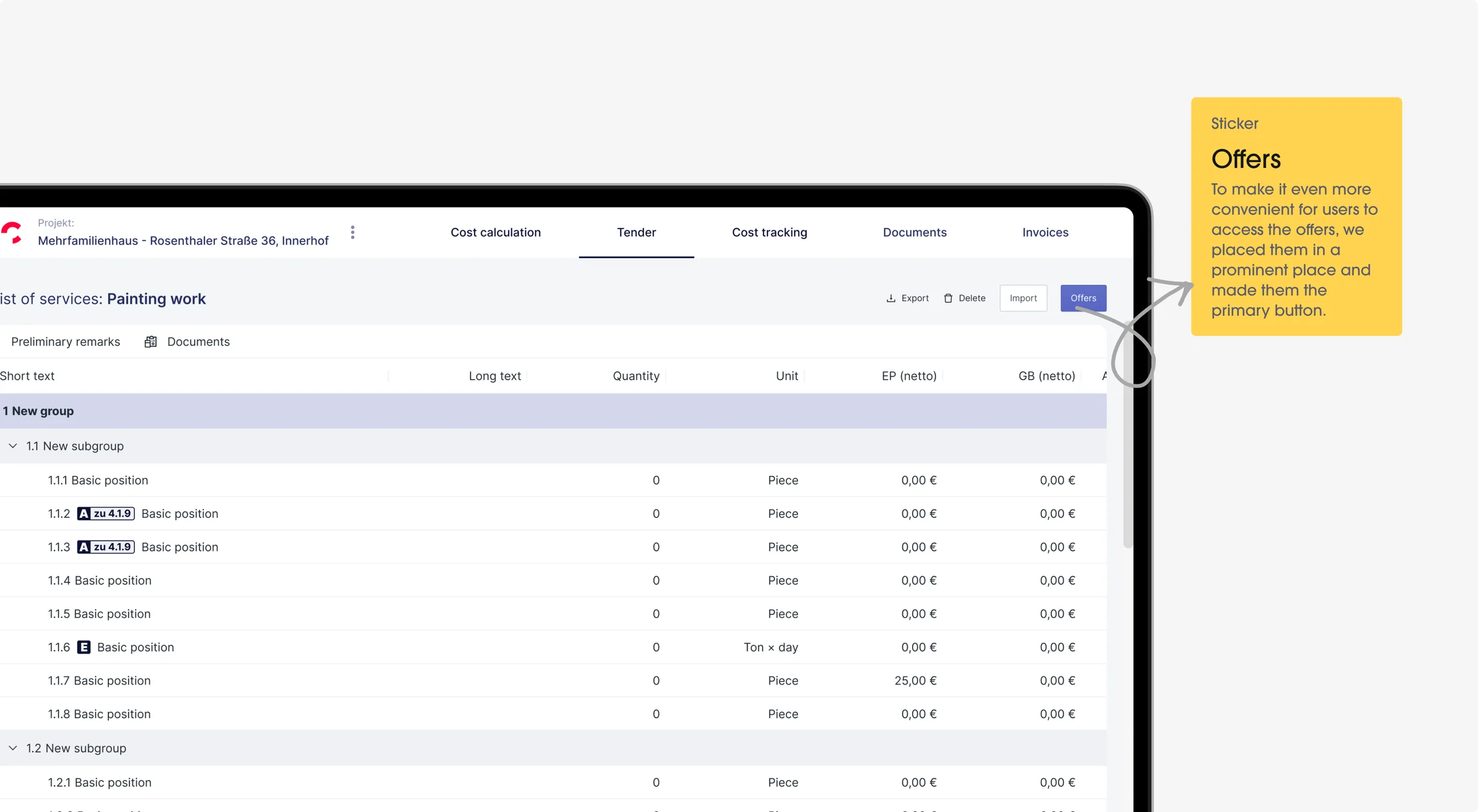
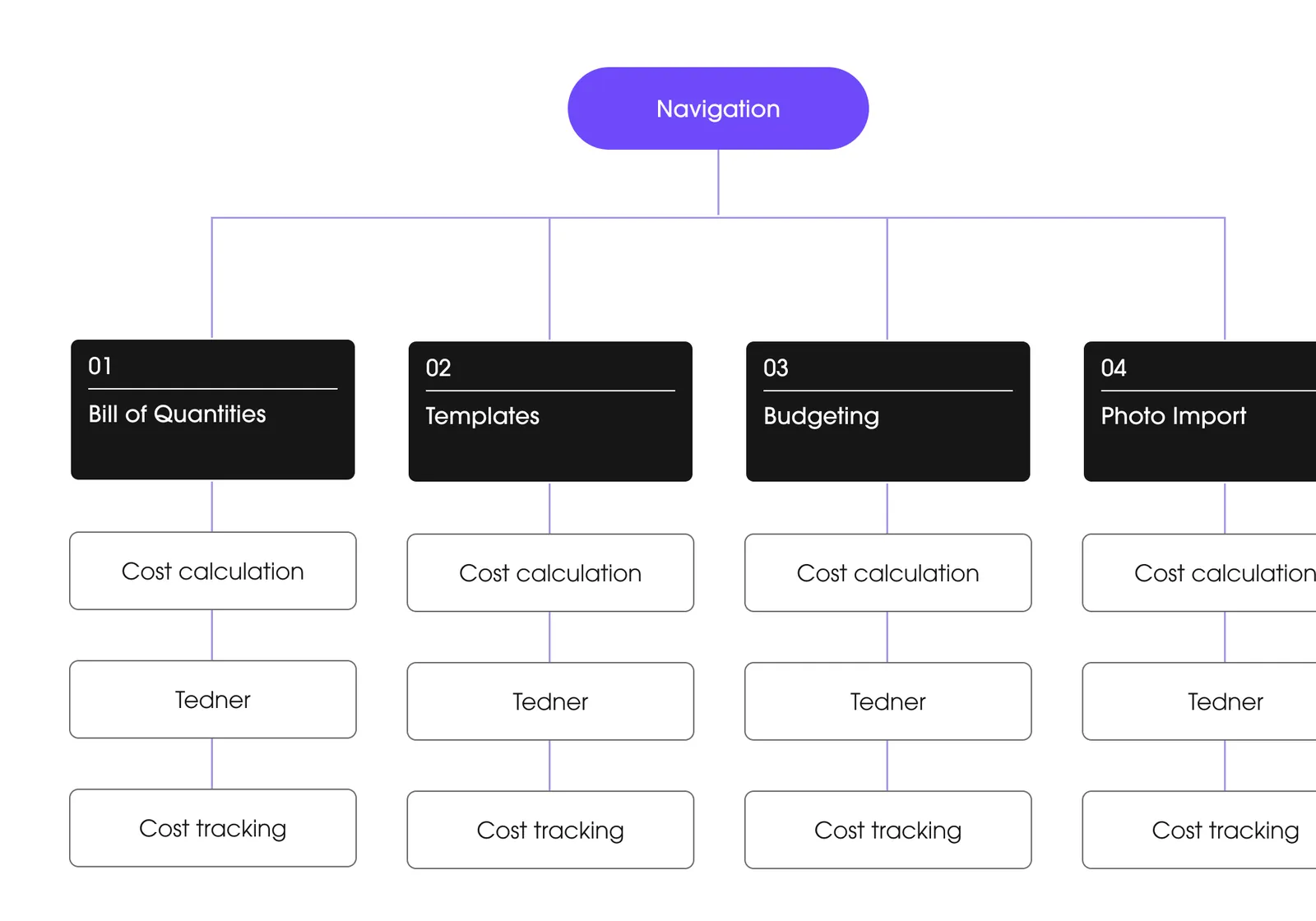
Bill of Quantities
Problem
Construction and engineering workers had difficulty with their current systems for creating and updating Bills of Quantities. The systems were slow, confusing, and prone to errors. This caused project delays and extra costs.
Solution
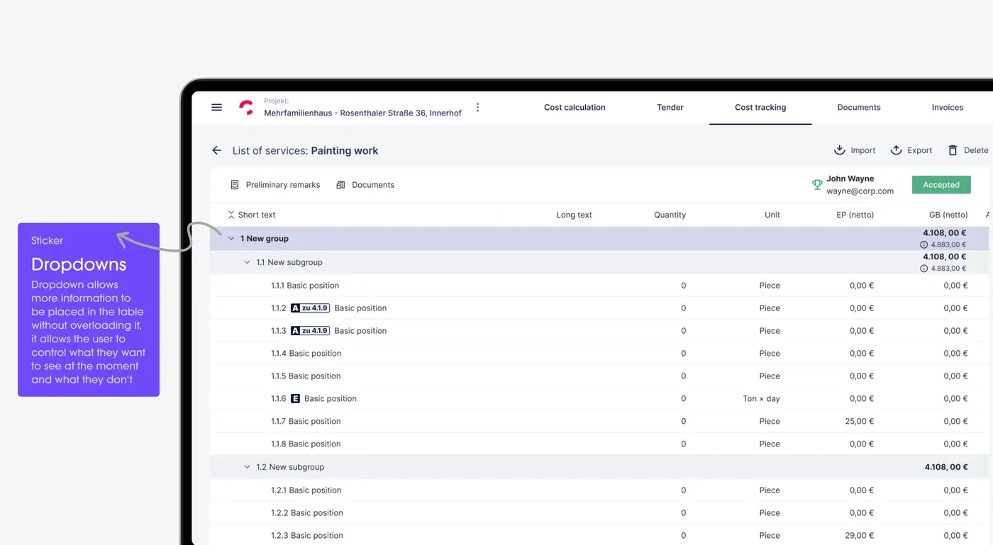
We made a simple interface for users. They can easily add, change, and keep track of materials and costs. Our system updates everything right away, so any changes are seen immediately. We also added features to find and fix mistakes. This made the process faster, less prone to errors, and better for managing projects and budgets.
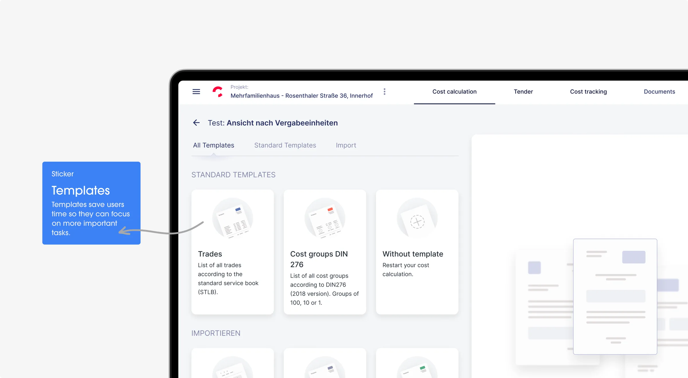
Templates
Problem
It was hard and took a long time for people to make new documents. They had to start over each time. This meant doing the same work again and again. This was particularly difficult for people who needed the same documents frequently.
Solution
We created a set of pre-made templates. Now users can choose an almost right template and just tweak it a bit. It saves a lot of time because they don't have to start each new document from scratch. This new approach is quicker and much simpler for everyone.
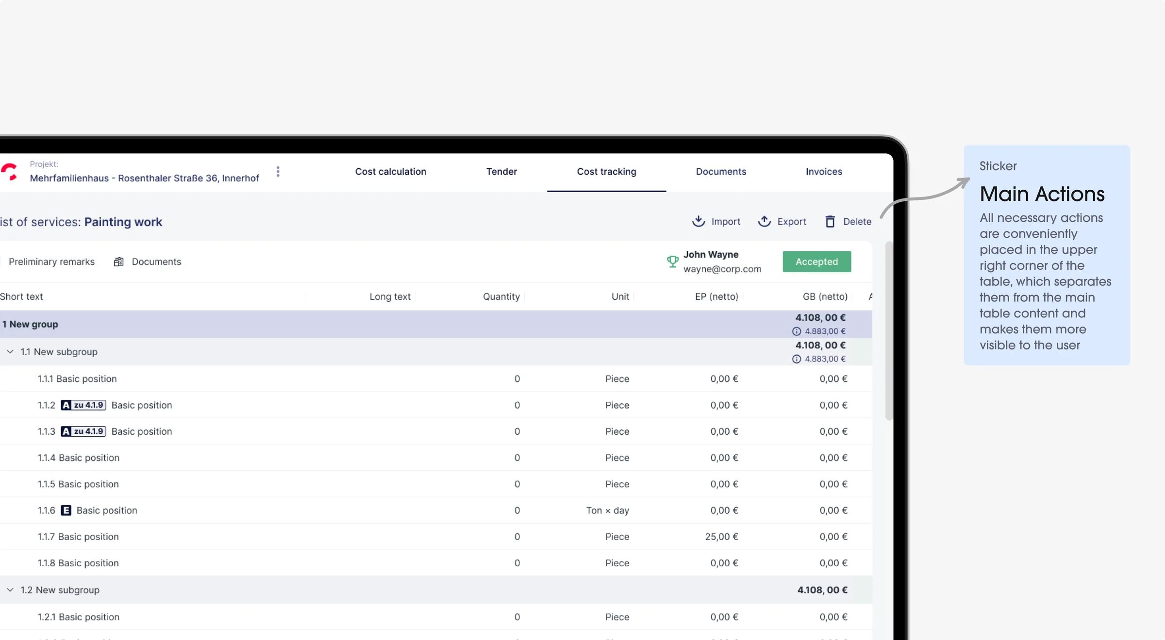
Photo Import
Problem
It was hard and slow for people to upload and sort project photos. They were stuck with slow uploads, hard-to-use menus, and no easy way to organize their pictures. This was really frustrating, especially for those with lots of photos.
Solution
Our fix was to make adding photos really easy. We set up a system where you can just drag your pictures in and they get uploaded fast. We also made a feature that sorts your photos by itself, so you don't have to. This made everything much quicker and easier for users.
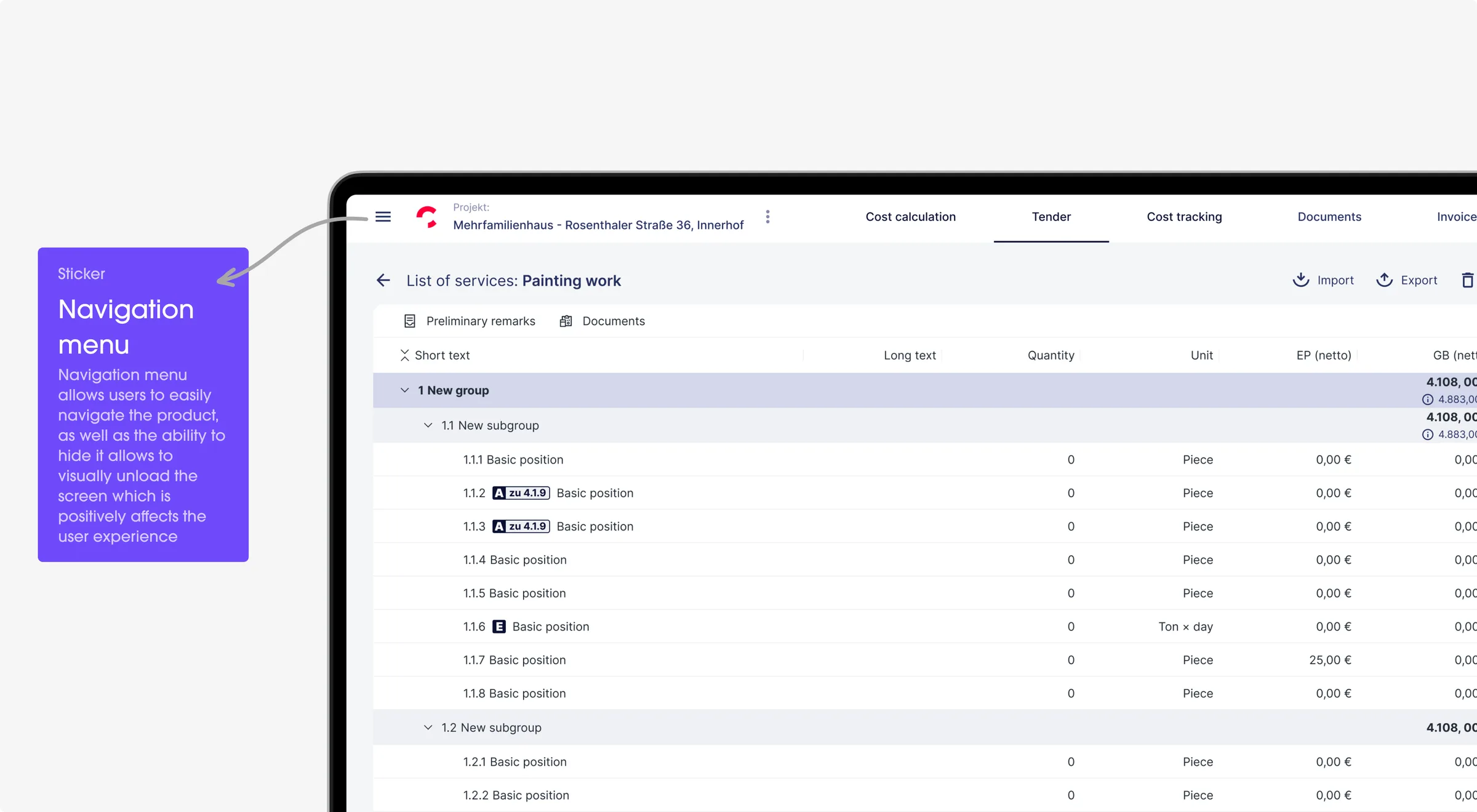
Budgeting
Problem
Managing money was tough and took a lot of time for users. They were using hard tools that made it tricky to keep an eye on spending and plan their money right. This often led to spending too much or not using their money well.
Solution
The feature lets users quickly add the information. We added tools to sort expenses automatically. Users can see where their money goes and manage it better. They don't need to do the difficult tasks usually associated with budgeting.
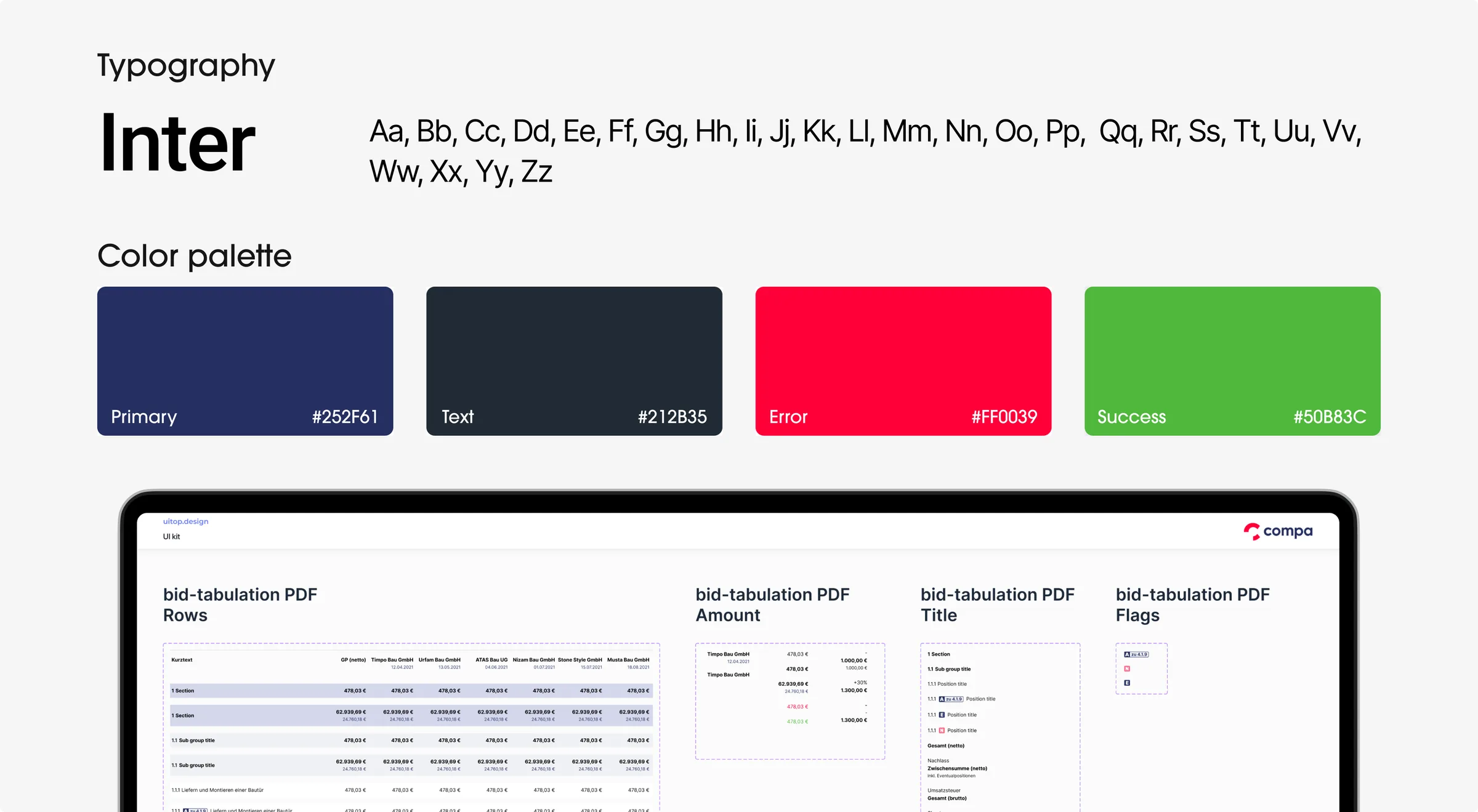
Components Library
Challenge
The application did not have a centralized system for design elements. Because of this, it was difficult to keep a consistent look and feel across the application. The repetitive work was inefficient and caused small inconsistencies in the design. These inconsistencies affected the overall user experience.
Solution
The components library had reusable design elements like buttons, menus, and input fields. These elements were standardized for style, size, and color. Designers could use these pre-made components to quickly build and update interfaces. The components library became a crucial tool for efficient and consistent design.
Ready to redesign your product?
Customer’s feedback

Similar cases
Technology
Interface seamlessly aligns with the development frameworks, ensuring a cohesive and user-friendly experience.

Ant Design
Ant Design system

Figma
AUTO-LAYOUTS, COMPONENT DESIGN SYSTEM, CUSTOMIZATION
Problem solving
We spoke with users and heard their problems and ideas. This helped us improve the platform's design.
Architecture
We start by planning how the app will be built. This is like drawing a map that shows where everything in the app should go. We ensure that users can easily find what they need. The app can also grow and change in the future without any problems.
Wireframing
Then, we create wireframes. We draw simple outlines of each page or screen, showing where all the parts like buttons, images, and text will go. It's not about making it look pretty yet, it's about arranging everything in the right place.
Design system
A design system is a set of rules and components used throughout the entire app. It includes colors, fonts, buttons, and more. Having a good design system makes it easier to create new app elements because we already know which tools to use.
Prototype & Testing
Last, we create prototypes, which are like a test version of the app. The prototype lets us and others try it and see how it works. We thoroughly check everything to ensure it is both easy and enjoyable to use. If we come across any issues, we promptly fix them.