How we use AI in our process
UX Audit for a Construction Intelligence
Platform

Dozer is an AI platform that uses site cameras and IoT sensors to monitor heavy construction equipment in real time. Through a web dashboard, it captures live footage, detects proximity hazards, and tracks fleet activity to improve site safety.

Dozer's customers manage heavy equipment across large industrial sites and need to react instantly when safety alerts fire. The software platform already captured all necessary machine data, but the user interface lacked the clarity required for site managers to make fast decisions under pressure.
A 3-day UX audit successfully uncovered 21 critical design issues across 4 key dashboard screens. This delivers 9 immediate front-end "quick wins" that the development team can ship in a single sprint with zero backend changes.

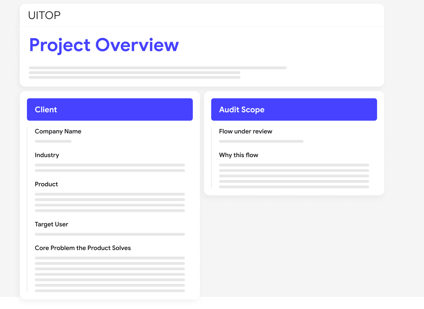
Project Brief
Dozer collects live video, sensor data, and safety alerts from dozens of heavy machines at the same time. This creates too much information for site managers, meaning the dashboard just displays numbers instead of helping them take quick action.
Although Dozer already had a working product with real customers, users missed critical safety alerts and ignored key features because the screen lacked visual urgency. UITOP stepped in to find exactly what blocked the user experience and showed the team where to focus their fixes first.

Dashboard
Problem
The main dashboard overloaded users with too much information at once. Fleet status, live alerts, recent activity, and equipment health indicators all competed for attention without a clear visual hierarchy. Because of this chaos, users trained themselves to look for specific numbers and missed other critical updates.
Solution
We found 6 major UX issues on the dashboard alone, making it the most problem-dense screen in our audit. The main problems included inconsistent safety alert signaling, KPIs that lacked time context, and a layout that buried urgent data. Our audit provided a prioritized list of fixes, ranging from quick label changes to structural updates that separate daily operational views from analytical reports.

Safety Alert Flow
Problem
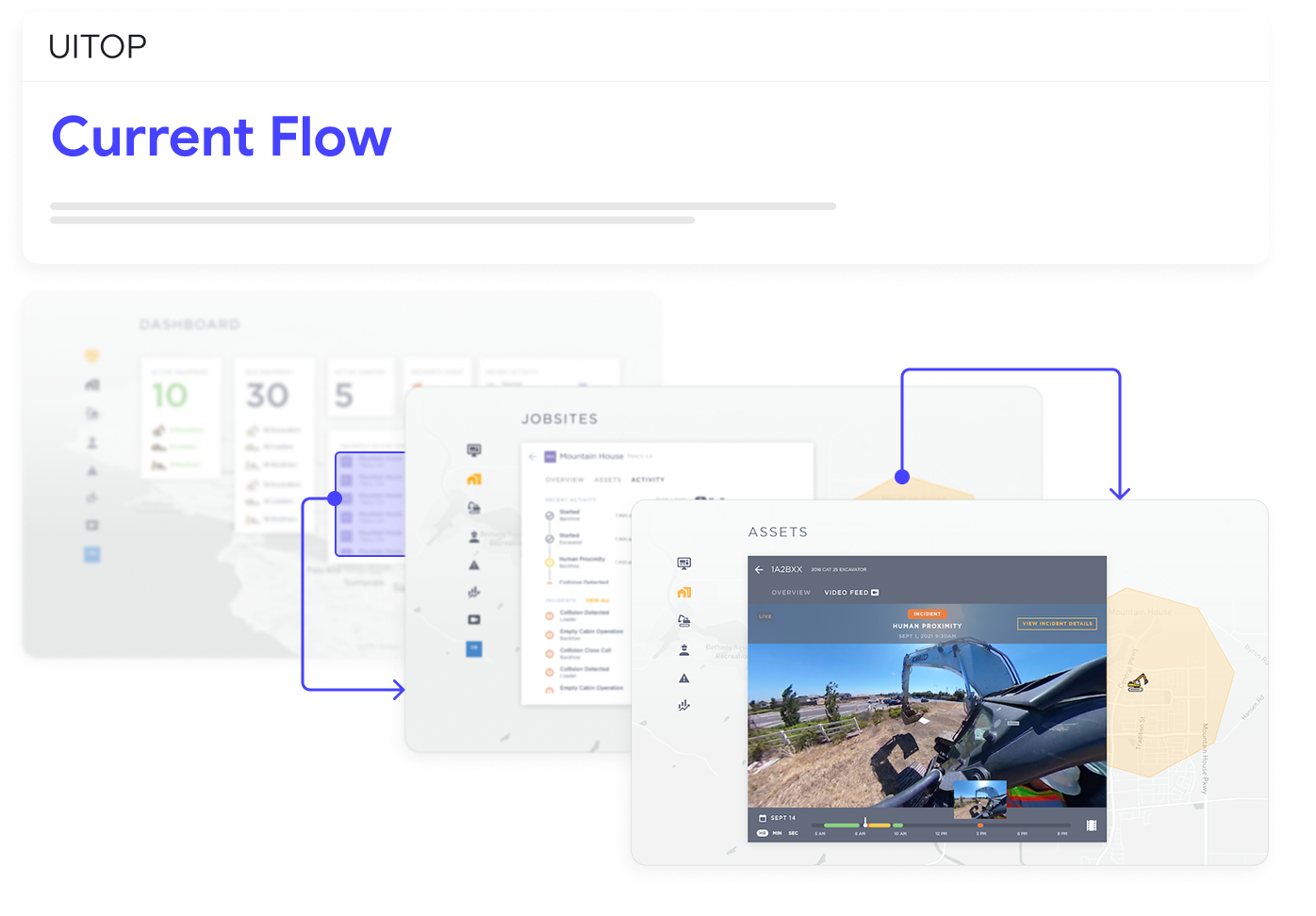
Proximity alerts are Dozer's core safety feature, but multiple UX friction points slow down the flow from "alert fires" to "manager takes action. Because live alerts and historical logs used the exact same visual design, there was no way to tell what needed attention right now versus what had already been handled.
Solution
We mapped the entire alert lifecycle to find exactly where the interface lost its sense of urgency. The audit revealed that the notification panel styled unread and acknowledged alerts identically, while the Equipment View lacked inline alert badges. To fix this, we recommended a 3-tier status system (Active / Acknowledged / Resolved) and a special sorting screen for the 6 critical-severity safety events.

Competitor Research
Problem
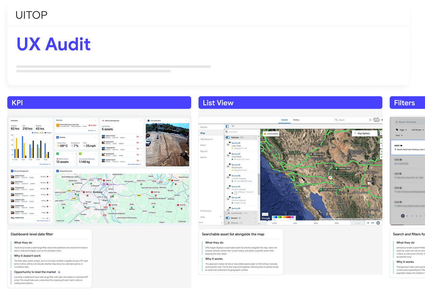
Dozer operates in the growing construction site intelligence market, where direct competitors like Samsara, Fleetio, and Trackunit have already heavily invested in UX design. Because of this, several standard interface patterns that field operations users expect were completely missing from Dozer's platform.
Solution
We analyzed six direct competitors focusing on alert management, navigation, KPI displays, and map usage. This research highlighted industry standards to adopt, such as severity-first alert hierarchies, as well as bad design patterns to avoid. Since many competitors have overloaded dashboards, we showed how Dozer can differentiate itself by building a simpler, faster operational view.

AI Redesign Concepts
Goal
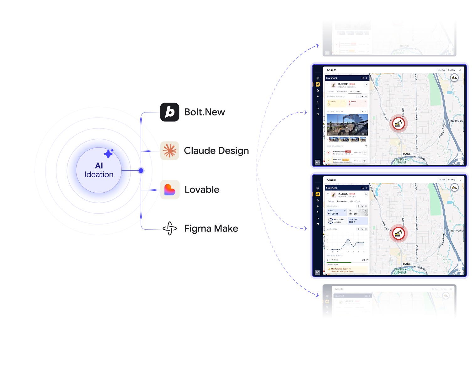
To make our 21 UX recommendations easier to act on, we prepared visual prototype concepts for the Dashboard and Safety Alert Flows. We generated these design directions using AI prototyping tools including Bolt.new, Lovable, and Figma Make as an extra project bonus. This allows the product team to clearly visualize every layout improvement and interactive optimization instead of just reading about them in the written report.

Prioritization
Goal
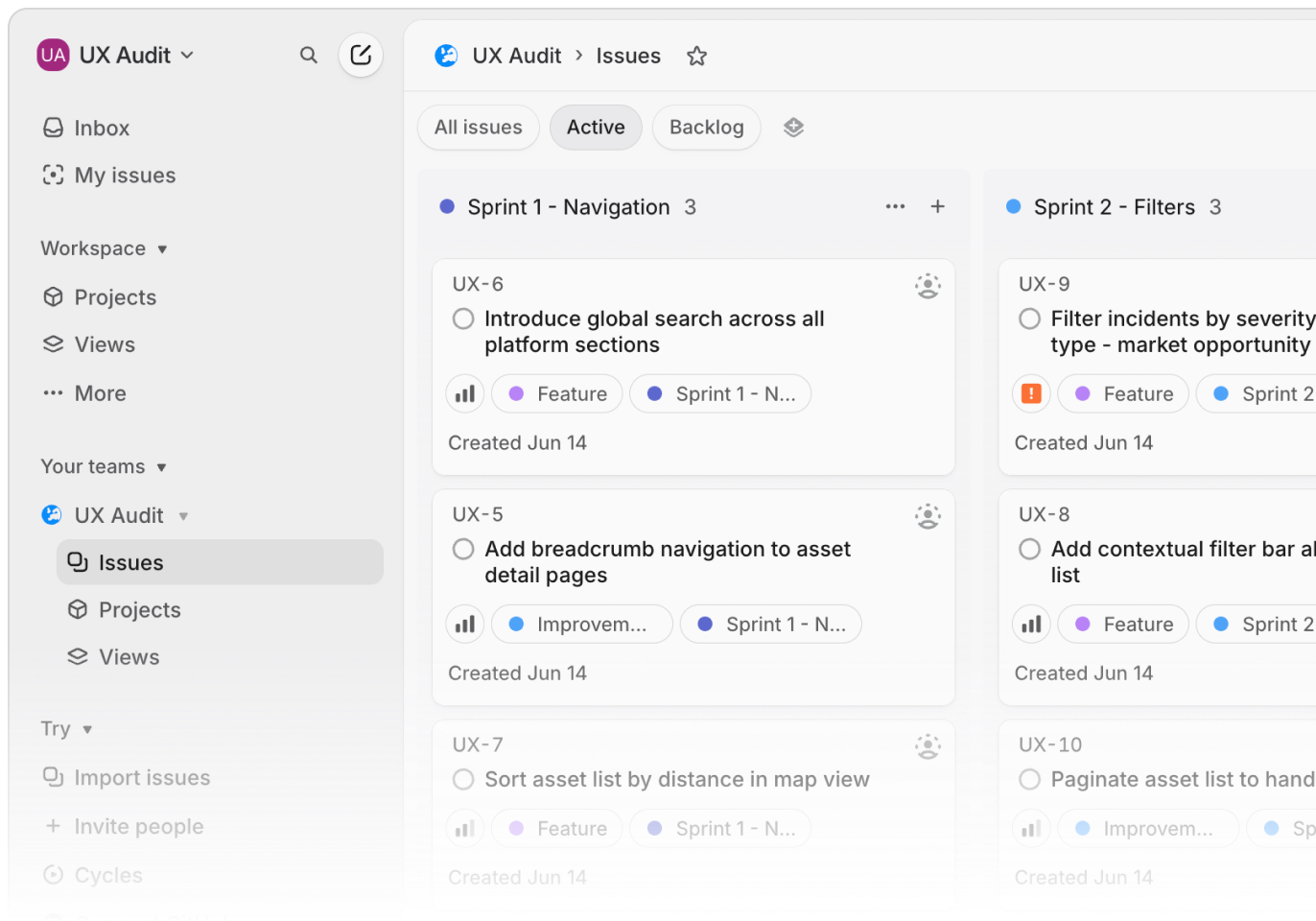
Not every UX issue requires the same priority, so we organized all 21 findings into three tiers: critical, major, and minor. We separated 9 immediate quick wins from larger structural changes and mapped them directly into Linear. This output fits perfectly into sprint planning: the team can track and ship the quick wins in a single sprint with zero backend work, while the remaining 12 issues form a clear roadmap for the next quarter.

Impact
Problem
Before UITOP’s UX audit, the product team lacked a clear picture of which specific interface issues caused the most friction across the 21 evaluated screens. They did not know where to focus their development resources first to improve the user experience effectively.
Solution
By implementing the 9 quick wins in a single development sprint, the platform achieves immediate business metrics. The safety alert response rate improves significantly, dashboard decision-making becomes faster, and new users learn to navigate independently 3× faster than before, all without a single backend change.

Similar cases


Technology
We used our UX expertise, Figma for audit documentation and annotations, and AI prototyping tools to generate concept directions as a bonus deliverable.


Problem solving
Get access to live system and kick off
Review current flows and pain points
Best practices and competitor benchmarks
AI Redesign Concepts [Bonus]
Prioritize improvements