Fitness Clubs CRM System
ReLounge transforms back health centers with IoT technology. This ensures excellent patient care and efficient operations.
Back health centers often face the tough job of keeping track of patient details, appointments, and health devices, which can lead to mistakes and stress.
After implementing ReLounge’s user-friendly interface, the centers noticed that their workflow became faster. They also experienced fewer errors when navigating the system.
Description
ReLounge is the simple yet powerful tool that’s changing how back health centers work. Before, staff struggled with hard-to-use software, but the app makes everything clear and easy. Tasks are now completed faster, and mistakes are reduced by half. This allows everyone to focus more on caring for patients. It is not just a CRM.
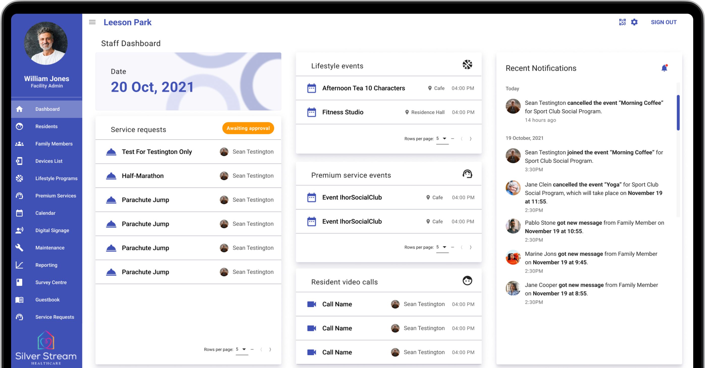
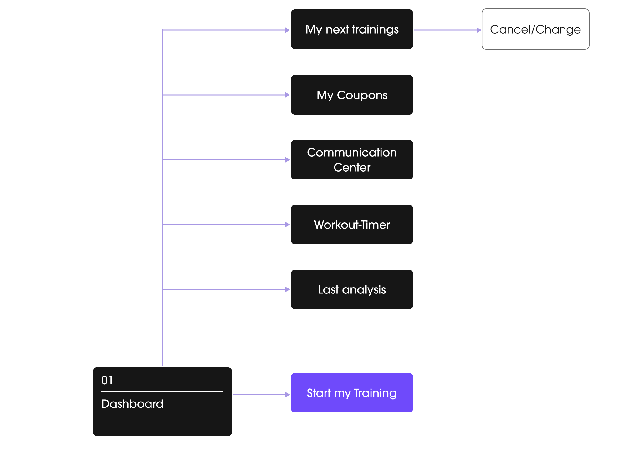
Dashboard
Problem
Staff at back health centers often have a hard time using their dashboards. The complicated systems are not clear, which slows down work and causes stress. It is difficult to quickly find important patient details, keep track of appointments, and see updates from health devices.
Solution
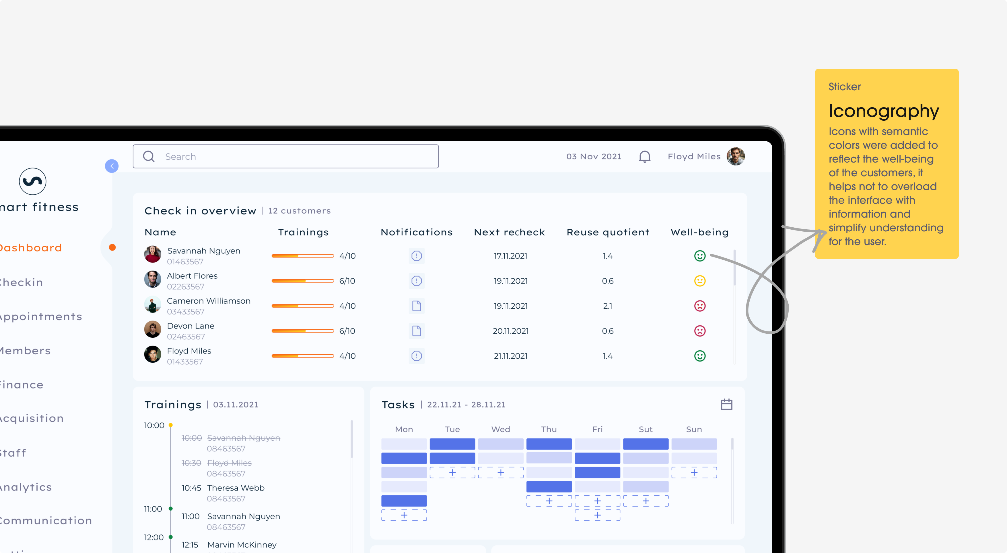
The dashboard design solves these problems by being simple and clear. It’s easy to use, with the most important information right where staff can see it. They can change the dashboard to show just what they need, making their jobs easier.is most important to them.
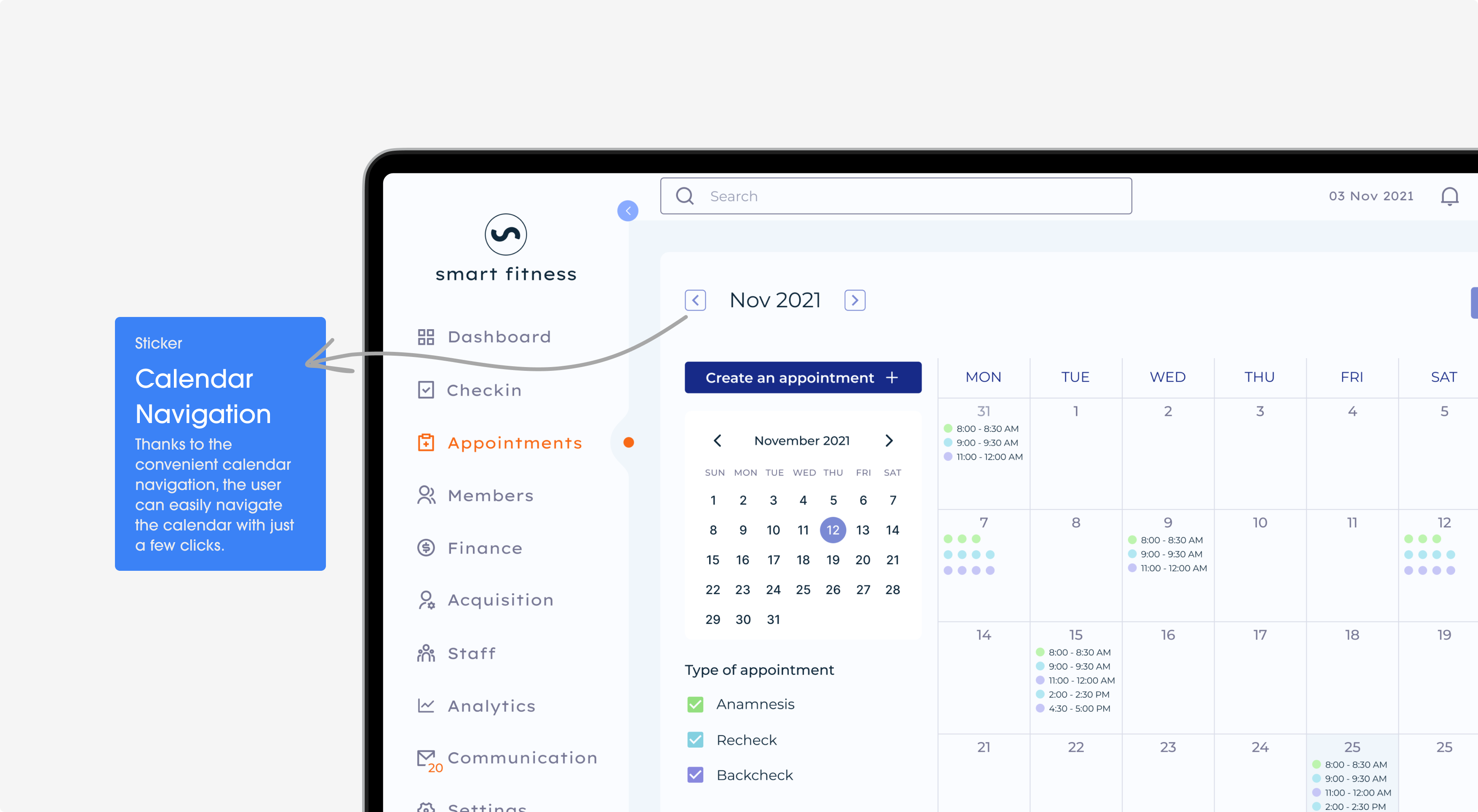
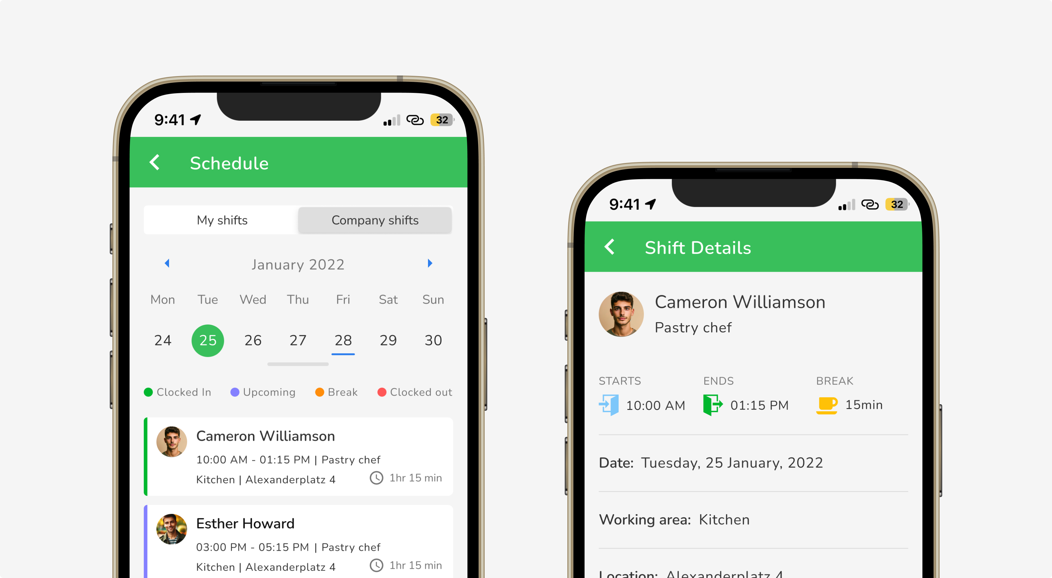
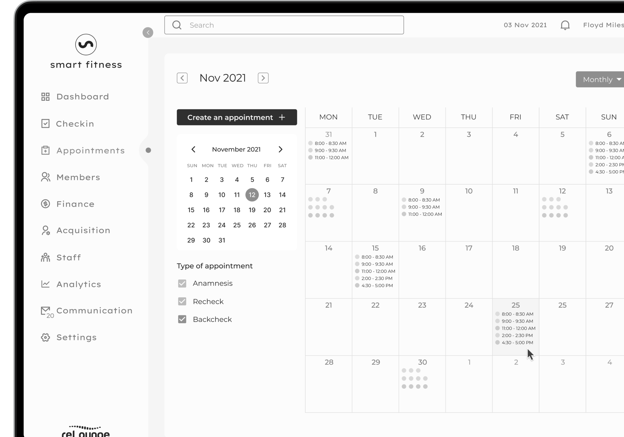
Appointment
Problem
Setting up appointments in back health centers can be tricky and slow. It’s easy to get mixed up and book two people at the same time, or forget an appointment altogether.
Solution
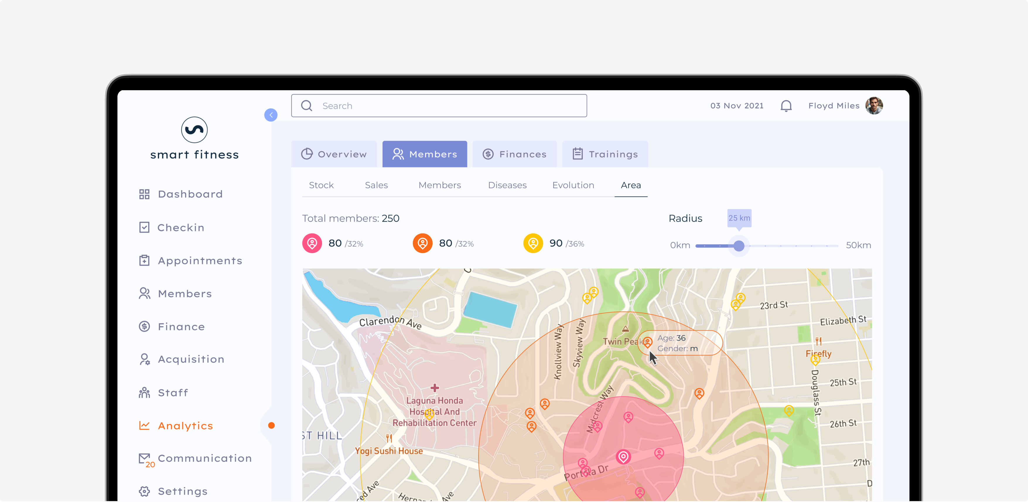
We created an easy-to-use appointment system. It’s clear and fast, so staff can quickly make or change appointments without any mix-ups. The system also warns if someone tries to book two things at once. It helps fix missed appointments.
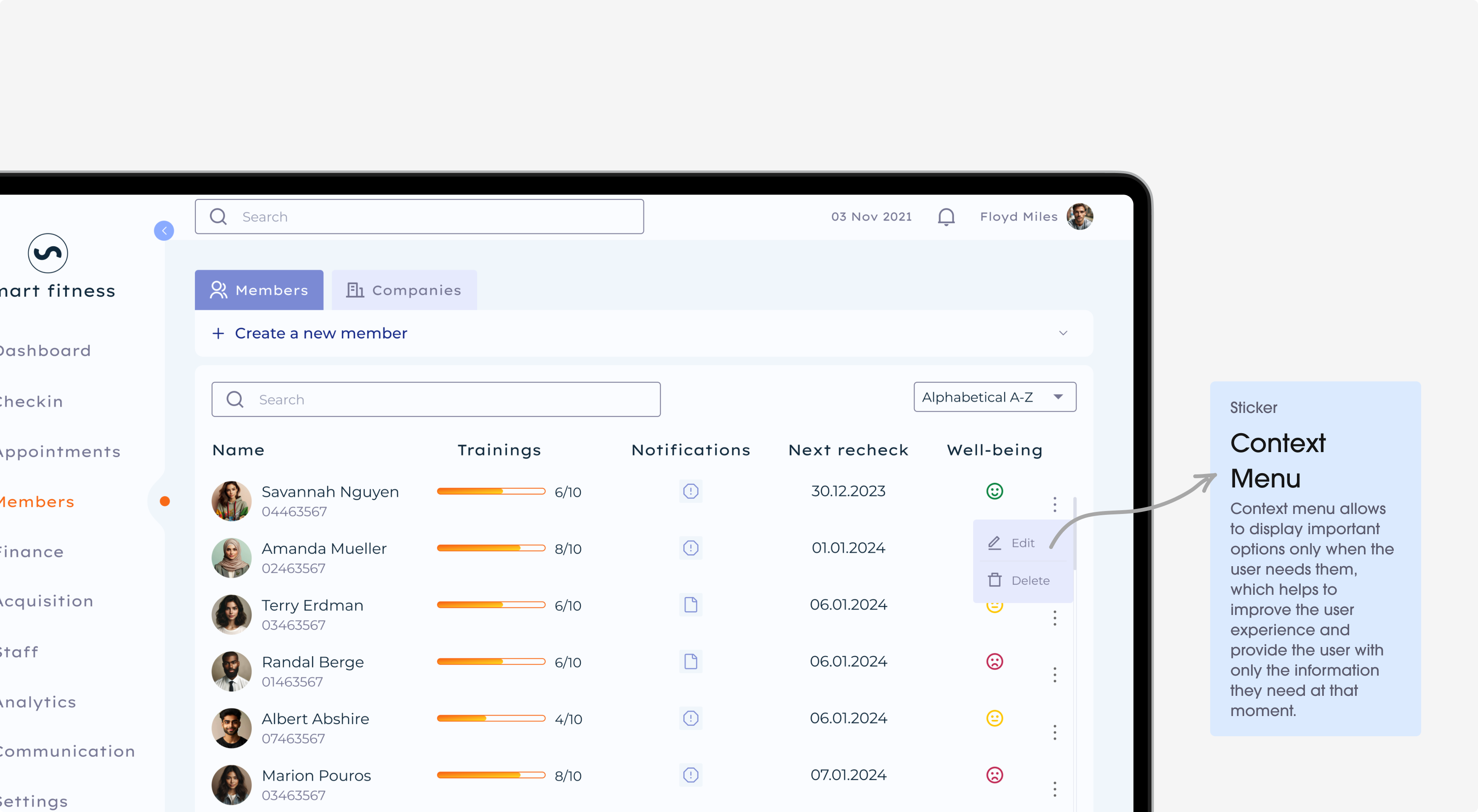
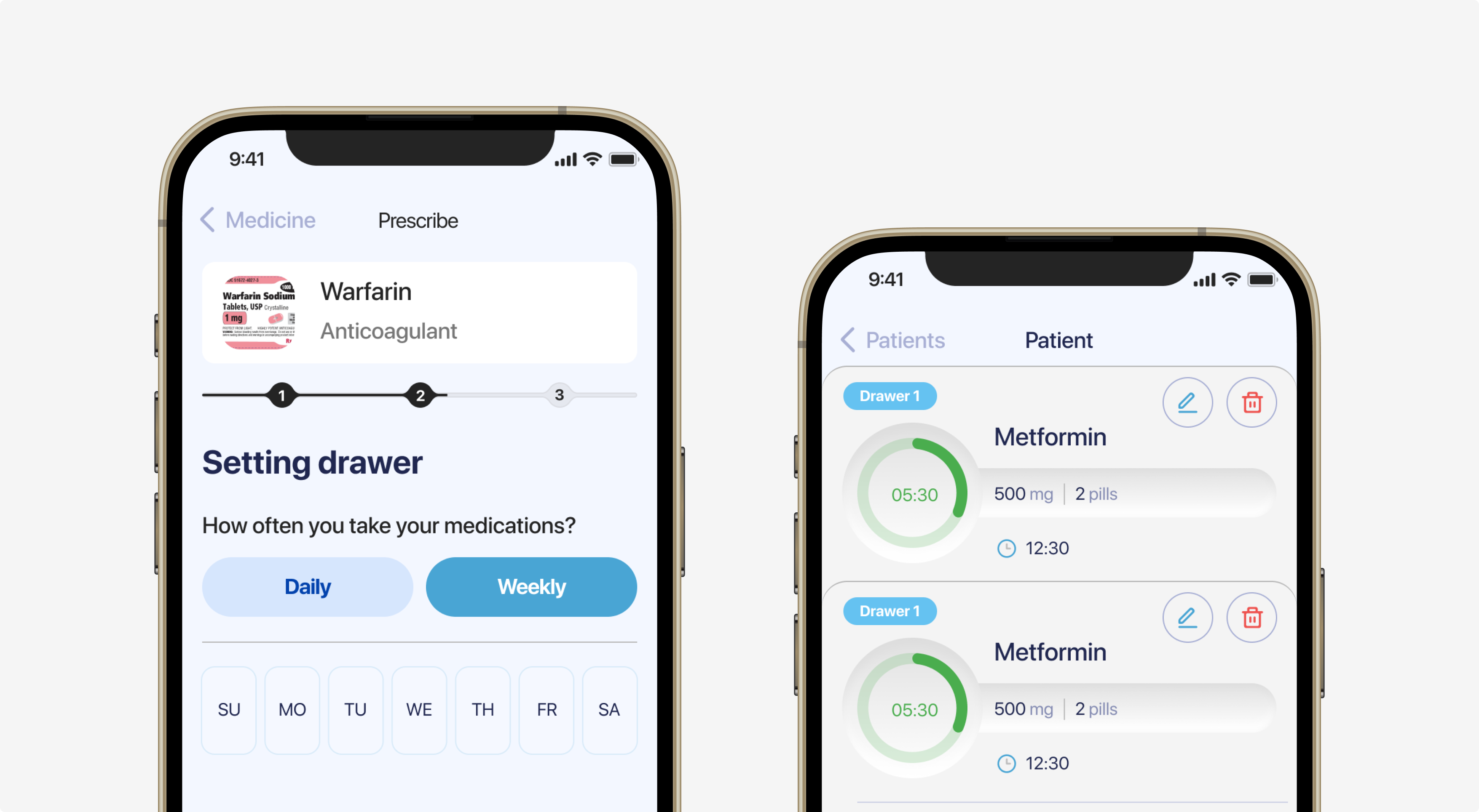
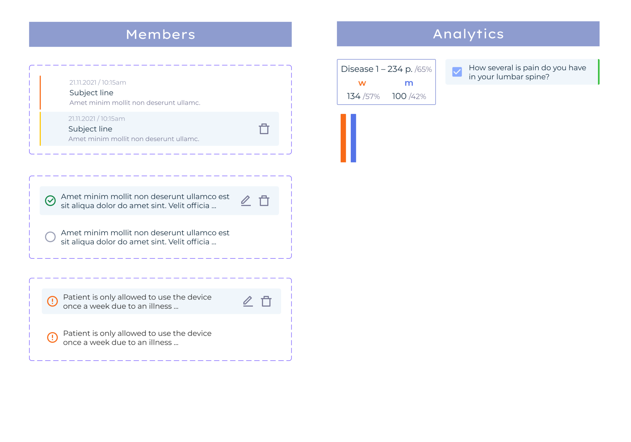
Members
Problem
Keeping track of patient information is tough in many back health centers. The systems they use are too complicated and messy. This makes it hard for staff to keep patient details up to date or find the information they need. Patients may not receive the best care. Staff become frustrated because they cannot perform their job effectively.
Solution
Members feature has a simple design that lets staff quickly add and change patient details, like phone numbers or treatment plans. All information about a patient is in one location. This makes it simple to view their history and monitor their health. This means all the information is right and up to date, and patients get more personal care.
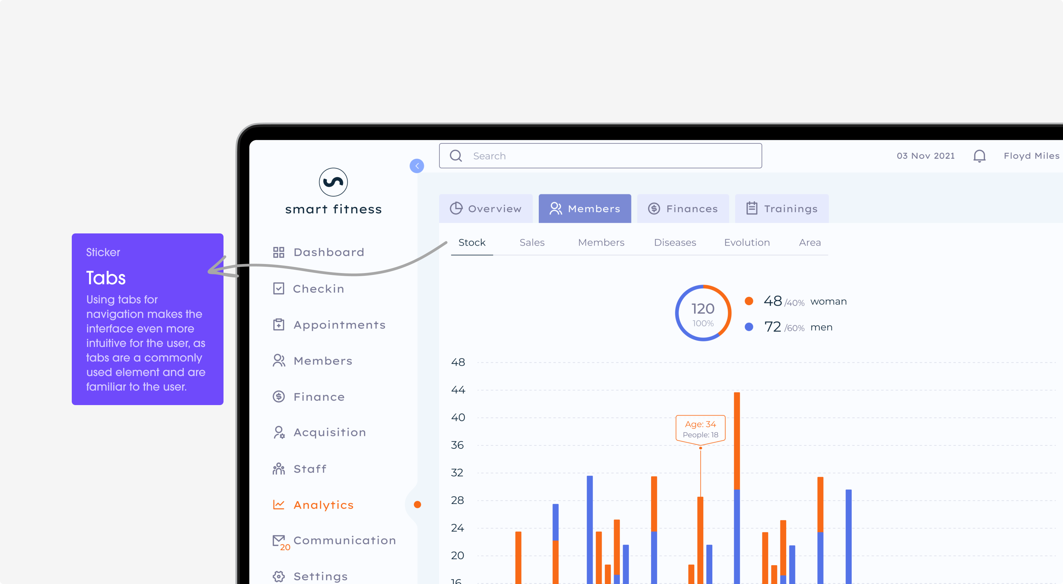
Analytics
Problem
At many back health centers, dealing with patient data is a big headache. Staff can’t easily tell if treatments are working or what’s going on with their patients’ health. They spend too much time trying to understand all the numbers and not enough time helping people.
Solution
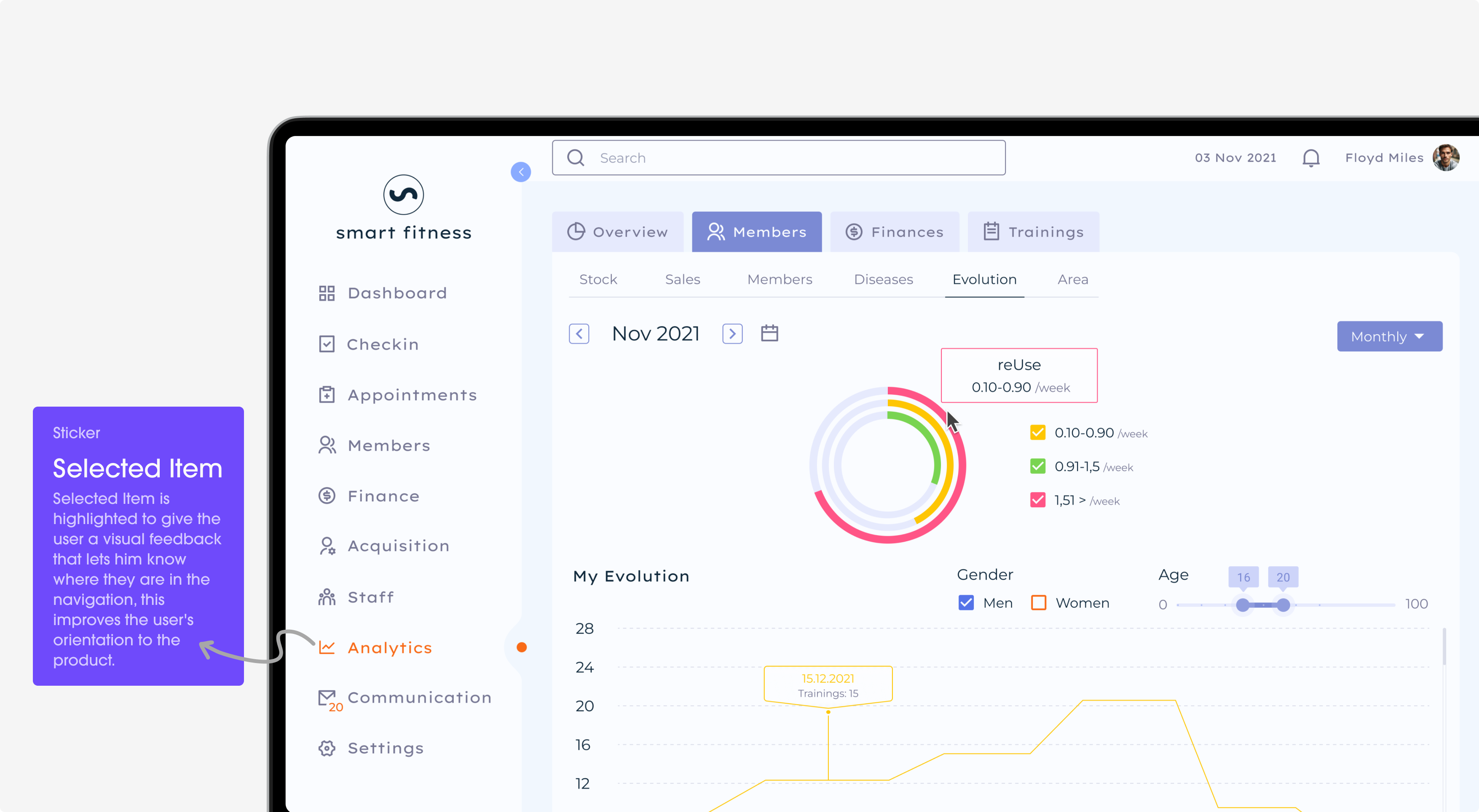
Now, staff can quickly see important things, like which treatments work best or if a patient is getting better. They don’t need to be experts in data; they can just look and understand. This means they can spend more time caring for patients and less time worrying about numbers.
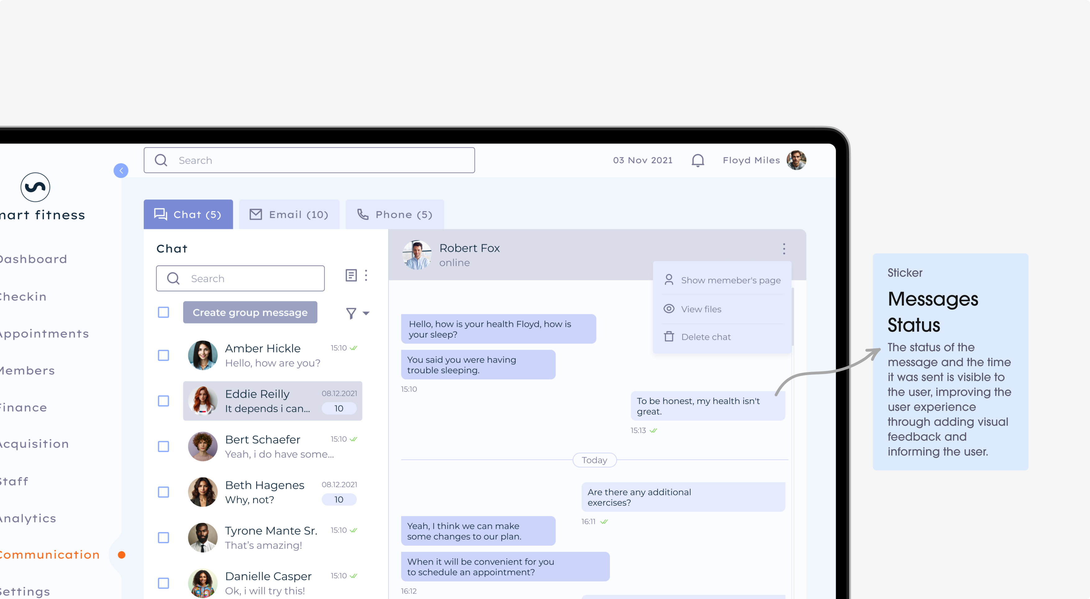
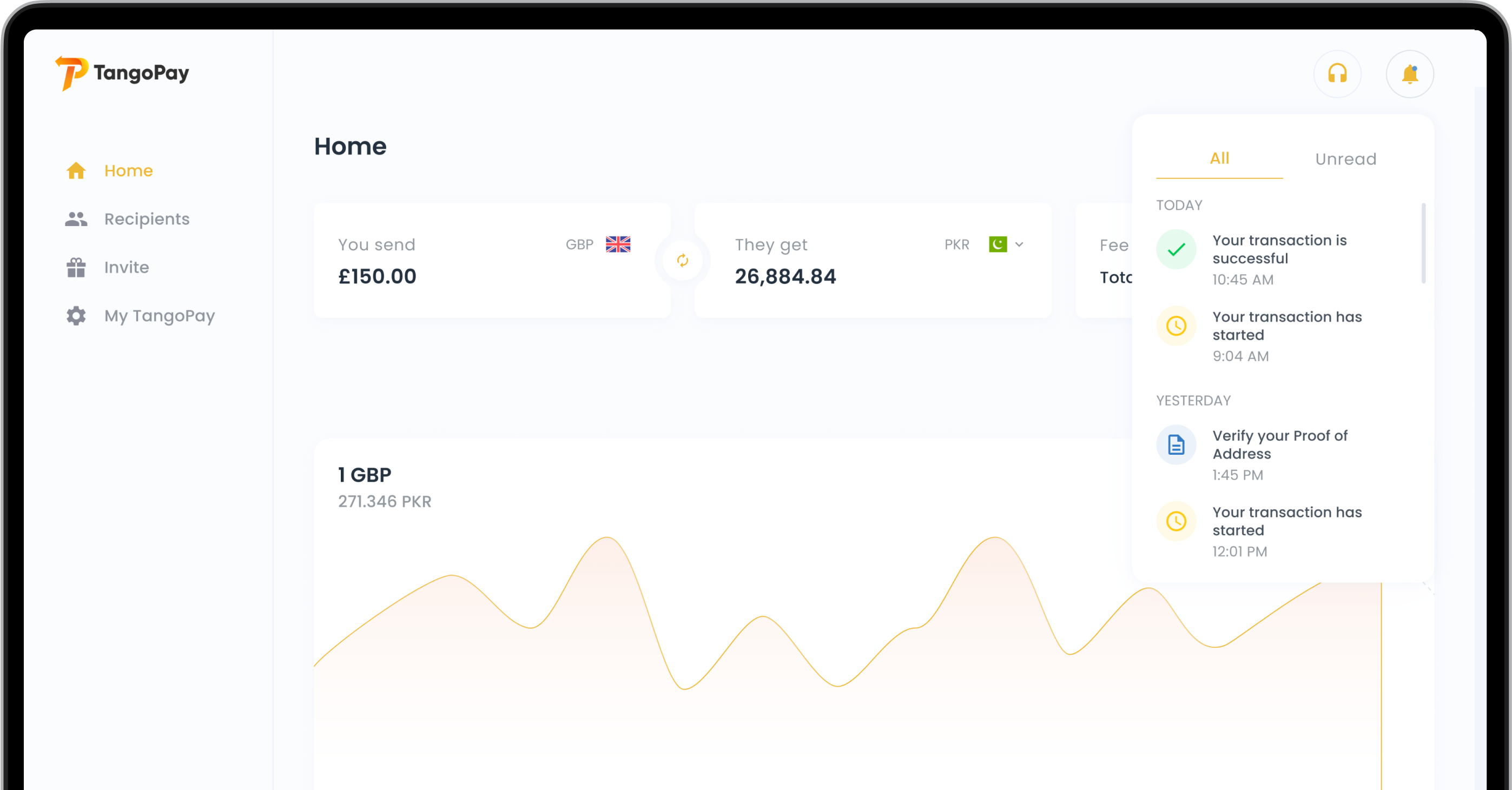
Communication
Problem
Talking to each other in back health centers is often a big mess. The ways they try to send messages and updates are usually complicated and unreliable. This means people miss important notes, wait too long for answers, and sometimes even get things wrong with patient care.
Solution
It’s a simple tool that lets staff quickly send messages, update each other, and work together smoothly. It’s all in one spot, so nothing gets lost or forgotten. This means everyone gets the info they need right away, can respond faster, and can work better as a team. Everything runs more smoothly, and staff can focus on what’s important: taking good care of their patients.
Technology
The interface matches well with the development frameworks. This ensures that the experience is easy for users.
flutter dev
AUTO-LAYOUTS, COMPONENT DESIGN SYSTEM, CUSTOMIZATION
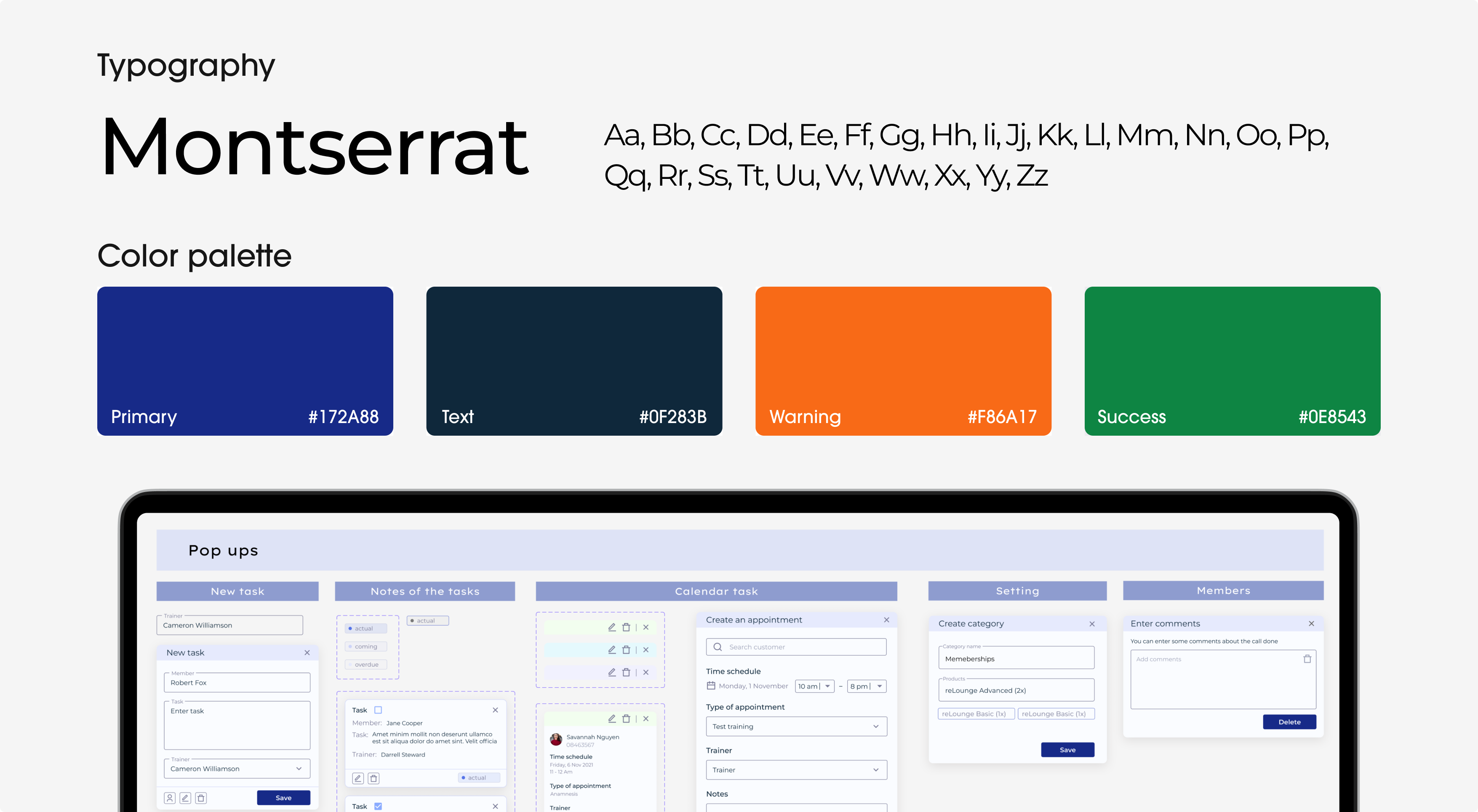
Components Library
Challenge
The application did not have a centralized system for design elements. Because of this, it was difficult to keep a consistent look and feel across the application. The repetitive work was inefficient and caused small inconsistencies in the design.
Solution
The components library had reusable design elements like buttons, menus, and input fields. These elements were standardized for style, size, and color. Designers could use these pre-made components to quickly build and update interfaces.
Problem solving
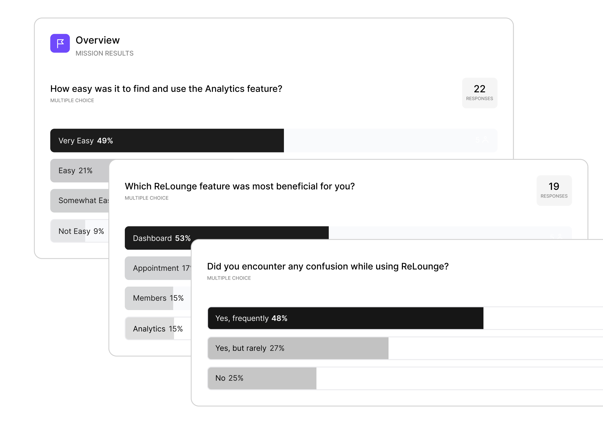
We talked to users and listened to their issues and ideas. This helped us enhance the design of the platform.
Architecture
Wireframing
Design system
Prototype & Testing
Reviews
“They conducted intensive research, gathered information and industry reviews, and reviewed the competitors. The application received positive attention from customers.”

Ready to redesign your product?
A great product is the one designed with the client’s business goals in mind!

