
Best Mobile App Design Examples in 2027: UX Patterns That Work


Think about the last mobile app that felt really easy to use. You probably didn't have to figure out where to tap, search for basic features, or wonder if your action worked. Everything just made sense. That experience usually comes from dozens of small design decisions working together. And some of the best lessons come from studying apps people use every day.
Still, a great-looking screenshot doesn't tell you much about the actual experience. The more interesting details are in how an app guides new users, handles mistakes, organizes information, and keeps everyday tasks simple.
The best mobile app designs show these decisions in action. They reveal UX patterns that other product teams can learn from and adapt. Looking at popular apps can also give teams app design inspiration for their own interfaces, user flows, and interactions.
In this article, we'll look at eight popular apps: Duolingo, Airbnb, Wise, Revolut, Spotify, Strava, Headspace, and Uber. We'll explore what makes their onboarding, navigation, forms, feedback, and accessibility work, and how you can apply similar ideas to your own product.
How We Chose the Best Mobile App Design Examples
There are thousands of apps with impressive interfaces. Some win design awards, others have millions of downloads, and many look great in promotional screenshots.
But what makes an app genuinely good to use? For this article, we focused on something more practical: how well an app supports its main user tasks.
| Criteria | User question | Observable evidence |
|---|---|---|
| Task clarity | Can I understand what to do here? | Clear labels, visible primary actions, logical hierarchy |
| Native familiarity | Does the app feel natural on my device? | Familiar navigation, controls, and gestures |
| Reachability | Can I comfortably reach the controls I need? | Convenient button placement and touch targets |
| Feedback | Does the app show what's happening? | Loading states, confirmations, progress indicators, and status updates |
| Error prevention and recovery | Can I avoid mistakes and fix them easily? | Input validation, review screens, helpful error messages |
| Accessibility | Can people with different needs use the app? | Readable text, contrast, screen reader support, flexible controls |
| Content and consistency | Can I find and understand information? | Clear information density, reusable components, consistent behavior |
These criteria help us look beyond the visual layer. For example, a banking app can have a beautiful dashboard and still make money transfers confusing. A travel app can display stunning property photos but make it difficult to compare locations or understand booking conditions.
Visual design matters, of course. It shapes first impressions and helps people understand the product. However, it also needs to make everyday tasks easier.
We also considered how each example handles different situations. First-time use, repeated actions, mistakes, interruptions, and less common scenarios all deserve attention.
These details are worth thinking about early in the process. Effective mobile app design takes them into account when mapping user flows, planning interactions, and creating the interface.
Mobile UX Examples at a Glance
A fitness app needs to keep workouts easy to track, while a money transfer app needs to make every step clear and predictable. They solve different problems, so there's no point ranking them by one beauty score. What matters is how each app handles the tasks people open it for.
| App | Core task | UX pattern | Why it works | When not to copy |
|---|---|---|---|---|
| Duolingo | Learn a language | Short lessons, streaks, instant feedback | Makes daily practice feel manageable and rewarding | When gamification distracts from learning. |
| Airbnb | Find & book a stay | Filters, map search, listing highlights | Helps users narrow down many options | When users need detailed technical comparisons |
| Wise | Send money abroad | Step-by-step transfers with upfront fees | Users can check costs and delivery estimates before sending | When a task needs fewer steps and less financial detail |
| Revolut | Manage money | Spending analytics and accessible card controls | Makes financial activity easier to review and manage | When charts add complexity without useful insights. |
| Spotify | Listen music & podcasts | Personalized discovery and playlist controls | Makes finding and managing content easier | When personalization hides useful navigation. |
| Strava | Record & review activities | Live stats, maps, and progress goals | Gives users useful feedback during and after workouts | When constant metrics create unnecessary pressure |
| Headspace | Practice meditation | Guided sessions with clear instructions | Helps beginners understand and follow each exercise | When users need more freedom than guided flows offer |
| Uber | Book a ride | Map-based pickup, ride options, driver tracking | Keeps key trip details visible throughout the journey | When a map isn't central to the task. |
Each app solves a different problem, so its UX patterns work in a specific context. Use them as inspiration, then check whether they make sense for your users and their everyday tasks. So, let's look at what makes these experiences worth studying.
Duolingo: Progressive Onboarding and Visible Momentum
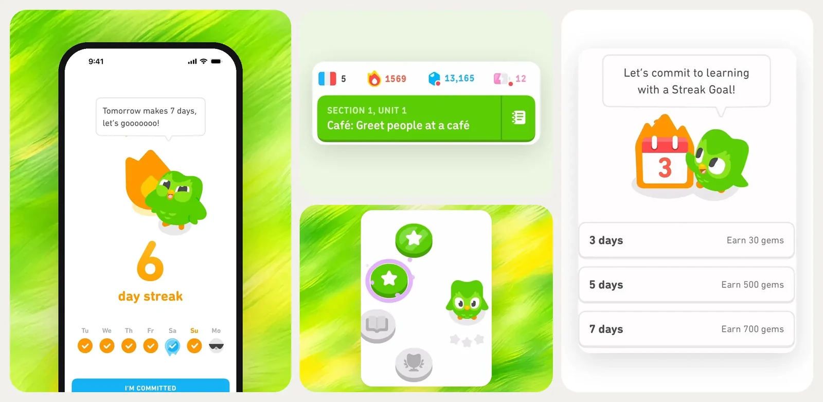
Duolingo doesn't ask new users to fill out a long profile before they can start learning. Its mobile onboarding focuses on a few useful details first: which language they want to learn, why they're learning it, and how much time they can commit each day.
Then comes a quick level check. Complete beginners can start with the basics, while those who already know some of the language can take a placement test. This saves experienced learners from repeating lessons they don't need. The app uses these answers to shape the learning path and gets users into their first lesson fairly quickly. They don't have to spend ages setting things up before trying the product.
Once learning begins, Duolingo makes progress hard to miss. Lessons earn XP, streaks count consecutive days of practice, and progress bars show how far users have moved through a course. Every answer gets immediate feedback. Get something right, and the app lets you know. Make a mistake, and you can see the correction and try again. These small signals give users a reason to keep going, even when they only have a few minutes to spare.
There's a downside to this approach, though. Streak reminders, daily goals, and leaderboard competition can start to feel like pressure. Too many notifications can also become annoying, especially when users are already busy. It may push people to mute the app altogether.
The pattern to borrow: Ask only for details that help shape the first experience. Let users reach the main activity quickly, then show progress in ways they can actually understand. For learning and habit apps, streaks and rewards can help build routines, but users should still feel free to miss a day and come back.
Airbnb: Search and Navigation Organized Around a Trip
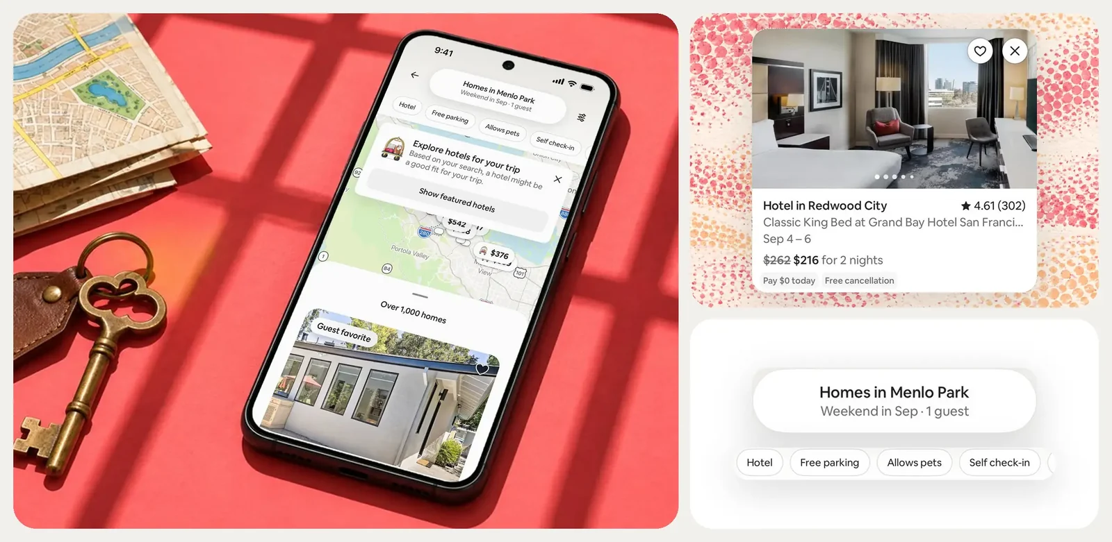
When people open Airbnb, they usually have a specific trip in mind. They know where they want to go, or at least have an idea. The app puts search right at the center of its mobile navigation, making it easy to start planning without digging through menus.
Users can enter a destination, travel dates, and the number of guests before browsing available stays. They can also explore flexible dates or describe what they're looking for in their own words. This gives the search some context from the beginning.
Once the results appear, users can switch between listing cards and a map. The list helps compare photos, prices, ratings, and property details. The map shows where each place is located and how it relates to nearby areas. Filters make it easier to narrow things down by price, amenities, property type, and accessibility features.
The useful part is how these tools work together. Someone can check a property, look at its location, adjust the filters, and return to the results without starting the search from scratch. Saved listings make it easier to keep interesting options for later, while wishlists let people organize and share potential stays.
Airbnb also gives users several details to help judge whether a listing is worth considering. Guest reviews, ratings, host information, photos, and cancellation conditions all help build trust before booking.
The pattern to borrow: Keep important search details available as users browse, compare, and save options. This works especially well for travel and other marketplace products with lots of choices. But the navigation should reflect what people are trying to do. A marketplace for quick local services, for example, may need a much simpler path than Airbnb.
Wise: Mobile Forms That Reduce Financial Uncertainty
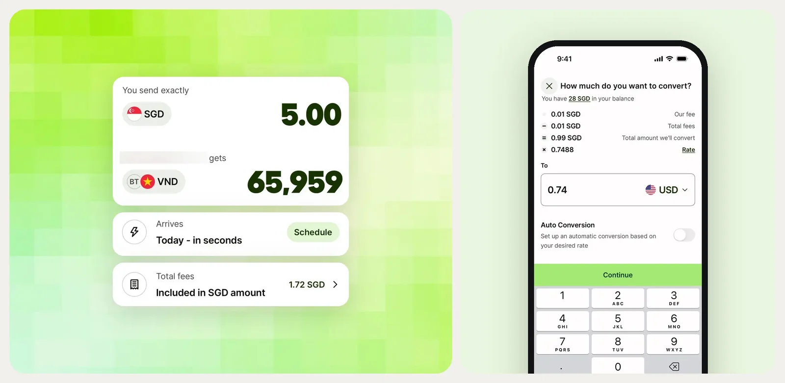
Sending money abroad involves several details people want to get right: the amount, exchange rate, fees, recipient information, and arrival time. Wise makes these details part of the transfer flow instead of leaving users to figure them out on their own.
The process starts with two simple amount options. Users can enter how much they want to send or how much the recipient should receive. Wise then shows the exchange rate, fees, and estimated delivery time. This helps users understand exactly what will happen to their money before confirming the transfer.
Next comes the recipient information. Users can select someone they've paid before or add a new recipient using their @Wisetag, email, phone number, or bank details. The app collects this information as part of the flow, so users don't have to deal with every field at once.
Before sending, users get a review screen with the transfer details. They can check the amount, fees, payment method, and recipient information before confirming. This extra step matters because a mistake in a bank detail can delay a transfer or send it back.
The experience doesn't end after confirmation, either. Wise shows transfer updates and lets users track progress under Transactions. If something goes wrong, its help guidance explains common issues, such as incorrect recipient details or delays, and how to follow up.
The pattern to borrow: Break complex mobile forms into manageable steps, show costs before asking users to commit, and give them a clear chance to review important details. This kind of fintech product UX helps people understand what they're agreeing to at each stage. The same approach can work for payments, insurance, and other financial tasks where a small input error can have real consequences.
Revolut: Making Complex Financial Data Actionable

Revolut packs a lot into one app. Users can check balances, manage cards, send money, review spending, and track their finances. With so many things happening in one place, the challenge is helping users find what they need without making every feature compete for attention.
The Home screen gives users access to their accounts and common banking actions. Card settings have a separate set of controls, such as freezing a card, setting spending limits, and managing virtual cards. Spending analytics lives in its own section. There, users can check spending, income, and cash flow through charts. They can also change time periods or filter transactions by category, merchant, country, currency, or card.
This setup lets users choose how much detail they want to see. Someone checking their balance doesn't need to go through a full spending report. Someone reviewing monthly expenses can open analytics and look at specific categories or merchants. Labels and filters help make the numbers easier to read.
Revolut also adds confirmation steps to actions that need extra care. Sending money to a new recipient, for example, includes an in-app review before the transfer goes through. Card controls are kept accessible for situations when a user needs to freeze a card quickly.
The downside is that a large feature set can make some tools harder to find. Users may know a feature exists but still have trouble remembering where it lives.
At UITOP, we faced a similar challenge while building TangoPay. The platform needed to support transfers, currency conversion, transaction tracking, and back-office operations across mobile and web. We gave users a live currency calculator on the home screen, added searchable transaction history, and broke transfers into clear steps. TangoPay launched in 4 months and kept 92% of its users.
The pattern to borrow: Put frequent actions where users can reach them quickly. Keep detailed reports available without crowding the main screen. And make important actions easy to review before users confirm them.
Spotify: Personalization Without Losing Predictable Navigation
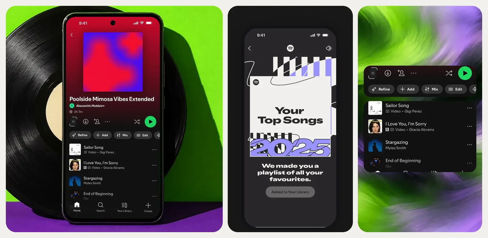
Spotify changes what users see based on their listening habits. Open the Home tab, and you'll find playlists, albums, podcasts, and recommendations picked for you. The selection changes over time, but the main navigation stays familiar.
The app keeps its core sections easy to recognize. Home is where users discover something to play. Search helps them find a specific artist, track, album, or podcast. Your Library keeps saved music, playlists, and other collections in one place. This structure gives users a clear starting point, even when the content on the screen looks different from one visit to the next.
Personalization works through recommendations based on listening history and activity. Daily Mixes, Discover Weekly, and other personalized playlists help users find music without searching for every track themselves. At the same time, familiar playback controls and small microinteractions make it easy to pause, skip, adjust the volume, or check the queue without interrupting the listening experience. Spotify Connect also lets users move playback between supported devices without having to start listening all over again.
There are trade-offs, though. Recommendations can become repetitive if the app keeps leaning on the same listening patterns. Personalized sections may also push less familiar content out of view. And users don't always know how to influence what appears in their recommendations or find the controls that shape them.
The pattern to borrow: Personalize the content around a stable navigation system. Keep search, saved items, and essential controls easy to find. Give users visible ways to influence recommendations, too. Personalization works best when people can still find what they came for without having to fight the app.
Strava: Feedback, Progress, and Social Context
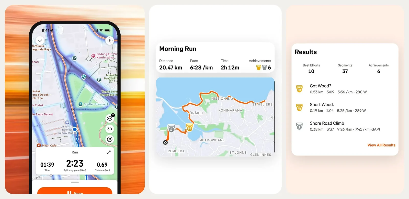
With Strava, recording a run or ride takes just a few taps. Users pick an activity, hit Start, and get going. While they're moving, the app tracks details like distance, pace, speed, and time. They can check their stats along the way without digging through menus.
After the activity, Strava puts all that data together in a summary. Users can look at their route, splits, elevation, and personal records. They can also see how they did on popular route segments compared with other athletes. These numbers give them something to work with next time. Maybe they want to run a little faster, cover a longer distance, or beat their previous time on a familiar route.
Strava also gives users a few ways to stay motivated between workouts. They can set weekly distance goals, join challenges, and follow friends' activities. Kudos and comments add a social element, while leaderboards let users compare their results with others. For some people, that friendly competition is a good reason to keep moving.
Of course, not everyone enjoys being compared with other athletes. Leaderboards can make exercise feel like a competition, even when someone just wants to stay active. Location privacy matters, too. Public activity maps can reveal home addresses or regular routes if users aren't careful. Strava has privacy settings for activity visibility and map details, but people need to know where to find them.
The pattern to borrow: Show useful stats during an activity, then help users decide what to do with them. Goals and social features can add motivation, but they should never come at the cost of privacy or make people feel they have to compete.
Headspace: Calm Interaction Design With Clear Next Steps
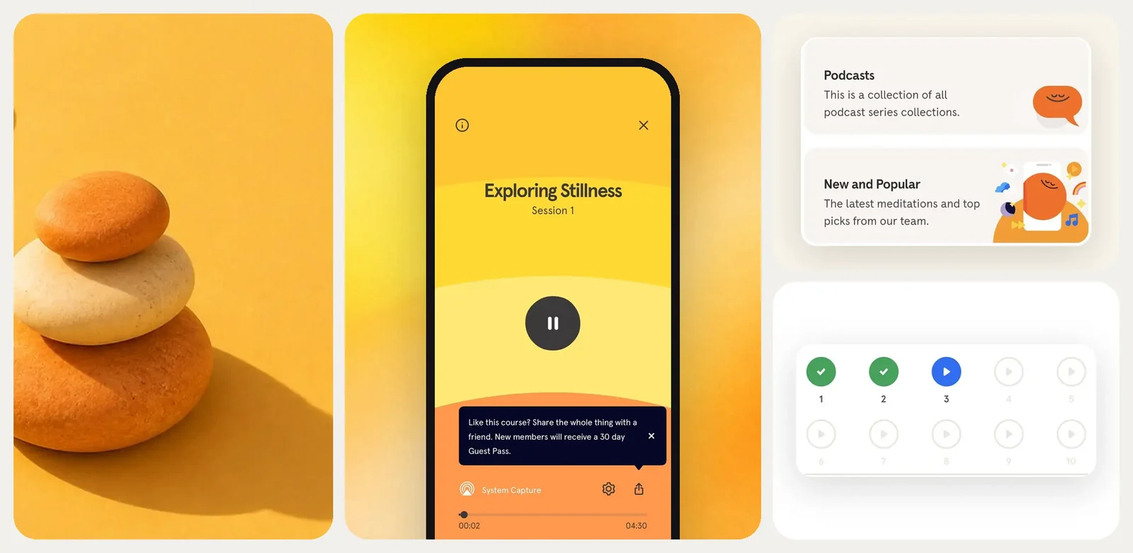
Headspace has a pretty recognizable look: soft colors, friendly illustrations, rounded shapes, and plenty of space between elements. The screens feel easy on the eyes, and the content doesn't compete for attention all at once. Small animations add a bit of movement without turning every interaction into a distraction.
The app also makes choosing a session less overwhelming. Users can browse meditations by topic, explore sleep and focus content, or pick a short exercise when they don't have much time. The Today section gives them a more direct starting point, with activities they can try without digging through the full library. Clear labels help users understand what each session is about and how long it takes.
Progress tracking adds another reason to return. Users can see their completed sessions and meditation history, while reminders can help fit practice into an existing routine. The tone stays friendly and encouraging. Prompts feel more like a gentle nudge than another task on a to-do list.
Still, a calm-looking interface doesn't automatically make an app accessible. Text contrast, readable font sizes, screen reader support, and reduced-motion options still matter. And a relaxing design shouldn't be mistaken for proof that a meditation app delivers clinical results. Those claims need proper research behind them.
The pattern to borrow: Use visual hierarchy, clear session labels, and a manageable number of choices to help users get started. Let illustrations, motion, and copy support the product's purpose, but keep the main action easy to spot. A calm interface should make tasks easier, not hide important information.
Uber: System Status and Recovery in a Time-Critical Flow
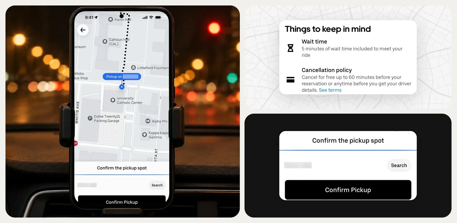
Booking an Uber takes a few steps, and users need to know what's happening at each one. First, they enter their destination and check the pickup point on the map. If the pin is in the wrong place, they can move it before confirming the ride. This is a simple example of gesture design working alongside clear visual feedback: users can adjust the pickup point directly, without having to start over. The app also shows the estimated fare upfront, so there are fewer surprises later.
Once a driver accepts the request, users see their name, car details, location, and estimated arrival time. As the driver moves, the map updates too. Users can follow the car, contact the driver, or double-check the pickup details without switching between screens.
Things don't always go according to plan, though. A driver may get stuck in traffic, take longer than expected, or cancel the ride. Uber updates the ride status and ETA as things change. If users decide to cancel, they can check whether a cancellation fee applies before confirming. Payment is handled through the selected method, and the receipt is available after the trip.
There's also a support path for problems that come up along the way. Users can open a completed ride in their activity history and find help with issues like incorrect fares, lost items, or problems during the trip.
The pattern to borrow: Keep users in the loop from the first step to the last. Show when something changes, explain what it means, and make the next action easy to find. Live maps make sense for services like ride-hailing. Products without a real-time location task need a different way to show progress and handle unexpected changes.
Accessibility and Native Patterns Behind Strong Mobile UX
A screen can look perfectly fine during a design review and still cause problems in everyday use. Someone may increase the font size and find that half the text disappears. A button may be difficult to tap, or a screen reader may announce an icon without explaining what it does.
That's why good mobile app accessibility starts with a few practical checks.
- Text and contrast: Make sure larger text doesn't break the layout. Text, icons, and buttons should stand out clearly from their backgrounds. Don't use color alone to show errors or status.
- Touch and screen readers: Give buttons enough room to tap. Add clear labels to icons and custom controls, and make sure the focus order follows the way users move through the screen.
- Motion and orientation: Respect reduced-motion settings and avoid forcing one screen orientation without a clear reason.
- Platform conventions: Keep navigation, gestures, and system controls familiar to iOS and Android users.
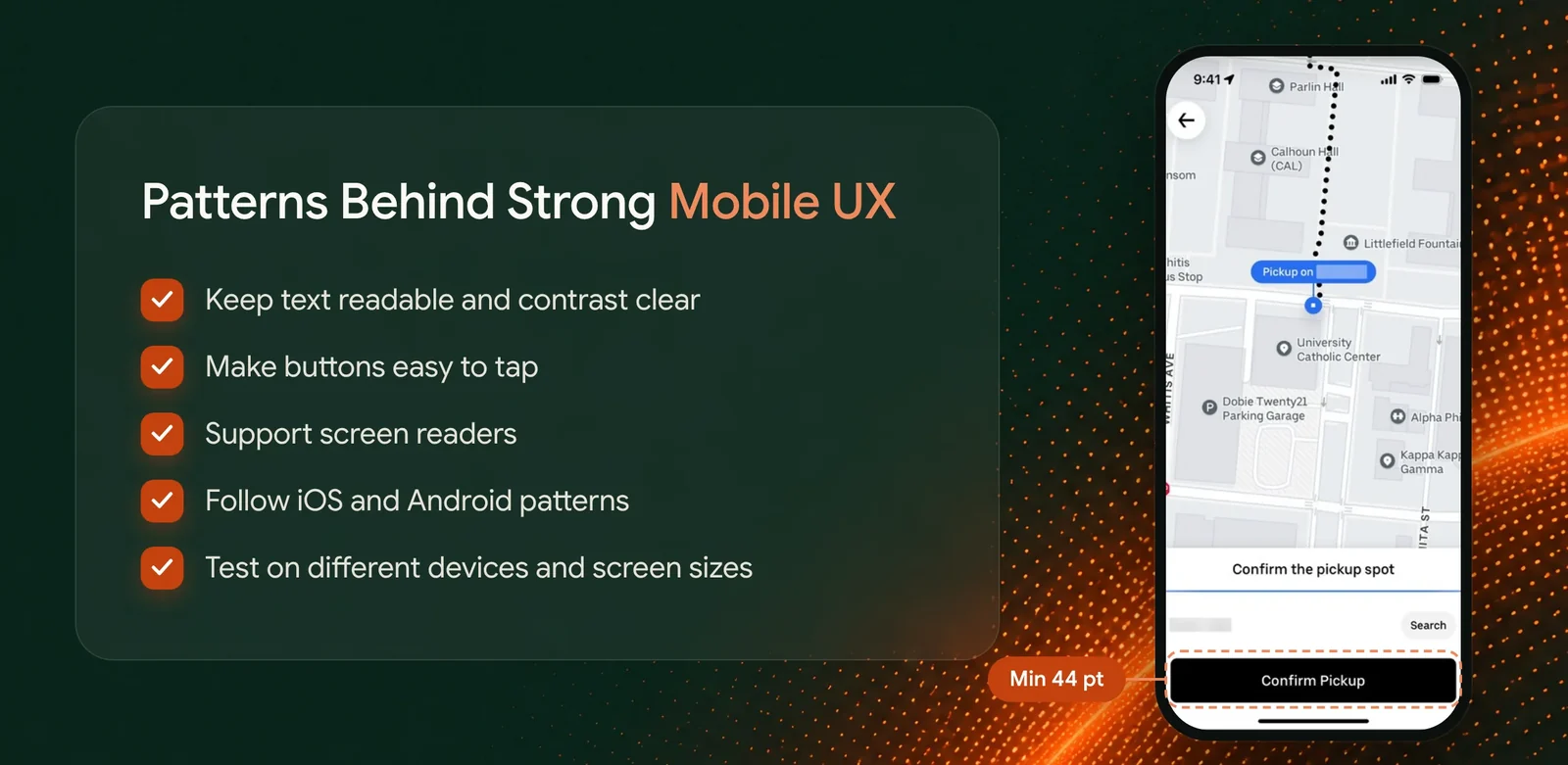
Apple's Human Interface Guidelines and Google's Material Design explain how to follow platform-specific native patterns. For example, Apple recommends 44 × 44 pt touch areas, while Android guidance recommends 48 × 48 dp. WCAG 2.2 sets measurable accessibility criteria, including contrast and target size. Platform recommendations and WCAG requirements serve different purposes. Following them doesn't automatically make an app accessible. That needs proper testing and an accessibility audit.
A responsive UI should also account for different screen sizes, text scaling, and device orientations without hiding essential information or making controls harder to use.
We put these ideas into practice with ImpruvonHealth, a medication management app. UITOP designed flat navigation so users could find active prescriptions without digging through nested screens. Clear prescription cards brought dosage details, alerts, and refill status together. Three key actions were available right from the home screen. We also built a consistent Material Design 2 component library and tested the app with diverse patient groups to make everyday tasks easier to complete.
So, check how the app works with larger text, screen readers, and different interaction preferences. A design that works in a mockup still needs to work on someone's actual phone.
How to Transfer a Mobile UX Pattern Into Your Own Product
You see a feature in another app and think, “That would work well in our product.” Maybe it's Spotify's recommendations or Wise's step-by-step transfer flow. But copying the screens rarely gives you the same result. The pattern needs to make sense for your users and the task they're trying to complete.
A few steps can help you adapt it:
- Look at the task first. What does the user want to do? Are they at home, on the move, or trying to finish something quickly?
- Figure out what makes the pattern work. Does it save time, make information easier to compare, or prevent mistakes? Keep that idea at the center of your design.
- Check the platform and device. Consider screen size, one-handed use, iOS and Android conventions, and features like location or camera access.
- Prototype more than the ideal flow. Show what happens when data is loading, a field is empty, something fails, or a user changes their mind.
- Put it in front of real users. Watch people try the task on their own devices. Pay attention to where they pause, tap the wrong thing, or ask what to do next.
- Check the results and document the behavior. Look at completion rates, time spent, errors, and drop-offs. Record how each component behaves, including its different states, so developers can build it consistently.

Every great UX pattern starts with understanding what users need. When adapting a pattern to your product, focus on the problem it solves and how it fits your users’ expectations. Testing it in real scenarios helps ensure the experience feels natural, intuitive, and useful.
This process helps turn inspiration into UX patterns for digital products that fit real user needs. The best solution may look quite different from the original example, and that's perfectly fine.
A Practical Mobile App Design Review Checklist
Even a well-designed app can have a few annoying moments. Maybe new users don't know where to start, a form is confusing, or an important action doesn't give any feedback. A design review helps spot these issues before they affect more users.
Go through the main parts of the app and see what needs attention:
| Area | What to check | Evidence to collect | Suggested owner | Severity |
|---|---|---|---|---|
| Onboarding | Can new users get started without too many steps? | Completion rates, drop-offs | Product designer | High |
| Navigation | Can users easily find what they need? | Task tests, user feedback | UX designer | High |
| Forms | Are fields clear? Do error messages explain what to fix? | Abandoned forms, input errors | UX designer / developer | High |
| Feedback | Does the app confirm actions and show when something is loading? | Usability tests, support tickets | Designer / developer | Medium |
| Errors | Can users understand and recover from problems? | Error logs, failed tasks | Developer / UX designer | High |
| Accessibility | Do larger text, screen readers, and touch targets work properly? | Accessibility audit & assistive technology testing | UX / QA | High |
| Performance | Do screens load quickly and respond without delays? | Load times, crash reports | Developer / QA | High |
| Design consistency | Do buttons, forms, and other components behave the same across screens? | UI audit, design system review | Designer / developer | Medium |
Don't treat this as a test where the app needs to get a perfect score. One problem with a payment flow can be more important than several minor visual inconsistencies.
Look at how often an issue occurs, how much it affects users, and how difficult it is to fix. Use those findings to build a prioritized scope for your mobile product redesign. That way, the team spends time fixing problems that actually get in the way of using the app.
Conclusion: Copy the Principle, Not the Screen
The best mobile app design examples are useful because they show how a specific UX decision solves a real problem. Duolingo makes progress visible. Wise breaks financial tasks into manageable steps. Uber keeps users updated when plans change. Each app has its own context, users, and priorities.
You can borrow these ideas, but they need to fit your product. Start with one task that causes users trouble. Maybe they abandon onboarding, struggle to find a feature, or make mistakes when filling out a form.
Look at where the friction happens and write down what you can measure. Then choose one UX pattern that could help, adapt it to your app, and test it with real users. Compare the results with what you had before. Did more users finish the task? Did they make fewer mistakes? Could they complete it faster?
If you're unsure where to start, a mobile UX audit can help uncover the biggest usability issues and turn them into a clear improvement plan.
Good mobile UX comes from understanding what your users need and making everyday tasks easier.


