How we use AI in our process

Product, Development
/
Aug 04, 2026

People are careful with financial products for a reason. They want to know where their money is, what a transaction will cost, why a verification step is required, and much more.
A fintech product earns confidence through many small details. For instance, fees need to appear at the right moment, while errors should explain what happened and what the user can do next.
This means trust depends on the interface and the way the product is built. Overall, the product has to work as one system.
In this article, we cover the UX and development decisions that influence trust in fintech products, including onboarding, payments, security flows, errors, delays, and product performance.
When people use a fintech product, they rely on it to represent their money accurately and carry out instructions as intended. An error can affect a payment or limit access to an account, so the impact goes beyond frustration with the interface. The user may lose time or incur an extra cost, and the company then has to investigate the case.
This higher cost changes what customers expect. They pay close attention to balances, fees, transaction records, and security requests because each detail influences a financial decision. Once the information in the product becomes difficult to trust, users often become more cautious about how much money they place in the service.
These expectations need to be considered throughout fintech product development. A transaction status, for instance, is useful only when the backend provides an accurate state, and the interface explains what that state means. If the information is incomplete, a good copy alone will not resolve the uncertainty.

So far, we have focused on what happens after a user starts using the product. In many cases, however, trust begins to form during registration and onboarding.
At this stage, the company asks for personal details and identity documents, sometimes before the user has seen much of the service. Most users understand why a financial provider needs this information, though they still expect some context. A verification request with little explanation can raise concerns.

Fees, account limits, and eligibility rules also affect the early impression. When these details appear only near the end of onboarding, some users may discover that the account does not suit their needs after they have already shared sensitive information.
Transparent communication helps set more accurate expectations. Users can benefit from knowing what information is required, why it is needed, and what the next stage is likely to involve.
Looking more closely at onboarding, KYC is a good place to start. If you have opened a digital bank, investment, or payment account, you have probably completed this process yourself. The provider asks for identity documents and checks the information against regulatory requirements before giving access to certain features.
The process is necessary for compliance and helps the company identify fraud or restricted activity. Still, it is also one of the points where users often leave. The problem is rarely the identity check alone. Drop-off usually grows when the app asks for sensitive information before explaining why, or when a document is rejected and the user gets no useful reason.
A common case is a failed photo upload. The user takes another photo, receives the same message, and still has no idea whether the issue is glare, framing, or the document itself. Better fintech UX gives enough guidance before the upload and a specific explanation after a failed check. That reduces repeated attempts and avoids unnecessary support tickets.
Once KYC is complete, the product still has to confirm who is accessing the account and who is approving a sensitive action. Authentication appears again and again throughout the customer relationship, so the way it is designed has a noticeable effect on daily use.
When it comes to routine access, biometrics often reduce unnecessary effort. A fingerprint or face scan is usually enough on a recognized device, with a passcode available when the scan fails. MFA becomes more useful when the context changes. Logging in from a new phone, for example, gives the product a valid reason to request another factor and explain why it appeared.
Extra checks are generally easier to accept when users can see what triggered them. A message about a new device gives the request a purpose. Asking for the same verification on every visit can make the process tiring while adding limited value. The balance comes from applying more scrutiny where the risk is higher and making regular account access less demanding.

Registration and authentication establish the first layer of trust. Financial operations test it in a more concrete way, because the interface now guides decisions about real money. At this stage, fintech product design affects whether users understand what they are approving and whether the record on screen remains believable afterward.
Take a bank transfer. The confirmation screen shows the recipient and the amount being sent. If a fee applies, it belongs beside the final total before approval. Showing it later in the transaction history creates an avoidable question about whether the product changed the terms after the payment was submitted.
The status shown after confirmation matters just as much. Processing can be accurate at first, but it becomes less useful as time passes. The user wants to know whether the funds have already left the available balance and when another update is likely. Support agents also benefit when the app reflects the same payment state they see internally.
Beyond fees and payment statuses, confidence also depends on how the product handles the moments around the transaction:


See what we offer
Explore the services we provide to help businesses build, launch, and scale SaaS products.
Learn moreThe interface may explain a transaction well, but slow response times can still weaken confidence. After a user confirms a payment, even a short delay can leave them unsure whether the instruction was received or whether the funds are still available.
Most users have no way to tell whether the pause comes from the app, the payment processor, or the bank. They see a frozen button or a status that has not changed. Some may try again, which increases the risk of a duplicate payment. Others may contact support simply to confirm that the transaction exists.
Instability can have a similar effect. If the app closes during authentication or shows an outdated balance after a transfer, users may start checking each operation more carefully. No financial loss may occur, but the uncertainty alone can reduce their willingness to rely on the product for time-sensitive payments.
This makes performance an important part of fintech app development. Teams have to account for the time it takes external systems to respond and decide what the interface displays during that wait.
Performance issues often end in an error state, and this is where the product has to explain itself. A message such as “Transaction failed” tells the user very little. They still do not know whether the payment was submitted or whether it is safe to try again.
A useful error message answers the question the user has at that moment. If the bank rejects the transfer, the product can say so and explain what the user can do next. Or if the final status is still unknown, the interface should reflect this uncertainty rather than present the payment as failed too early.
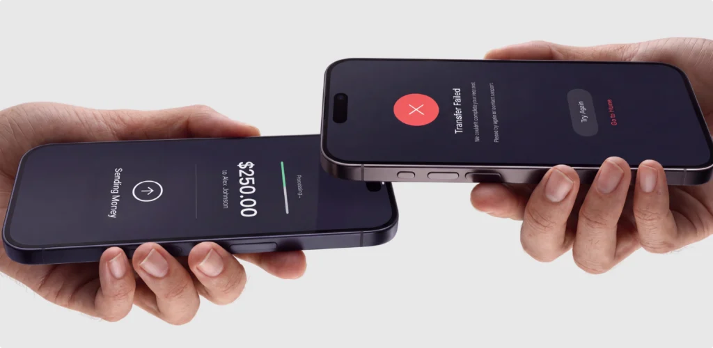
Recovery also depends on where the user returns after the error. Losing all entered payment details makes a failed attempt more frustrating and increases the chance of another mistake. In many cases, the user can return to the previous screen with the details still available for review. Where a retry is allowed, the action should appear only once the system has confirmed that the first request will not continue processing.
Also necessary to mention that some errors take longer to resolve. In such scenarios, a notification can update the user once the payment reaches a final state, so they do not have to reopen the app and check repeatedly.
Fintech teams often face the same question when adding a security control: how much extra effort will it create for the user? The concern is understandable. Another verification step can slow down a payment or block access at a sensitive moment. Still, the friction usually depends on how the control is introduced and how well the product explains it.
Consider a login from a new device. Security may require an additional check because the risk is higher than during a regular login. Engineering determines which device signals are available, while UX decides how the request appears in the flow. If these decisions are made too late or in isolation, the user may see a generic warning and have no idea why access has changed.
Working together earlier gives each team more useful options. Security can define the risk that must be addressed, while engineering can explain what the system can detect in real time. UX can then present the check with enough context and design a recovery route for failed verification.
All of this appears as one product decision for users. They see an extra code request or a restricted action, rather than the teams behind it. Security becomes easier to accept when the reason is understandable, and the next step matches what the system can actually support.
The same coordination that improves security flows also affects the rest of the product. UX may define how a transfer is confirmed or how a restriction is explained, but the quality of this experience depends on what the system can actually provide.
A payment status is a useful example. Design can give each state a distinct label, yet these labels are only accurate if the backend receives the right response and the API passes it to the interface at the right time. If several processor responses arrive under one generic status, the product has little useful information to show. Copy cannot solve a gap in transaction logic.
Architecture also influences decisions that users eventually see on screen. Data may pass through several services before a balance is updated, and each delay or mismatch affects the final record. During fintech software development, UX and engineering benefit from reviewing these flows together. Designers gain a better sense of which states are available, while developers see where the interface requires more context than the current system provides.
If you are planning a fintech product, it is worth considering a team that handles both design and development. Separate vendors can work well, but every handoff adds room for missed context, especially when the interface depends on backend logic or API limitations. UITOP is a full-service agency, so our designers and developers work on the product together. This makes it easier to resolve technical constraints early and carry the original UX decisions into the final solution.
Our agency also has extensive experience with fintech products. Here are just a few examples from our fintech portfolio.
MedTax is a Canadian accounting firm working mainly with healthcare professionals and medical businesses. Its team had been managing client transactions through spreadsheets and several separate tools. The biggest source of manual work was categorization.
The task was to bring this work into one platform. UITOP designed and developed Pacioli, a web application for the accounting team, along with a mobile app for MedTax clients. Overall, we worked on Pacioli as one product team, from the first user flows through release.
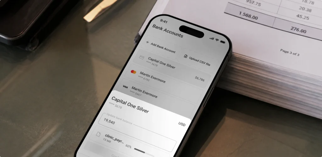
The accountant workspace was designed alongside the bank integrations and processing logic behind it, so technical decisions were discussed while the interface was still taking form. Two full-stack developers built the web and mobile products. QA checked financial data and transaction edge cases, while DevOps and project management stayed involved through delivery.
The project results include:
TangoPay is a SaaS platform for international money transfers. Our task was to make the product easier to use while accounting for the amount of information involved in sending money across borders.
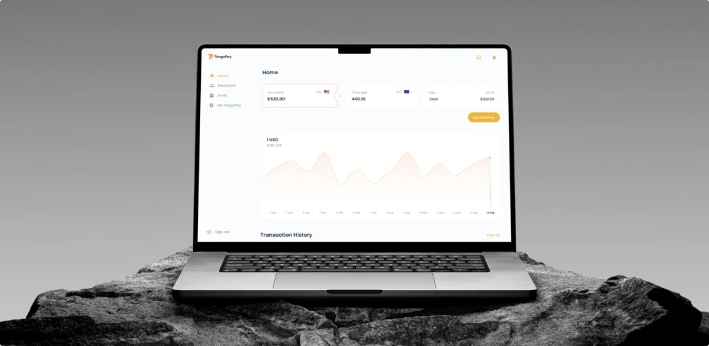
One of our solutions was the exchange-rate calculator. After choosing the currencies and entering an amount, users could see an estimate based on the latest available rate. Our team also revised document submission. Users can now scan a document with their phone, while the app adjusts the image and checks whether the required details are visible.
When it comes to the back office, UITOP designed a dashboard that brings transaction records, reports, and account management into one workspace. A Material UI 3 component library supported the project’s scale and gave the product team reusable interface elements for implementation. This was especially useful across a product containing more than 350 screens.
The results were:
Having design and development in the same team helps, but coordination alone does not guarantee that they are solving the right problem. Discovery gives both sides a shared direction.
Take a transfer that is held for manual review. The team first has to understand what triggers the review and what information the operations staff can return. This affects the status shown in the interface and the explanation support can give to the customer.
Regulatory rules can also influence the flow much earlier. If compliance limits who can use a feature or requires additional checks at a certain amount, these conditions belong in the product logic from the beginning. Adding them later often means revisiting both the interface and the architecture.
A product discovery process brings these questions into the same discussion as user scenarios and business operations. It gives designers a more accurate view of the service they are designing, while developers can see which system states and integrations the fintech user experience depends on.
A related idea is UX-first development, where the team works through how a person will use the product before the build is divided into separate technical tasks.
At UITOP, this is how we approach our fintech product design services. Our designers and developers start discussing the same flow early, while there is still time to adjust both the interface and the technical setup. Development is based on more than a set of finished screens.
Consider a KYC application sent for manual review. The product still has to show a useful status during that period and return the user to the right place once the review is complete. When this part is discussed early, engineering has a fuller view of the process it has to support. Design also stays grounded in the data the system will actually provide.
The same approach helps with payment flows, where several responses can appear between submission and completion. Working through those states before implementation tends to reduce missing cases and late revisions. It also gives users more consistent information, which matters when they are deciding whether to trust the product with another transaction.
Let's build your SaaS product
Whether you're starting from scratch or scaling an existing platform, we're here to help.
Contact usSo, users form trust over months of using the product. A customer might send several transfers and barely think about them because the amounts and statuses remain accurate. Then one payment takes longer than expected. At this point, the product has to show where the money is and update the record once the processor responds.
This is also where post-launch work frequently matters. If customers repeatedly contact support about the same pending status, the problem might be partly in the wording and partly in the data available from the backend. Changing the message alone will not help much if every processor response still appears under one generic label.
Teams should learn from these cases and adjust the product over time. Some changes may be small, though users notice their effect: fewer unexplained delays, more accurate account records, and more. The engineering behind these updates matters as much as the screen itself.
This is the approach we follow at our UX-first product design and development company: UITOP. Our designers and developers review real product use together, so improvements account for both the interface and the systems behind it.

The examples in this article lead back to one point. The interface can only show what the product behind it knows. If a payment processor returns limited data, the status in the app will be limited too. And if an account restriction has no defined communication process, the designer has little useful information to give the customer.
Trust comes from how these decisions connect. UX affects what the customer understands, while architecture and development determine whether the information is accurate and arrives on time. Security also affects the experience each time access is checked or an action is restricted.
Fintech products tend to earn more trust when the people responsible for these areas work on the same product. At UITOP, we combine UX/UI design and development in one agency. Contact us to discuss your fintech product and see where a better product process could improve customer trust.
Users typically begin by checking whether the app gives an accurate account of their money. A transfer left pending needs a status that explains what has been processed and what remains unresolved. Fees matter at approval, while an account restriction requires context before the customer contacts support. No single screen settles the question. Trust develops through repeated use, as the customer sees that balances update and earlier promises hold. This record makes people more willing to rely on the app for larger amounts and for financial activity they consider important.
KYC drop-off frequently starts before the document check itself. Users are asked to share sensitive information with a company they have only just encountered, so the flow has to explain why the request appears and what review follows. The upload stage deserves attention. A generic rejection sends people into trial and error; specific guidance gives them a chance to correct the photo. Waiting needs context as well. If the check goes to manual review, the app can show that status and say when another update is likely. This leaves compliance rules intact while removing reasons for users to abandon the application.
Performance matters in fintech because a delay can look like a problem with their money. After a transfer is confirmed, a frozen screen does not indicate that the request reached the system. Some users submit it again; others contact support to check whether the first attempt exists. Both reactions come from the lack of feedback. Delays from banks or payment processors will still occur, but the app controls what appears during the wait. So, in fintech app development, this period deserves its own state. A visible processing message and later status update help the customer decide when further action is necessary.
Security tends to work better when it enters the product flow. Consider a login from a new device. The extra verification has a valid purpose, but the user needs to know why access changed. This explanation depends on the teams working from the same risk scenario. Security decides when the check applies. Engineering exposes the device signal to the product, and UX places the request where it makes sense. Recovery belongs in that discussion too, since failed verification can lock out a customer. When the teams decide these details together, protection is less likely to appear arbitrary during account use.
Product design influences how a product explains its rules and reflects system behavior on screen. The work becomes important after a payment is submitted, while the processor has yet to return a result. The interface needs a state for that wait. How useful it is depends on the information available from the backend. Designers work with development. API limits affect what users can see, while compliance rules determine when actions are available. Bringing these constraints into the design process makes implementation easier and reduces the chance of releasing a flow that ends with a misleading status or no next step.