How we use AI in our process
Product, Development
/
Oct 05, 2026
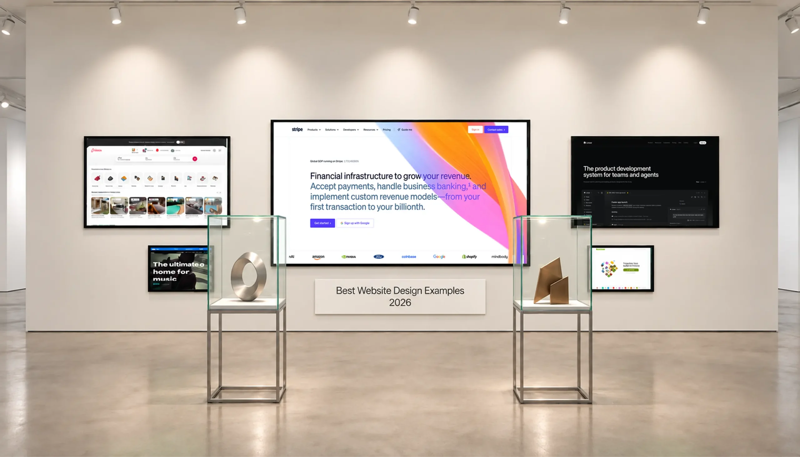
Finding website inspiration is easy. Figuring out why a website actually works is a different story.
A lot of design roundups focus on how a site looks. You’ll see beautiful pages, bold animations, and clever layouts. And sure, they can spark ideas. But good website design goes further. It should help people understand what you offer, find what they need, and know what to do next.
The strongest websites make that journey feel natural. They explain the product clearly, build trust, and remove unnecessary friction along the way.
In this guide, we look at best website design examples through a UX lens. We’ll focus on clarity, navigation, visual hierarchy, usability, trust, and conversion.
The goal? Find design decisions worth borrowing, rather than screens worth copying.
So, what actually makes a website good?
For us, it starts with one simple question: can users figure out what to do?
People typically visit a website with a specific goal. Maybe they want to compare products, check pricing, read documentation, or buy something. A good website helps them get there without making them work too hard.
Visual style still matters, of course. A strong brand can make a website memorable. Good typography and imagery can also make information easier to understand.
But a trendy layout cannot fix confusing navigation.
Here are the things worth paying attention to:
| UX criterion | What to check | Potential effect |
|---|---|---|
| Clarity | Can visitors explain the offer quickly? | Faster understanding |
| Navigation | Can users predict where each link leads? | Less searching |
| Visual hierarchy | Is the primary information easy to scan? | Better comprehension |
| Usability | Can users complete key tasks without confusion? | Fewer friction points |
| Accessibility | Can different users interact with the interface? | Broader usability |
| Responsive design | Does the experience work on smaller screens? | Consistent access |
| Trust | Does the site answer important concerns? | Lower perceived risk |
| Conversion | Is the next action clear and relevant? | Smoother decision paths |
These things are connected.
For example, a clear headline can help visitors understand the product. Good navigation can then help them find more details.
That combination matters much more than having another impressive animation.
A solid user experience design service looks at the whole journey. The team needs to understand users, their goals, the information structure, and the product itself.
Need a better design direction?
Turn website inspiration into ideas that fit your product
Contact usSome products are easy to explain.
“Book a hotel.” “Buy shoes.” “Order food.”
Others need a few more sentences.
Payments, developer platforms, collaboration tools, and cloud infrastructure come with far more complexity. These products have plenty of features and several types of users.
Below are good examples of handling that complexity without throwing everything at visitors at once.
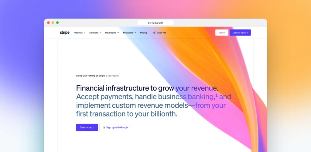
Stripe has a lot to explain.
There are payments, billing, financial products, developer tools, and plenty of technical details. Putting all of that on the first screen would be overwhelming.
Instead, Stripe keeps the first step simple. Users can then move deeper when they need specific information.
This is a useful example of progressive disclosure. You don’t have to explain everything immediately. Give people enough context to decide where they want to go next.
For B2B websites, this pattern can prevent the homepage from becoming a product encyclopedia.
A business decision-maker may only need the basic value proposition. A developer might want API documentation five minutes later. The website needs to support both without confusing either person.
So, start simple and give users more detail when they need it.
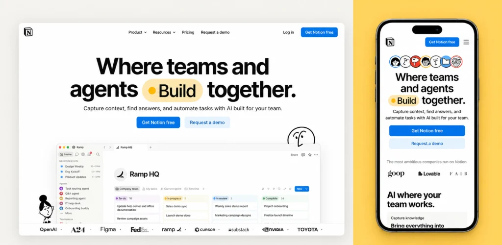
Notion has almost the opposite problem.
The product can be used for notes, documents, databases, projects, wikis, and much more.
That flexibility is useful but it can also leave new users wondering where to start.
The interface handles this through familiar structures. The sidebar gives users a clear sense of where they are. Pages, databases, settings, and other areas have recognizable places.
The same idea can work on a marketing website.
If your product has dozens of possible use cases, don’t make visitors figure out all of them themselves.
Give them clear paths based on what they are trying to accomplish. Show possibilities without making visitors map the whole product on their own.
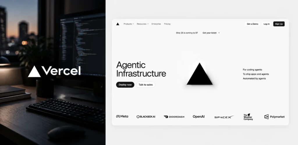
Vercel speaks to developers, teams, and companies, so there’s a lot to explain.
Terms like deployment, preview environments, frameworks, and infrastructure can sound pretty abstract on their own. Vercel makes these ideas easier to understand by showing how they work in the product.
You can see the interface and workflows instead of reading through a long list of features.
That’s especially useful for complex products. A screenshot can often explain something faster than a generic illustration ever could.
A good product preview should answer three simple questions:
If your product is visual, let the interface help explain the value.
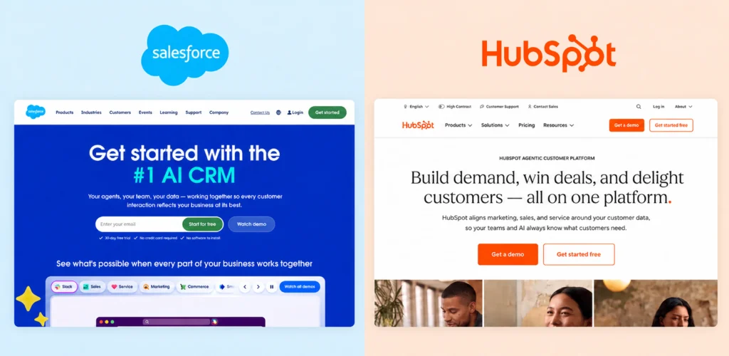
Salesforce and HubSpot both offer broad B2B platforms with many connected products.
Their websites need to serve different audiences. A sales leader may look for pipeline tools. A marketer may need campaign automation. A support team may search for customer service features. A technical team may want to understand integrations.
Both platforms make this complexity easier to navigate through clear product categories and business functions.
Visitors can start with the area closest to their work. From there, they can explore related tools, features, and use cases.
This approach helps people understand a large platform without exploring every product at once.
The idea is to give visitors a starting point that matches their goal.
The homepage introduces the bigger picture. Deeper pages answer more specific questions.
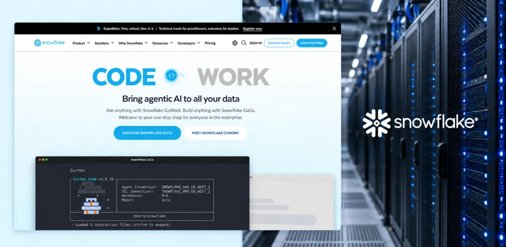
Snowflake serves technical teams working with data, analytics, applications, and AI.
There’s a lot of technical detail behind the platform. The website organizes that complexity through product areas, use cases, resources, and solution pages.
This gives different audiences several ways to find relevant information.
A developer may start with documentation or a technical feature. A business leader may look for data strategy or business value. A data team may search for a specific workload or integration.
This works for pretty much any technical product. Give people several clear ways into the same product.
Some visitors start with a use case. Others start with a product feature, industry, or technical question.
Navigation can make or break a website. And there’s a simple way to test it.
Ask yourself: “I’m a first-time visitor. I know what I want. Can I figure out where to go?”
Airbnb, GOV.UK, GitHub, Spotify and Duolingo approach this problem in very different ways. They’re also good website examples of how navigation can adapt to different user goals.
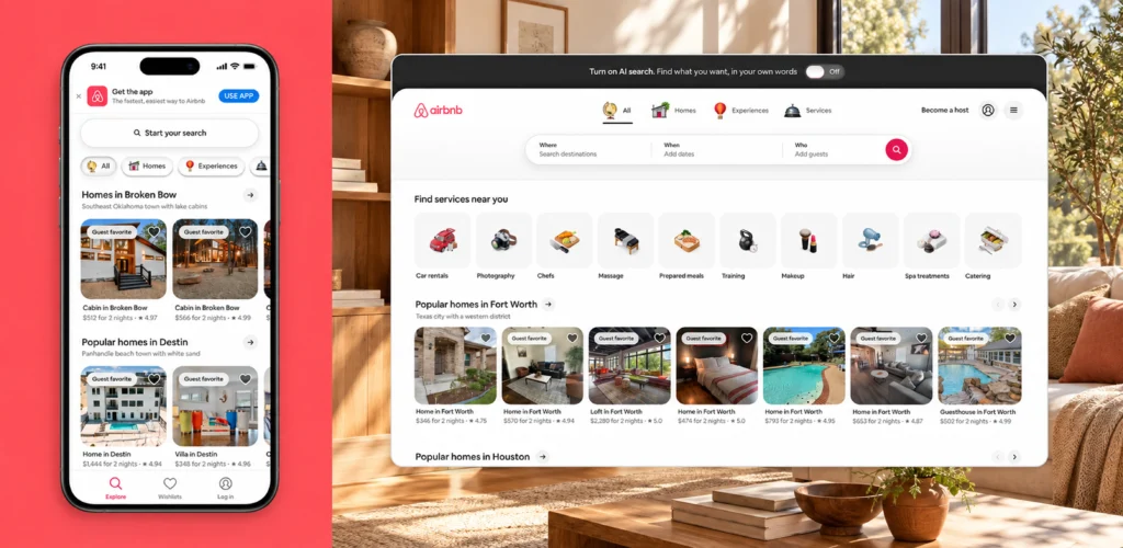
When people visit Airbnb, they usually have a clear goal - they want to find somewhere to stay. That makes search a natural starting point.
The experience puts the important decisions close together. Location, dates, guests, and search all sit around the core task. There is very little need to explore the website first.
This pattern can work outside travel too.
If visitors usually come to your website with one specific goal, make that goal easy to start. Don’t make them walk through your company story before they can get to the useful part.
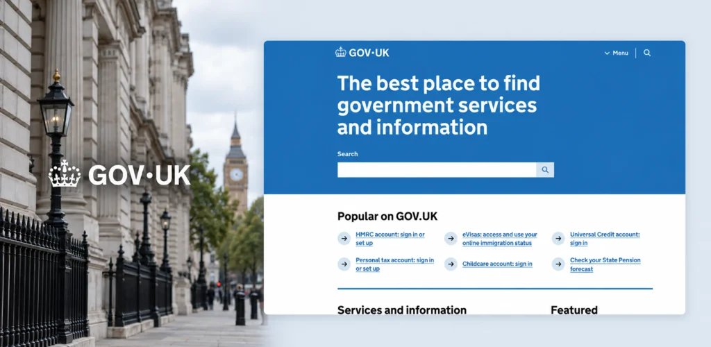
Government websites have a tough UX problem.
There are departments, regulations, forms, services, and endless amounts of information.
Most people don't care which department owns a particular service. They care about getting something done.
GOV.UK structures much of its experience around those tasks. The design system also includes patterns for navigation, journeys, components, and accessibility.
This is a useful lesson for any content-heavy website.
Your internal organization probably makes perfect sense to your team. It may mean very little to someone visiting for the first time.
So, organize information around user goals, not your org chart.
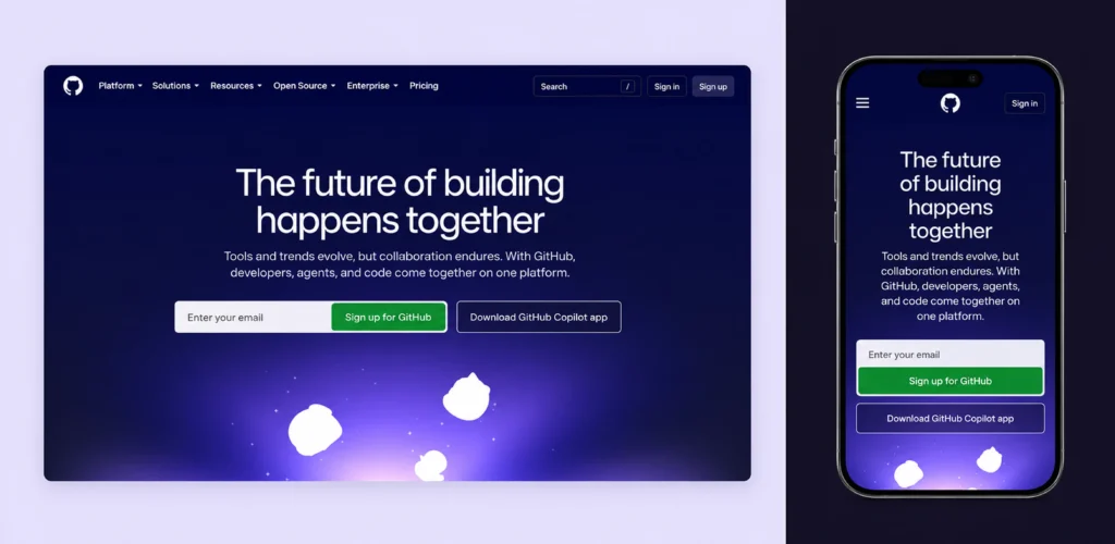
GitHub has a huge range of users.
Developers might want repositories or documentation. Team lead may want collaboration features. Companies may be looking for security or enterprise features. One navigation structure has to serve all of them.
The key is giving different users relevant paths without making the whole experience feel complicated.
This is especially important for B2B products.
Your visitors may have very different reasons for arriving on the same page. Think about those reasons when you build your navigation.
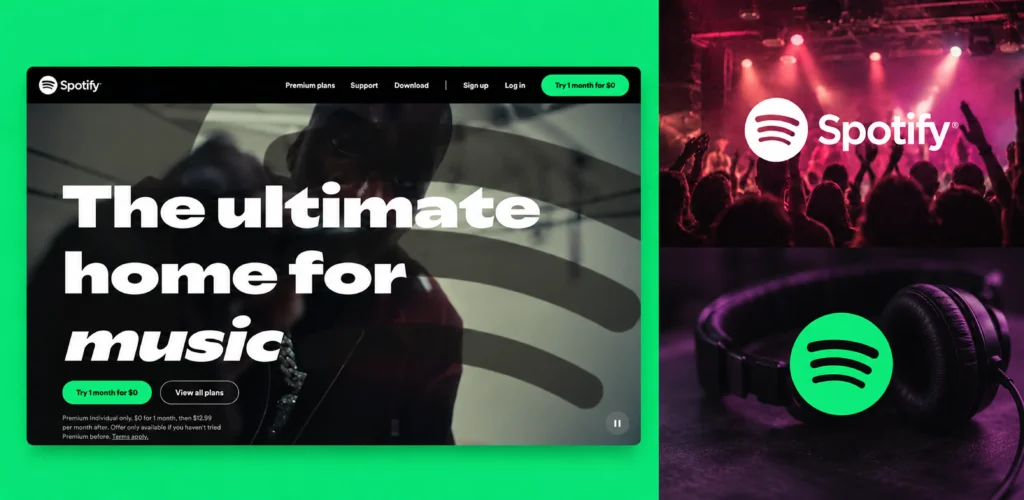
Spotify has several types of visitors. Some want to start listening. Others want to learn about Premium, compare plans, or manage their account.
The website keeps these paths easy to recognize. Visitors can quickly understand where to go based on what they want to do.
The main action stays clear, while other options remain available through the navigation.
This is useful for products with both free and paid experiences. The website needs to support discovery, conversion, and returning users without making the first step confusing.
For subscription products, that’s a useful approach. It makes the first step clear, then gives visitors room to explore when they need more information.
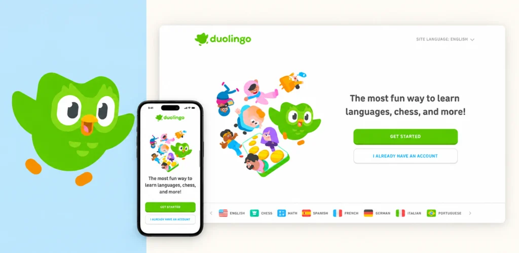
Duolingo has a simple goal: help people learn a language.
Its website supports several related goals. Visitors can learn how the platform works, explore language options, compare subscription plans, or start learning.
The navigation and page structure help users move from interest to action. Each step answers a natural question before introducing the next one.
That matters for products built around ongoing use.
People need to understand the value quickly. Then they need an easy way to begin or continue.
For your own website, think about the journey in small steps. What does a new visitor need to know first? What should they do next? Which information can wait until later?
Trust usually comes from small details.
People want to know how much something costs. They want to understand what they’re getting. They may also want reviews, examples, guarantees, policies, or proof.
Wise, Monzo, Shopify, and Patagonia handle these questions in different ways.
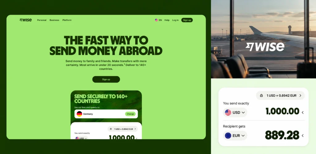
Financial products come with an obvious concern: money is involved.
People want to know the fees, exchange rates, transfer details, and what to expect.
A strong financial product website should make these details easy to understand.
The UX principle here is transparency before commitment.
This is a useful pattern for any product where price or risk matters.
Give people the information they need before asking them to take action.
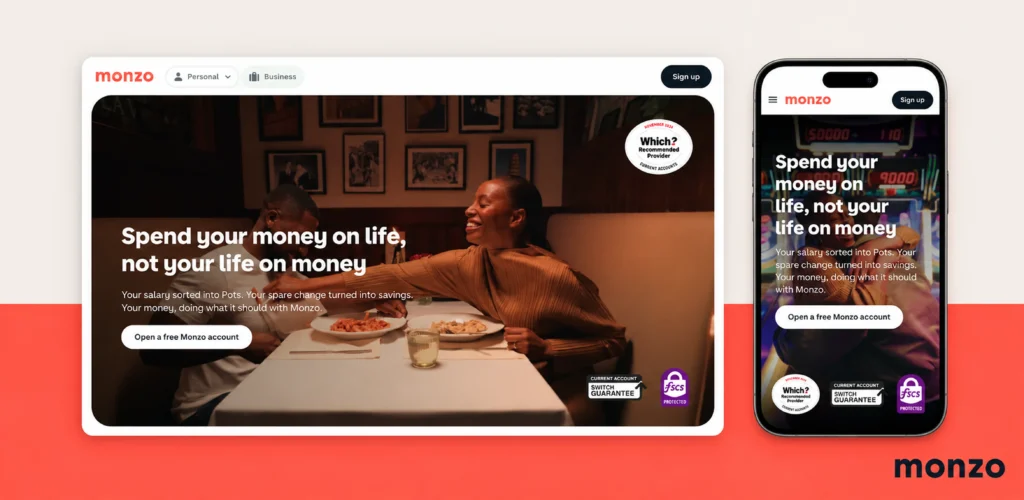
Banking websites can easily become full of financial terms, conditions, and product details.
Monzo takes a more approachable route. Its website explains banking products with simple copy, clear sections, and practical examples.
This matters because people may understand the product category but still have questions about how it fits into their everyday life.
Clear content is part of good UX, especially when the product itself is complex.
When visitors can quickly see what a product does, what it costs, and why they might need it, they have less work to do before making a decision.
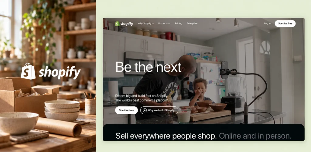
Not everyone visiting Shopify is ready to start selling today.
Some people are still researching. Others are comparing platforms. Some already know what they want and are ready to get started.
The website supports these different stages with product information, examples, resources, and clear next steps.
This is worth thinking about when designing a conversion path.
One CTA doesn't have to do everything. A new visitor may need more information. Someone who has already made up their mind may need a much shorter path.
So, the goal here is to give people a next step that matches where they are in the decision process.
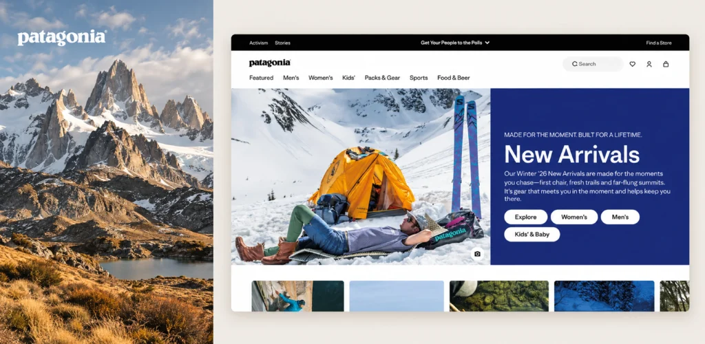
Patagonia is an interesting example because its brand values show up throughout the website.
You’ll find areas focused on repair, resale, environmental topics, and community alongside the shopping experience. Those choices make the brand feel consistent.
The UX lesson here is broader than sustainability.
If your company has strong values, they should show up in the actual experience. Your content, navigation, imagery, and product experience should tell a similar story.
Trust gets stronger when what you say and what you do feel consistent. Сonversion can benefit from this consistency because visitors receive fewer conflicting signals.
Modern websites often use large typography, motion, immersive visuals, and interactive storytelling.
These techniques can make a website memorable. They can also make a simple task harder.
Linear, Webflow, Framer and Apple show different ways to connect visual expression with UX.
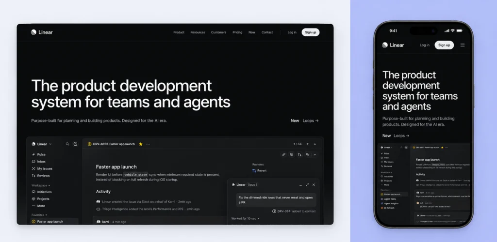
Linear has a very recognizable visual language. But the more interesting part is how its product is presented.
Product motion can demonstrate how an interface behaves. That makes animation more informative than decorative.
For SaaS websites, this can be especially useful. A short interaction can explain a workflow faster than several paragraphs.
The animation has a job. It helps people understand the product.
Use motion to show how things work and explain key interactions.
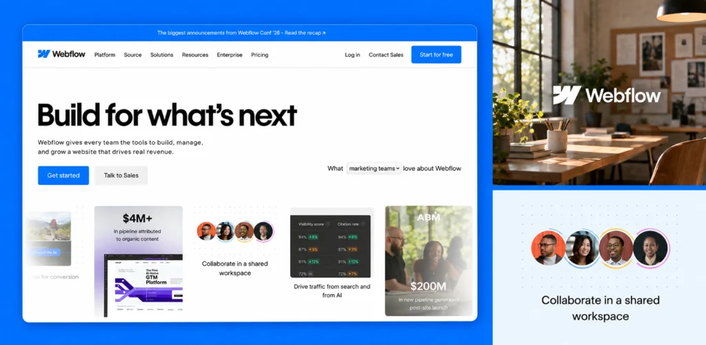
Webflow is a visual product, so its website has an advantage.
Visitors can see the type of work the platform enables.
Interactive sections and product visuals help bridge the gap between a feature description and the actual experience.
This approach can work for any product where screenshots or demos communicate value quickly.
Sometimes people understand an interface faster by seeing it than by reading about it.
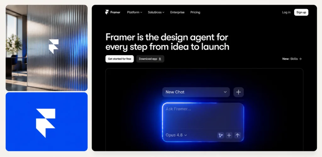
Framer is a good example of a website where interaction is part of the visual experience.
The site uses animation, scrolling effects, and interactive elements to show what the platform can create. This makes the website itself feel close to the kind of work users can build in Framer.
That creates a nice connection between the brand and the product. Visitors don’t just read about visual effects. They experience them while moving through the site.
For creative products, this can be a strong way to show what the tool is capable of. The website becomes a small example of the product itself.
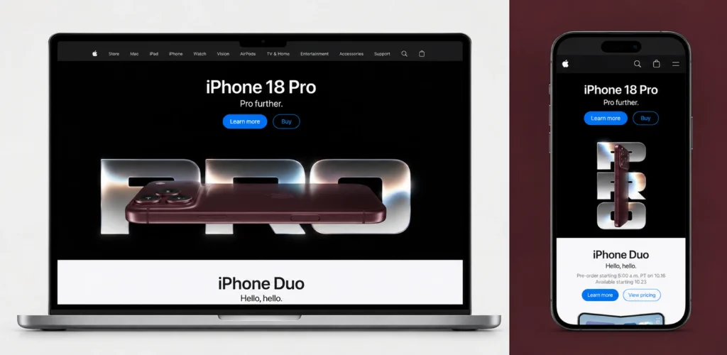
Apple is probably one of the most recognizable examples of visual storytelling.
Large images create focus. Short pieces of copy give visitors one idea at a time. Calls to action stay easy to spot. The experience feels carefully paced.
There’s also a clear connection between products. For example, Apple's Mac pages explain how Mac and iPhone features work together.
The important idea here is controlling attention, rather than making everything huge.
Each section has a clear purpose.
Motion and visual scale work best when they help people know where to look next.
There’s an easy trap when looking at website examples. You see the desktop version and assume the design works.
Then you open it on your phone.
Suddenly, the navigation is awkward. The text is tiny. The important button is halfway down the page.
A good responsive experience needs more thought than simply shrinking a desktop layout.
Content may need to move, navigation to change and some interactions may need a completely different treatment. The important thing is keeping the main task intact.
Accessibility deserves the same attention.
Readable text, visible focus states, useful labels, keyboard interaction, and sufficient contrast all affect usability.
You also shouldn't assume a site meets accessibility standards just because it looks accessible. Proper testing is needed before making that claim.
Think about accessibility while designing the experience. It becomes much harder to fix structural problems later.
After looking at all these examples, a few patterns stand out.
The websites look very different.
Some are minimal. Some are highly visual. Some have lots of content.
But the underlying thinking is surprisingly similar.
These details may seem small. Together, they can make a huge difference to how an experience feels.
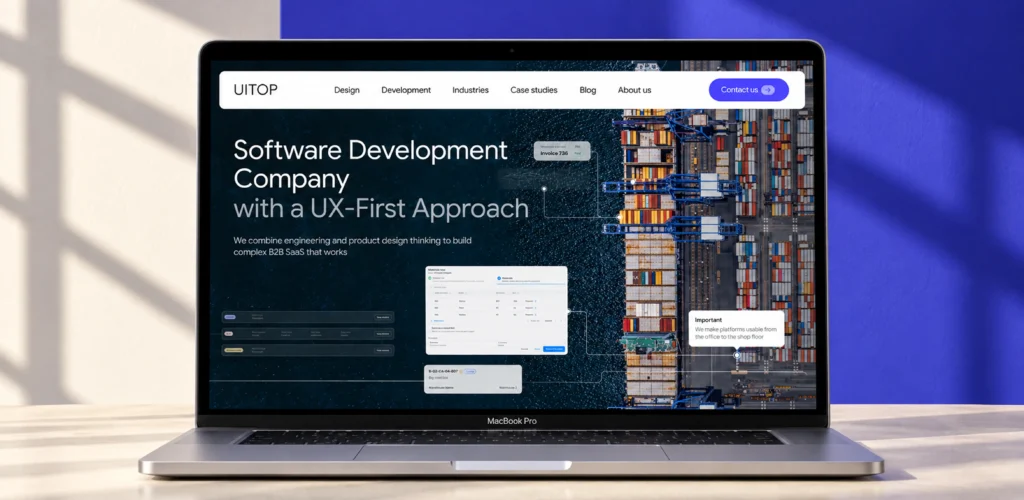
Looking at other websites is useful. Copying them without understanding the context usually isn't.
Here are a few mistakes we see pretty often.
A beautiful hero can look like the magic ingredient. Usually, there is much more happening underneath. The layout may work because the brand is already familiar. The product may be easy to understand. The rest of the page may provide strong proof.
Take the idea behind the design. Don't automatically take the layout.
Award-winning websites are great for visual inspiration. They also tend to prioritize experimentation. Your SaaS product may need a completely different balance. Your users may care more about speed and clarity than visual novelty.
Both approaches can be good. They simply solve different problems.
This happens a lot. The layout looks perfect with short headlines and neat three-word labels.
Then real content arrives.
The headline is twice as long. The product has six pricing options. The FAQ has 20 questions.Suddenly the beautiful layout starts falling apart.
Design should account for real content from the start.
A design can look great on a large monitor. That tells you very little about the mobile experience.
Check navigation, content order, buttons, forms, tables, and key actions on smaller screens.
A marketplace and a SaaS dashboard have different jobs. So do an editorial website and a fintech app.
The same applies to B2B products with very different workflows.
For example, we worked on an AI-powered B2B SaaS platform for managing delivery costs across couriers and parcel carriers. The goal was to cut logistics costs and make carrier management easier.
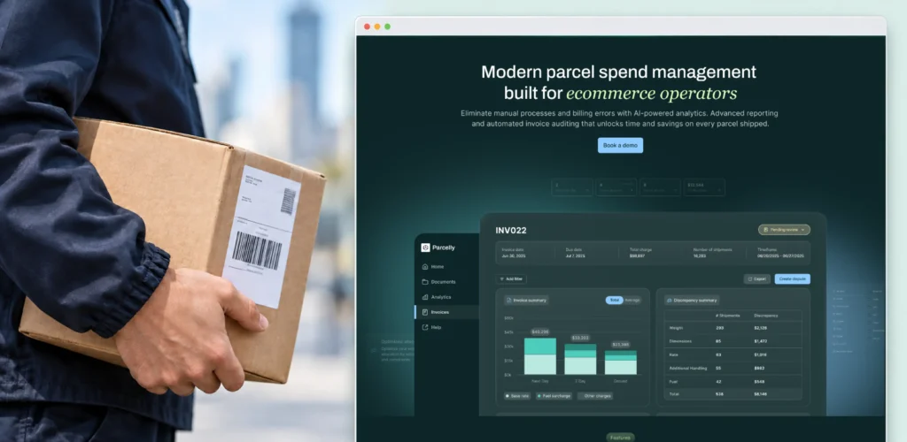
The product needed to support decisions around delivery spending, carrier performance, and logistics operations. Borrowing familiar patterns from other SaaS products without considering these workflows could easily add unnecessary steps.
The interface had to reflect how logistics teams actually work and what information they need to make decisions.
This is why it’s important to understand why a pattern works, not just how it looks.
A design that fits one product may be completely wrong for another.
Always ask what problem the original pattern was solving.
A screenshot shows one moment. UX happens across a sequence of actions.
Ask what happens before and after that screen.
What brought the user there?
Where does the click take them?
What if they make a mistake?
That reveals much more about usability.
Before saving a website as a reference, spend a few minutes actually using it.
Here’s a simple way to do it:
This is close to how a structured UX audit approaches an experience.
The difference is that an inspiration review studies someone else's product. A UX audit looks at your actual users, flows, and business goals.
That distinction matters because a pattern that works for Airbnb may make little sense for your product.
Found a website you really like? Great.
Now resist the urge to copy it.
Start by asking yourself what you actually like about it.
Is it the easy navigation? The way it explains a complex product? Or maybe how clearly it highlights the main action? That’s the part worth taking with you.

Once you spot the idea, try it on your own product. Look at your users, content, goals, and technical limitations. Would the same approach actually make sense here?
Then turn that idea into a simple hypothesis. Prototype it. Put it into a real user flow. Test it and see what happens.
This is where a reference becomes useful. You’re taking an idea and adapting it to your own product.
It also helps you catch problems before development starts. Some ideas look great in a screenshot but are harder to build. Here is more about why strong UX ideas can break during implementation.
Don’t use references as ready-made answers. They give you the starting point. Your users decide whether the idea actually works.
It’s easy to put websites and web apps in the same design bucket. They can even share the same brand. Their UX priorities are often very different, though.
A marketing website usually needs to explain something. People want to understand the product, compare options, and build confidence. Then they need a clear next step.
A web app works differently.
People may spend hours using it every day. They might deal with dashboards, tables, filters, permissions, alerts, and complex workflows.
Here, speed and clarity matter a lot.
Users need to know where they are and what to do next.
The interface also needs to support the way they work.
It’s easy to put websites and web apps in the same design bucket. They can even share the same brand. Their UX priorities are often very different, though.
A marketing website usually needs to explain something. People want to understand the product, compare options, and build confidence. Then they need a clear next step.
A web app works differently.
People may spend hours using it every day. They might deal with dashboards, tables, filters, permissions, alerts, and complex workflows.
Here, speed and clarity matter a lot.
Users need to know where they are and what to do next. The interface also needs to support the way they work.
BoltWise shows why this difference matters.
It’s a B2B SaaS platform we built for industrial distributors and MRO businesses. The platform uses AI to simplify quoting, catalog management, sourcing, and purchase order processing.
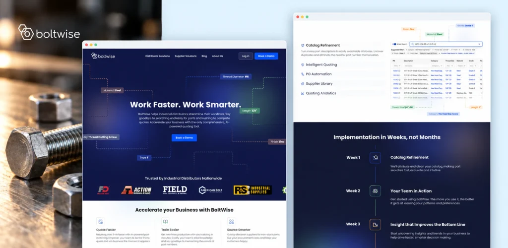
Its users deal with messy RFQs, part numbers, supplier information, ERP systems, and large product catalogs. They need to find the right parts, prepare accurate quotes, and move orders forward quickly.
A marketing-style layout wouldn’t solve these problems. The product needs an interface built around real workflows.
BoltWise brings several connected tasks into one workspace. Users can refine product catalogs, match parts from messy RFQs, find suppliers, automate purchase order entry, and review quoting analytics.
The important part is how these features connect. A distributor doesn’t use them as separate marketing sections. They move between them while completing a task.
The interface needs to make those transitions clear and reduce repetitive work. It also needs to handle complex data without making every screen feel overwhelming.
That’s what makes UX for complex web applications different.
The design has to support real work, rather than just explain a product. Information architecture matters more. So do system states, error handling, permissions, integrations, and repeatable workflows.
So when you look for inspiration, start with the type of product.
A beautiful landing page can inspire your website. It probably shouldn’t decide how your application works.
At UITOP, inspiration is just the beginning.
We usually start somewhere much less glamorous: the actual product problem.
From there, the team can form UX hypotheses and start shaping the experience.
Information architecture gives the product a structure.
The process looks roughly like this:
Business goal - discovery - UX hypothesis - information architecture - prototype - engineering constraints - validation
The point is to connect design decisions with something real.
A reference can show us an interesting interaction. Research and testing tell us whether that interaction makes sense for the product.
That’s the approach behind UITOP’s UX-first product team.
We use inspiration to ask better questions, instead of building copies of someone else’s website.
The best website references give you more than something nice to look at.
They show you how another team solved a particular problem. It could be a smarter way to explain a complex product, organize information, or build trust before asking visitors to take action.
Those are the ideas worth taking with you.
When reviewing best websites, look through four main lenses: Clarity. Navigation. Trust. Conversion.
Then consider usability, accessibility, and responsive behavior.
A great reference should leave you with a question worth testing.
Does this principle make sense for our users?
Does it work with our content?
Can our product support it?
If the answer is yes, you may have found something genuinely useful.
A good website helps people understand what they’re looking at and what they can do next. Clear hierarchy makes content easier to scan. Good navigation keeps people oriented. Relevant proof builds trust. Responsive and accessible interactions make the experience easier to use.
There isn’t one universal winner. Different websites solve different problems well. Stripe handles product complexity. GOV.UK focuses on tasks. Airbnb makes search central. Apple combines brand and storytelling. The best reference depends on your audience and product.
Look at websites in your own industry first. Then explore design galleries and product showcases. Official websites are especially useful because you can study the real experience. Don’t stop at screenshots. Click around, try the main flow, and see how the site actually behaves.
Modern websites often use strong typography, generous spacing, responsive layouts, focused imagery, and purposeful motion. Trends change quickly, though. Good hierarchy and clear interactions tend to stay useful much longer than individual visual trends.
Good design can make the path to action easier. Clear messaging helps people understand the offer. Strong hierarchy helps them find relevant information. Trust signals can reduce uncertainty. Relevant CTAs give users a clear next step. Results still depend on the product and audience.