How we use AI in our process

Design, Product
/
Apr 29, 2026
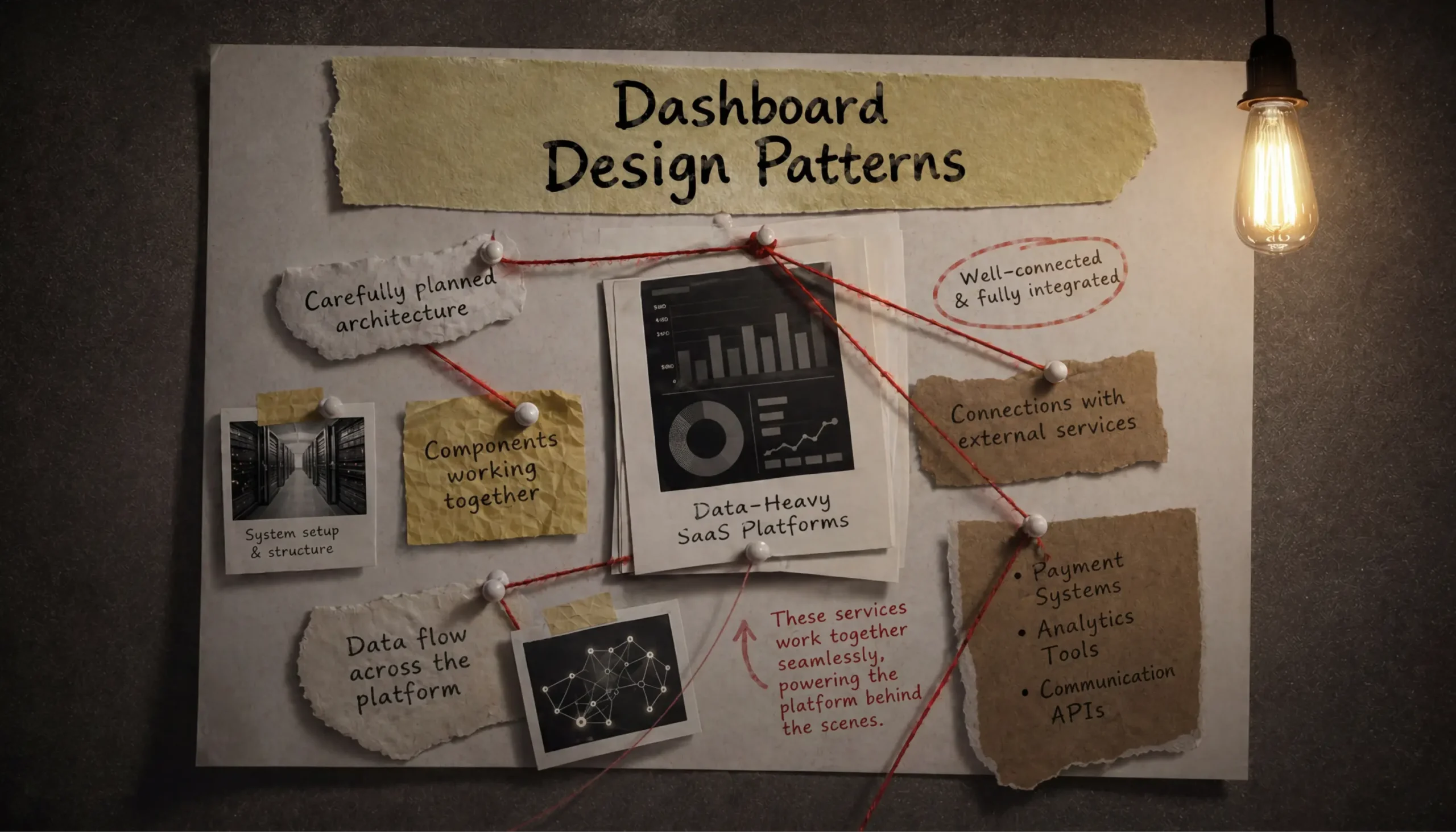
Behind an effective SaaS platform, there are numerous functioning elements. There's a carefully planned architecture - the system setup, how various parts join together, and how data flows among them. Furthermore, there are properly set up connections with external services. These could be payment systems, analytics tools, or communication APIs, and they all work together in the background.
But there’s also the dashboard - the part users actually face when working with the product.
A dashboard does visualize data, but its main goal is to assist users with decision-making. It should help them quickly understand the situation, focus on the most critical aspects, and take the next step without hesitation.
When we speak about data-heavy SaaS platforms like Google Analytics, Salesforce, or Tableau, the challenge becomes even more obvious. These services manage huge amounts of information, which often gets updated instantly, and present it across multiple dimensions. It takes effort and expertise from the teams building these platforms to organize that data in a way that makes working with it as effective as possible.
In this article, we discuss how to approach SaaS dashboard design for such systems.
Discuss project
Need a SaaS UI/UX partner focused on product growth and business outcomes?
Contact usIn many SaaS products that are rich in data, the dashboard, from the perspective of a user, can be considered as the product itself.
Take CRMs like Salesforce. The sales personnel spend their whole day in dashboards - they track deals, monitor the health of pipelines, and determine what needs follow-up actions. If important metrics are hidden or spread out, it can lead to wasted time searching for them or, even worse, making decisions with partial information.

In fintech tools such as Stripe or QuickBooks, dashboards carry weight, too. Fintech platforms’ users deal with money, cash flow, risk. If revenue trends, failed payments, or anomalies aren’t immediately clear, users may not be able to react in time, and this may have direct financial consequences.
This is the reason why dashboard design is very much related to making decisions, efficiency, and real results in business. A clear format, properly organized order, and careful data visualization have a direct impact on how fast a person evaluates a situation and what they choose to do after that.
There are plenty of principles behind a well-designed dashboard, but if you have to start somewhere, start with prioritization.
The main problem in data-heavy dashboards is overload, when too much data is presented at the same time. This means users are faced with dozens of metrics, charts, filters, and tables competing for attention on a single screen. There’s no clear starting point, no obvious priority.
From a design perspective, overload is closely tied to cognitive load. The more information a user has to process at once, the more effort it takes to make sense of it. And in SaaS scenarios, whether it’s sales tracking, financial monitoring, or operations, users often don’t have time for that. They need clarity.
What helps address data overload is a clear information hierarchy. At our SaaS design and development agency, we put a lot of emphasis on data hierarchy in every project.
We define primary, secondary, and tertiary information. Primary data is what drives decisions and needs to be visible immediately, like KPIs, alerts, anything that requires attention. This is what users should see first, without scrolling or searching. Secondary information adds context: trends, comparisons, breakdowns. Tertiary data is detailed and exploratory, it’s there when users need it, but it doesn’t compete for attention.
| Level | What it actually is | How it’s displayed on a dashboard |
| Primary | Key metrics that reflect the current state of the business and require immediate attention | Placed at the top, visually prominent, easy to scan within seconds |
| Secondary | Data that helps explain and add context to the main metrics | Placed with primary data, often as charts or grouped insights |
| Tertiary | More detailed data used when deeper analysis is needed | Shown in tables, drill-downs, or secondary views |
If the hierarchy is clear, a user can open a dashboard and grasp the situation almost immediately. The metrics are easy to scan. If something is incorrect, it’s visible without effort. From there, they can move to supporting data to understand what’s driving the change, and then go deeper if needed.
What if your primary data isn’t just a handful of metrics, but dozens? That’s a common situation in data-heavy SaaS. For instance, a finance lead tracks revenue, costs, margins, cash flow, forecasts. All of these can be important at the same time.
You’ve already prioritized, defined hierarchy, and still, there’s more “important” data displayed on one screen.
At this point, prioritization alone won’t carry the whole experience. You need a way to move through the data. This is where filtering assists.

Filtering helps narrow the focus to the current task. Even within one role, people constantly switch context. A finance lead reviews this month’s performance, then checks last quarter, then looks at a specific business unit. Filters, like date ranges, segments, categories, simplify the tasks.
Drill-down plays a different role. It connects primary data to secondary and tertiary layers. For example, a top-level metric shows revenue. Click into it, and you get a breakdown by segment or product - this is your secondary layer, adding context. Go one step further, and you’re looking at individual transactions or accounts - the tertiary layer, where detailed analysis happens.
Here’s what this flow might look like:
So far, we’ve mostly discussed dashboards from the perspective of one role: one user, one set of priorities, one way of working. But real products rarely look like that, as one product can often be used by several specialists. This adds another layer of complexity.
Take CRM dashboard design for different user roles as an example. A sales rep cares about their pipeline, upcoming deals, and follow-ups. A sales manager, in turn, assesses the team performance, conversion rates, and forecasts. An executive wants a high-level view - revenue, growth, overall health of the pipeline. Same system, same underlying data, completely different expectations.
There are a couple of ways to approach this.
One option is role-based dashboards. This is when each role receives a tailored view with its own structure and priorities. This works well when workflows are clearly defined. Sales reps open their dashboard and see exactly what they need. Managers get a different layout, built around their decisions.
Another option is a shared dashboard with customization. The structure stays consistent, but users adjust what they see - rearranging widgets, applying saved filters, choosing which metrics appear. This works better in systems where roles overlap or vary across teams.
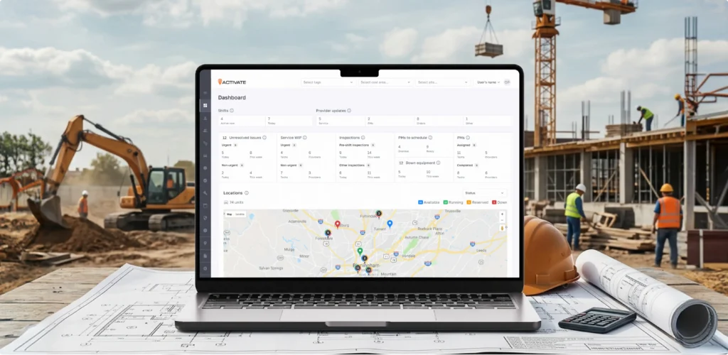
Let’s see how this works in a real product, one of our clients, Activate. It’s a fleet management platform working with multiple roles inside one system: managers, fleet managers, drivers, and mechanics.
Each role needed a different view of the same system, while staying connected through shared, real-time data.
Our team at UITOP designed a centralized ecosystem where each role has its own workspace, built around its responsibilities:
And here are the results we managed to achieve for the business:
And then there’s real-time data. This adds one more layer of complexity. Data often changes while the user is looking at it.
First, updates need to be predictable, as not every change deserves immediate attention. High-frequency updates can be grouped, delayed slightly, or reflected through subtle indicators. For example, a small “updated just now” label or a gentle highlight on changed values works better than numbers constantly flickering.
Statuses help anchor real-time data. This way, users can rely on clear states: active, delayed, completed, at risk. This reduces the need to interpret every number.
Visual cues do the rest of the work. Color, icons, small animations, when used carefully, can draw attention to what actually changed. The key word here is carefully. If everything is highlighted, nothing stands out. One or two meaningful signals are enough to guide attention.
All of this ties back to cognitive load. Real-time data naturally increases it, because the interface keeps changing. Good design keeps this load manageable.
We recently worked on WingWork, an aviation maintenance platform used by mechanics and operations teams working with constantly updating data.

In this environment, aircraft statuses change throughout the day, maintenance updates come in continuously. At the same time, teams rely on historical data to plan maintenance and avoid future problems. Bringing all of this into one dashboard requires careful structure, otherwise the interface quickly becomes hard to read.
This is exactly what we addressed in the WingWork case.
The UITOP team redesigned the dashboard around two clearly separated areas:
This made the interface much easier to work with. Real-time updates became clear and easy to track, while detailed information stayed available for deeper analysis.
Results:
There are plenty of SaaS dashboard design trends, and UI patterns do matter in data-heavy SaaS. At the same time, when the system is complex, visual experiments need some discipline.
What helps are a few SaaS dashboard design patterns that make the interface predictable and easy to work with.
KPI blocks come first. With their help, you can open the dashboard and see the main numbers right away, like revenue, users, tickets, whatever drives the product. Clear label, clear value, maybe a small change indicator.
Alerts take care of priority. Something drops or goes out of range - it’s marked. A color change, a small icon, sometimes a short note. Enough to catch attention.
Trends answer the next question: Is this normal? A small line chart or percentage change next to the number does the job. You glance at it and immediately understand the direction.
Comparisons give numbers meaning, like this week next to last week. That’s where patterns become recognizable.
Breakdowns are where people usually click next. You see a number, you want to know what’s behind it. Split by region, product, customer type - whatever makes sense for the product. This is where decisions start forming.
And then there’s progressive disclosure. The main screen stays focused. More detail opens up when you interact - click, expand, drill down. You don’t see everything at once, but you know it’s there.
Let’s shift focus at this stage and look at what tends to go wrong in real dashboards. These are the main UX mistakes in data-heavy systems we keep noticing, especially when clients come to us for a redesign.
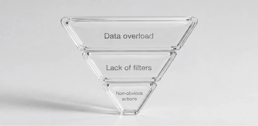
Data overload usually is placed at the top of the list. We’ve already mentioned it earlier, and for a reason. It keeps repeating across projects. Teams add metrics over time, each one justified, until the screen becomes overloaded.
Poor hierarchy often goes hand in hand with that. The same data can feel clear or confusing depending on how it’s arranged.
Lack of filters is about rigidity. The dashboard may display one fixed perspective, while real work involves switching between contexts, like time periods, segments, categories. Without flexibility, the data stays technically correct but practically inconvenient to use.
Non-obvious actions come down to interaction design. This is when functionality exists, but it doesn’t communicate itself. There’s no clear signal of what can be interacted with or what will happen next. As a result, part of the dashboard stays underused.
A simple example: imagine a dashboard with a KPI. This number actually opens a detailed breakdown: by region, by product, by customer segment. But visually, it looks like plain text.
So what happens in practice? The number gets read as a static value. Users take it at face value and move on. Meanwhile, the more useful layer, the breakdown, stays hidden behind an interaction no one thinks to try.
At a certain point, dashboard design may encounter challenges that go beyond design solutions only. This is when certain issues tend to point straight to what’s happening underneath.
In data-heavy web application design, the dashboard often ends up mirroring the structure of the data behind it. If this structure is inconsistent, it usually shows up as small but noticeable gaps in the interface. For instance, updates might not line up perfectly across sections.
The same goes for integrations. When data flows in from multiple services, each with its own timing and format, the dashboard may start reflecting this fragmentation. One metric updates faster, another uses slightly different logic. From the outside, it looks like a SaaS dashboard UI issue. In reality, it comes from how the data is connected.
Performance tends to follow a similar pattern. Filters, sorting, drill-down - on the surface, these look like simple interactions. Underneath, they rely on how efficiently the system handles data. If queries aren’t optimized or data isn’t structured for scale, interactions can start feeling slower as the product grows.
And then there’s metric logic. If definitions aren’t clearly aligned across the system, dashboards can end up displaying slightly different versions of the same number.
This is why SaaS dashboard design and architecture are closely connected. And we at UITOP respect this connection when developing and designing SaaS products.

If you want to evaluate your dashboard through the lens we’ve been discussing, here’s a way to do it.
Start with time to insight. Open the dashboard and check how fast the main picture becomes clear. You should be able to tell what’s going on almost immediately. If it takes scrolling, clicking, or comparing multiple widgets, the structure is doing extra work.
Then look at task completion. Take a few real tasks - checking performance, understanding why a metric changed, reviewing a segment - and walk through them step by step. Here, it’s also important to pay attention to how many clicks it takes, and how often you switch screens.
Error rate is easy to overlook, but it shows up in everyday use. Numbers get misread, filters get applied incorrectly, charts get interpreted in the wrong way. These aspects usually come from unclear labels, weak hierarchy, or visuals that require too much interpretation.
Watch interaction patterns. Moments where users pause, click around, or go back and forth usually mean something isn’t obvious. These are small signals, but they point directly to where the interface needs work.
And finally, check the consistency of use. Dashboards that work well tend to become part of daily routines. People rely on them without thinking twice. If usage feels occasional, it usually means the dashboard isn’t as helpful as it could be.
A dashboard earns its place in a product when it becomes part of how decisions get made.
This typically comes down to a few SaaS dashboard design best practices: clear structure, predictable interactions, and data that feels trustworthy. When these pieces align, the dashboard fades into the background, in a good way. People stop thinking about how to use it and focus on what they need to do.
This is the standard we aim for in our work. We design dashboards that look clean and structured, but more importantly, hold up in real use, where speed, clarity, and reliability actually count.
If you’re working on a data-heavy SaaS product and the dashboard feels harder to use than it should, it’s worth taking a closer look. Contact our team - we’re always open to discussing how to make it more effective.
A good dashboard needs to show the current state within seconds. The most important metrics have to stand out right away, with context placed close enough to understand what’s driving them. It has to support everyday work.
Reducing cognitive load comes from structure. The most critical data goes first, related information is displayed together, and the layout follows a predictable flow. Filters and drill-down take care of depth, so the main screen doesn’t get overloaded.
Dashboard design patterns are established ways of presenting data that people already recognize. KPI blocks, trends, comparisons, alerts, drill-downs – these patterns guide attention and help move from overview to detail.
Design usually starts with prioritization – deciding what deserves attention first. Then comes hierarchy, followed by filters and drill-down to manage depth. The main view stays focused, while deeper layers open up as needed. At the same time, the system behind it needs to handle large datasets efficiently so interactions stay fast.