 How we use AI in our process

Design, Product
/
Apr 21, 2026

As SaaS products grow, they almost always become more complex. What starts as a clean, focused tool slowly turns into a system filled with new features, advanced settings, and multiple workflows. At first, this feels like progress; it seems that more functionality means more value. But it's not always the case.
Over time, many SaaS platforms fall into the same trap: feature overload. New capabilities are added faster than the product structure evolves. Interfaces become crowded, navigation gets confusing, and users need more time to complete even simple tasks. This creates what teams often call UX debt. It's an accumulation of poor decisions that make the product harder to use with every release.
The result is predictable; almost always, new users struggle during onboarding. Existing users feel less efficient and teams rely on workarounds instead of clear workflows. And eventually, the product that once felt powerful starts to feel overwhelming.
This is especially common in any complex SaaS product. Whether it’s a CRM, analytics dashboard, or enterprise system. As the number of user roles grows and the platform scales, the interface often tries to serve everyone at once.
But here’s the key idea: simplifying a SaaS product doesn’t mean removing features. It means organizing them better. It’s about improving usability without sacrificing power, and creating a structure that supports both beginners and advanced users.
In this article, we break down why complexity happens, how it impacts usability and efficiency, and most importantly, how to simplify a product without losing what makes it valuable.


Discuss project
Want product design that aligns user experience with your long-term SaaS strategy?
Contact usComplexity in SaaS products doesn’t appear overnight. It builds up gradually as the product evolves, adapts to new users, and expands its capabilities. One of the main reasons is simple: growth. Every new feature is usually added to solve a real problem. A client requests something specific, a competitor introduces a new capability, or the product team identifies a gap. Each addition makes sense on its own. But over time, these decisions stack up.
Without a clear product structure, features begin to overlap. Similar actions appear in different parts of the interface, and settings get duplicated. Users have multiple ways to do the same thing, which sounds flexible, but often leads to confusion.
Another major factor is the increase in user roles. A small SaaS tool might initially serve one type of user, but as it scales, it starts supporting admins, managers, operators, analysts, and more. Each role has different needs, different workflows, and different priorities.
Instead of designing separate experiences, many products try to combine everything into one interface. This leads to cluttered dashboards, overloaded navigation, and interfaces that feel too heavy for everyone.
Then comes UX debt. Just like technical debt in development, UX debt builds up when quick fixes replace long-term thinking. Teams adjust screens, they add buttons. They optimize locally, but not globally. Over time, this creates fragmented workflows, a task that should take three steps suddenly takes seven. Users jump between sections, search for hidden actions, and rely on memory instead of intuitive navigation.

Scalability also plays a role; a system that works well with 1,000 users and a limited dataset may struggle when it scales to 100,000 users and multiple integrations. Without rethinking the product structure, complexity increases faster than usability.
This is why many complex SaaS product environments eventually reach the point where adding more features stops delivering value. Instead, it makes the experience slower, heavier, and harder to understand.
Feature overload directly impacts how people use it, how quickly they learn it, and whether they decide to keep using it at all. One of the first areas where this becomes obvious is onboarding. When new users enter a system filled with too many options, they don’t know where to start. They see a complex interface with multiple possible actions, and this slows down adoption and increases drop-off rates early in the user journey.
Even experienced users feel the impact when workflows are overloaded, and simple tasks take longer. Decision-making becomes harder because users must choose between too many options.
There is also a direct business impact. When usability drops, so does customer satisfaction, and when customers don’t fully understand the product, they are less likely to see its value. A good example of this comes from our work with AirClub, a platform designed for managing memberships and operations for fitness businesses.

Before we redesigned AirClub, the system suffered from serious interface overload. Basic actions such as viewing member details, accessing documents, updating payments, or checking active memberships required too many steps. Users had to click through multiple layers just to complete routine tasks.
This made the platform feel heavy and inefficient. For the AirClub team, it created an even bigger issue: it was difficult to attract B2B clients willing to pay for the product. Even though the functionality was there, the experience didn’t justify the cost.
In other words, the complexity of the interface was directly affecting the business's bottom line. After we reworked the product, the results changed significantly. The interface became easier to navigate, workflows were streamlined, and key actions were brought closer to the user.
The improvements were measurable:
One of the biggest misconceptions in SaaS design is that simplification means cutting features. Many product teams hesitate to improve usability because they’re afraid of losing functionality that users rely on.
But as we’ve already mentioned, the problem is rarely the number of features. The real issue is how these features are organized. A powerful product can still feel simple if its product structure is clear. On the other hand, even a moderate set of features can feel overwhelming if everything is mixed together without logic.This is especially true for any complex SaaS product. As functionality grows, the system needs a stronger structure to support it.
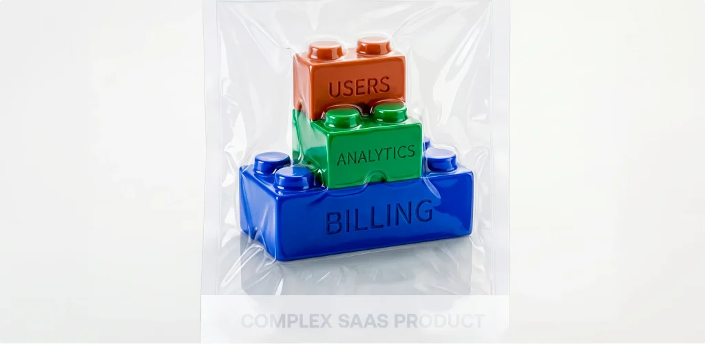
Simplification is about clarity. It’s about making sure users always understand:
This is where modularity becomes important, when the product is divided into logical parts. Each module represents a specific function or workflow, and users interact with only what they need, when they need it.
Another key idea is aligning the interface with the user’s mental model. Users don’t think in terms of backend logic or system architecture; they think about tasks and goals. When the interface reflects that, even complex workflows feel natural.
At UITOP, this approach is part of our UX-first SaaS design and development, where product structure comes before visuals. Our team focuses on organizing it.
The first step in rebuilding product structure is grouping features logically. Many products grow in a chaotic way, where new functionality is added wherever there is space.
By reorganizing features into clear categories, the product becomes easier to understand. Users don’t need to search across multiple sections; they know where to go based on their task.
The next step is defining clear user scenarios. The product should be built around workflows. For example:
Each scenario should have a clear start, middle, and end.
Another important layer is hierarchy. Some actions are used daily, while others are rare. If everything is displayed at the same level, the interface becomes overwhelming.
This is where complex product structures for SaaS need careful planning. The interface should guide users from general to specific:
At UITOP, the process of simplifying structure starts with breaking everything down.

This approach helps transform a fragmented system into a clear, structured experience.
Navigation is one of the most important elements in any SaaS platform. When it’s done right, users move through the system naturally. When it’s done poorly, even simple tasks become frustrating. In complex environments, navigation needs to support workflows.
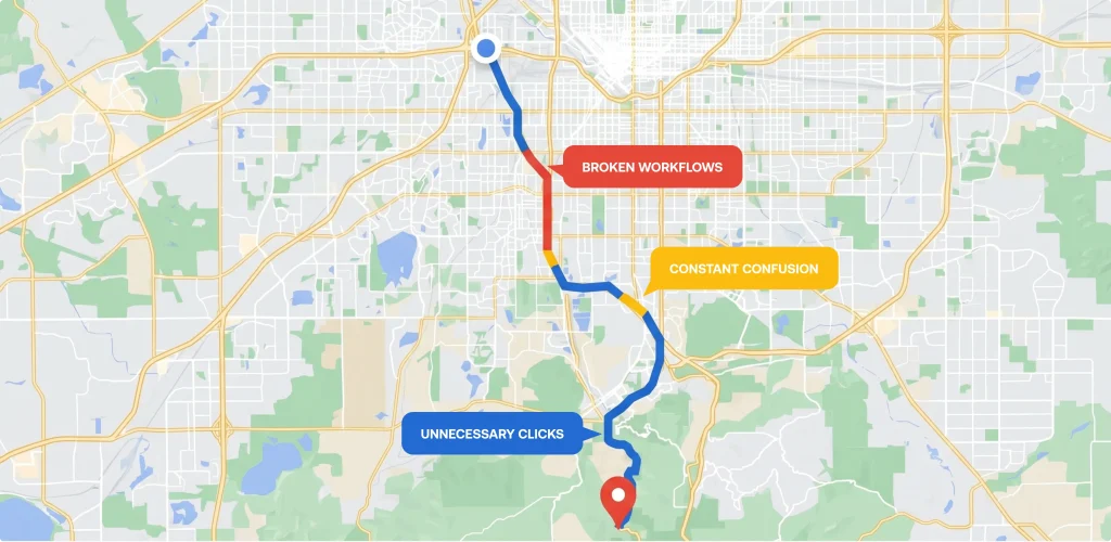
One effective approach is layered navigation. The main navigation provides access to key sections, while secondary layers reveal more specific tools and actions. This reduces cognitive load. Users focus only on what’s relevant at the moment.
Contextual navigation is another important pattern. The interface adapts based on what they are doing. For example, when viewing a customer profile, users can directly access related actions - payments, documents, history - without leaving the page. This keeps workflows smooth and uninterrupted.
Role-based navigation also plays a key role. Different user roles don’t need the same level of access or visibility. By tailoring navigation to specific roles, the system becomes cleaner and more efficient. Good navigation design directly improves usability and efficiency. Users spend less time searching and more time completing tasks.
In contrast, poor navigation leads to:
In any complex SaaS product, navigation is the backbone of the entire experience.
What we deliver
Planning a product redesign and want to avoid cosmetic changes with no impact?
Contact usAs SaaS products scale, they almost always need to support multiple user roles. This is where complexity increases rapidly. Each role has different goals, different workflows, and different levels of access. If all of this is combined into a single interface, the result is overload.
The solution is to separate their experiences. This is what we did when working on the Activate platform. The system needed to support several distinct roles: managers, fleet managers, drivers, and mechanics. Each of these users interacted with the product in a completely different way.
Managers needed a high-level overview of operations. Fleet managers focused on scheduling and logistics. Drivers needed fast, simple tools for reporting issues. Mechanics required detailed task management.
We designed a connected ecosystem:
Even though the system supported multiple user roles, each experience felt focused and relevant. At the same time, everything was connected. Information flowed between roles in real time, creating a unified workflow across the platform.

Here are the results we achieved:
Thus, by using role-based UX and clear segmentation, it’s possible to create a UX design for complex SaaS platforms that feels simple for each user, even if the tool itself is complex.
When dealing with a complex SaaS product, two approaches consistently help reduce complexity without removing functionality: modularity and progressive disclosure. Modularity means breaking the system into independent, logical parts. Each module represents a specific function, for example, billing, analytics, user management, or reporting.
This improves usability because users don’t have to process the entire system at once. They interact only with the module that matches their current task. It also improves scalability. As the product grows, new features can be added to existing modules or introduced as new ones.
Progressive disclosure works alongside modularity. It’s the idea of showing only the necessary information at each step, while keeping advanced options available when needed.
For example:
This approach reduces visual noise and helps users stay focused. At the same time, it preserves the full power of the system. Together, modularity and progressive disclosure create a balanced experience. The product feels simple on the surface, but remains powerful underneath.
One of the most difficult challenges in SaaS design is simplifying workflows without damaging the underlying business logic. In many cases, workflows become complex for a reason. They reflect real-world processes, compliance requirements, or operational constraints. This is why simplification must focus on how workflows are presented.
The first step is identifying unnecessary friction. These are moments where users perform extra actions that don’t add value, such as repeated clicks, switching between sections, or manually entering data that could be automated.
The next step is reducing cognitive load. Even if a workflow has multiple steps, it should feel clear and predictable. Users should always know what comes next and why. Another important technique is automation. When possible, the system should handle repetitive tasks in the background. This improves efficiency without changing the logic itself.
As one of the leading SaaS app development vendors, we often begin the process by mapping the real user journey. Our team asks, “How should the user experience this process?” This helps uncover gaps between business logic and user expectations. The result is a workflow that stays accurate from a business perspective, but feels faster and easier from a user perspective.
Simplification has a direct impact on how users adopt and use a SaaS product. When usability improves, onboarding becomes faster. New users understand the system more quickly and reach their first successful action sooner. This increases the chances that they will continue using the product.
For existing users, simplification improves efficiency. Tasks that previously required multiple steps become faster and more intuitive. Users spend less time navigating and more time achieving their goals.
This also affects retention, because when a product is easy to use, users are less likely to abandon it. They feel confident in their ability to complete tasks and rely on the system in their daily work.
UITOP often works with products that struggle with low adoption and poor usability. In these cases, the process usually starts with a UX audit. Our team analyzes current workflows, identifies patterns that users are used to, and carefully improves the structure without breaking familiar interactions. This helps avoid resistance while still moving the product forward. For instance, we redesigned ReLounge, a platform for back health centers. Before UI/UX redesign, the system had a confusing structure and low user engagement.

We reworked the product structure and improved navigation and workflows.
The results were clear:
This shows that simplification directly impacts business metrics. For a deeper understanding of this connection, it’s worth exploring how UX impacts SaaS growth.
Sometimes, small improvements are not enough. There comes a point when a product becomes so complex that fixing individual screens no longer solves the problem. This is what can be called a “complexity ceiling.” At this stage, the issue is the underlying product structure.
Some common signs include:
When these problems appear, it’s time to rethink the system from the ground up. At UITOP, the decision to move toward a structural redesign is based on clear signals.
A structural redesign focuses on reorganizing product structure, redefining workflows, and improving navigation at a fundamental level.
This approach is more complex than UI updates, but it creates long-term results. If you’re facing similar challenges, it may be worth exploring a SaaS product redesign process to understand how to approach this transformation step by step.
Simplifying a SaaS product also requires close collaboration between design and development teams. Design defines how the product should feel and function from the user’s perspective, while development ensures that these ideas work within technical constraints and scale properly. In complex environments, this collaboration becomes even more important.
For example, improving navigation may require changes in the backend architecture. Simplifying workflows may involve restructuring data models. Implementing modularity often depends on how the system is built under the hood. This is why UI/UX design for complex SaaS platforms cannot exist in isolation. It must be aligned with development from the very beginning.
At UITOP, projects are approached as a full-cycle process. This includes everything from UX research and prototyping to building scalable systems that support growth.
For companies looking to build or improve complex platforms, this approach is often the most effective. Especially when working on custom SaaS development for complex systems, where both usability and scalability are critical.
Our approach
Our discovery phase helps teams define scope, risks, and product direction early
Contact usSimplicity in SaaS is about organizing features in a way that makes sense. As products grow, complexity is inevitable. With the right product structure, clear navigation, well-designed workflows, and thoughtful use of modularity, even the most complex systems can feel intuitive. The goal is to make the product’s full power accessible. In the end, simplicity is the result of better product thinking, where usability, scalability, and efficiency work together.
SaaS products become complex because they grow over time. New features are added, user roles expand, and workflows become more detailed. Without a proper product structure, this leads to feature overload, confusing navigation, and reduced usability.
Focus on structure. Use modularity to group features, apply progressive disclosure to hide complexity when it’s not needed, and design workflows around real user tasks. This keeps functionality intact while improving clarity.
Feature overload happens when a product includes too many visible options at once. This creates confusion, slows down decision-making, and reduces efficiency. It’s a common problem in complex SaaS product environments.
A redesign is needed when usability drops, onboarding fails, navigation becomes fragmented, and small improvements no longer help. These are signs that the product structure needs to be rebuilt.

