How we use AI in our process
Design, Development
/
May 05, 2026

Enterprise SaaS has long since moved beyond the office. Warehouse managers log into the system right next to the shelves. Service technicians record data from their phones on-site. Sales reps process orders in their cars between meetings. All of this is the everyday reality for a wide range of B2B products.
The challenge lies elsewhere: not every team has interfaces designed for these scenarios. Usually, the web version gets shrunk to fit a small screen. Users get frustrated, lose data, and make mistakes. The product loses credibility.
In this article, we explore how to build mobile UX for enterprise products that operate in the field.
What we deliver
We design web applications that balance usability, performance, and scalability
Contact usConsumer apps are designed for users who are in a relaxed state. They're sitting at home, have plenty of time, a stable internet connection, and the desire to figure things out. In the enterprise world, it's a different story.
An employee in the field works under pressure. They are responsible for the outcome, and every extra step eats into their time. An error in the form results in downtime, a fine, or a lost customer.That is precisely why mobile UX best practices for SaaS constitute a distinct discipline, where speed, reliability, and minimizing cognitive load take precedence.

The context of use determines everything: information architecture, the number of steps, behavior during a connection loss, the size of controls, and even color contrasts. A screen is read differently in the sun than in an office.
Another fundamental difference is the stakes. In a consumer app, the user will simply switch to a competitor. In an enterprise product, they are forced to work with what's available, even if the interface is inconvenient. This creates a false impression that UX is secondary here. In practice, this approach leads to hidden losses: slow performance, input errors, and workarounds using notepads and parallel spreadsheets.
Imagine a technical support employee at a manufacturing facility. They’re wearing work gloves, surrounded by noise, with their phone sometimes in their hand and sometimes in their pocket. The connection is unstable; the signal comes and goes. They need to record the equipment's status, take a photo, and send a report.
A standard responsive interface becomes a nightmare in this situation: tiny buttons, a form with twenty fields, uploading files via a browser. The user tries three times and then calls a colleague to have them enter the data manually.
Teams like this need a product that takes physical working conditions into account. Large touch areas, minimal keyboard input, clear statuses, quick access to key actions: all of this comes down to usability, which is shaped solely at the product design level.
This is precisely where the role of a design and development partner is crucial; one who understands the specifics of such scenarios from the very beginning. Understanding the context transforms the interface into a tool for real efficiency.
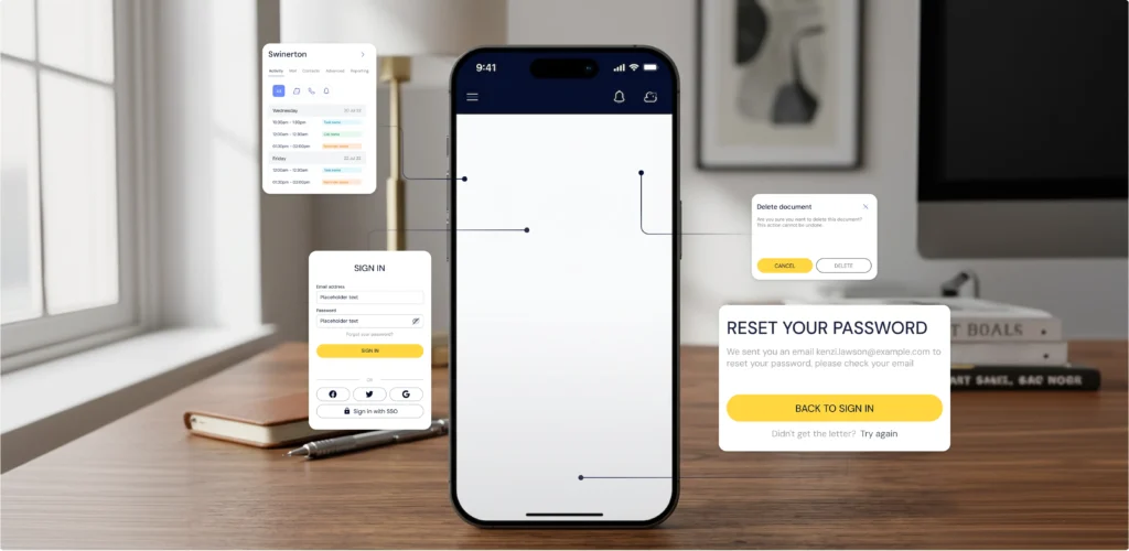
The difference between responsive design and product-level mobile UX is fundamental. Responsive design is about the screen. Product-level mobile UX is about the task. The first approach adapts an existing interface to a smaller screen size. The second designs the experience from scratch, based on how and where people actually perform tasks.
Adaptation solves a visual problem: elements are rearranged to fit the screen size. The contextual problem remains unresolved: unnecessary fields remain unnecessary, complex navigation patterns retain their complexity, and multi-step processes remain cumbersome.A good example is forms. In the web version, a form with 15 fields looks acceptable: the user is sitting at a desk, using a keyboard, and can open a neighboring tab. On mobile, the same form becomes a barrier. An employee stands by a forklift, entering data with one finger. Of the 15 fields, they can see only three. Responsive design shrunk the form; it didn't solve the problem.

| Criteria | Responsive adaptation | Product-level mobile UX |
| Goal | Visual fit to screen size | Designed around the user's real work context |
| Navigation | Same as the web version | Rebuilt around field tasks and task flow |
| Forms | Same fields, scaled down to fit the screen | Minimal fields, smart input, autofill |
| Offline | App stops working without a network connection | Full offline mode with background sync |
| Performance | Tied to the speed of the web version | Optimized for mobile conditions and API latency |
| User errors | High risk from small tap targets and extra steps | Reduced through confirmations, constraints, and clear statuses |
This is particularly critical for a SaaS mobile application in the enterprise sector: the cost of a user error is incomparably higher here than in the consumer segment.
Speed in mobile UX is measured by the number of actions required to complete a task. The fewer the steps, the greater the efficiency.
A well-designed interface shortens the path to the result. Frequently used actions are placed on the first screen. Forms are reduced to a minimum. Where text input used to be required, there is now a selection of options or scanning.
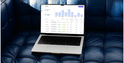
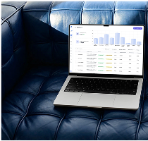
Contextual hints are also important to consider. If a user opens the "Warehouse" section at 9 a.m. on Monday, the system assumes they've come to process a shipment. The relevant screen opens immediately. This approach is called task-oriented navigation, and in enterprise mobile apps, it works significantly better than a universal menu.One of our clients, Slabstack, builds ERP software for the construction industry. Their sales reps close deals directly on job sites, which meant the product had to work just as well on a phone in the field as on a desktop in the office. We took on the challenge of designing both versions simultaneously.

We built the web version as the main control center, where managers handle large orders, track inventory, and review analytics. For the mobile side, we stripped the interface down to what sales reps actually need on-site: fast search, simplified data entry, and quick access to the most critical actions. We set up a syncing strategy so that any update made in the office lands on the rep's phone automatically.
For the features that field teams rely on daily, we built a dedicated offline mode: data is saved locally the moment it's entered and pushed to the server once a connection is found. We designed both products in parallel from day one, which is why switching between them feels natural rather than disjointed.
Slabstack's results:
It is precisely this approach to SaaS mobile app development, where the mobile version is designed separately from the web version taking real-world scenarios into account, that delivers measurable results.
Field teams work in areas with no signal. A warehouse in a basement, a construction site outside the city, a truck in a dead zone. These are all typical work environments, and therefore a fundamental requirement for the product: the app must work without a network.
Offline mode is an essential component for such scenarios. An app that freezes without a network loses its value precisely at the most critical moment.Working on UX in logistics software for one of our clients, Activate, we faced a common challenge: their users spent most of their working day in areas with no reliable signal: underground facilities, remote construction zones, rural delivery routes. The app had to stay fully functional regardless of network conditions, and that shaped every design and architecture decision we made.
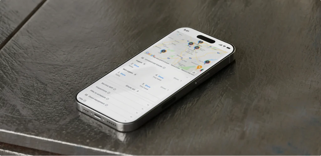
We built a local saving feature that captures every inspection, log entry, and status update directly on the device the moment the user types it. Additionally, our team developed background sync functionality that uploads data to the server as soon as the device detects a signal. We also made sure the interface never freezes while searching for a connection.
Battery efficiency was also taken into account, since constant reconnection attempts drain the battery fast. On top of that, we added simple status icons so drivers can see at a glance what has been sent and what is still waiting.
Activate results:
Offline-first is about trust. The employee knows that no matter what happens to the signal, their work is saved. This changes the relationship with the tool: it stops being a source of anxiety and becomes a reliable foundation.
In B2B products, the cost of an error is high. An incorrect order status, a wrong inventory entry, duplicated data: all of this costs money and time. UX must reduce the likelihood of such errors at the architectural level.
This means confirmations before critical actions, clear and unambiguous statuses, and restrictions on invalid data entry directly in the form rather than after submission.One of our clients, Kenjo, is an HR management platform built for companies with distributed and remote teams. Kenjo covers a wide range of HR tasks: time tracking, leave management, onboarding, and employee evaluations. When they came to us, their mobile app was difficult to navigate, which made it tough for people to handle everyday HR tasks on the go.

The core problem was that the interface had been designed for desktop and ported to mobile without rethinking. For companies with field and remote employees, this is particularly painful: people need to quickly log their hours, request time off, or check tasks, all from a phone while on the move. Instead, they ran into cluttered screens and unclear navigation.
We started by reworking the main screen: we removed the excess and brought priority tasks to the front. We restructured the Overview section, cutting out the noise and surfacing the most relevant tasks first, so users could take in the full picture without scrolling or searching.
Our team also simplified time management down to a few taps; the entire logging process now takes seconds.
To ensure consistency throughout the app, we built a component library, a unified system of components that eliminates visual inconsistencies between screens and gives developers a clear implementation reference.
After the redesign, Kenjo received an ease-of-use score of 93 out of 100. Daily user activity increased; the platform became a tool that teams open on their own, not because they're required to. Businesses with remote employees started to rely on Kenjo as a core part of their daily workflow.
Interface reliability here is expressed concretely: users know they will find the action they need exactly where they expect it. This directly affects operational workflows and trust in the product.
Data entry on a phone is a weak point for most enterprise apps.
The on-screen keyboard is awkward, typos are inevitable, and long forms turn a simple task into an ordeal.Good mobile UX minimizes keyboard input wherever possible. Selecting from a list instead of typing. Autofill based on history or context. QR and barcodes instead of manual article entry. Voice input where appropriate. Each of these solutions directly contributes to usability.

Numeric fields deserve a special mention. It seems like a small thing, but if a field expects a number and an alphabetic keyboard opens, the user makes an extra tap. Multiply that by a hundred entries a day, and you get a concrete loss of time. The correct keyboard type for each field is a basic requirement for data entry in a mobile enterprise.
Forms must also save entered data automatically, even if the user switches to another app or loses connection. Losing a completed form is one of the most frustrating scenarios in mobile UX.
For field teams, the speed of first interaction is especially important. Opening the app, navigating to the right section, and entering data: all of this needs to take seconds. Efficiency is measured literally, in the number of taps to reach the result.
A field employee makes decisions on the spot. They need up-to-date information right now: order status, stock levels, client history, visit schedule. A data delay leads to decision-making errors.
Real-time updates in mobile UX are built primarily around the correct visualization of changes: the user must see that the data has just been updated and understand how fresh it is.
It is important to distinguish between the two types of updates here. The first is background updates, which happen automatically and are displayed without interrupting the user's work. The second is critical updates that require a response: a task priority has changed, an urgent request has come in, or an order status has been updated. Mixing these two streams in a single notification channel is a guaranteed way to ensure that what matters gets lost in the noise.
Push notifications and inline updates must be rationed. A constant stream of changes on the screen creates cognitive overload. Design sets the priorities: what to show immediately, what to show on demand.
For logistics and service teams, this is especially important: the dispatcher sees where the technician is, the technician sees the updated route, and the client receives the current status. This is operational control in action.
Good mobile UX is built on the right architecture. Interface speed, offline functionality, synchronization, push notifications: all of this depends equally on design and on how the backend is structured.A slow API renders any animation worthless. Sloppy sync logic breaks offline mode. The impact of product design on development is very concrete: decisions made at the design stage directly affect the complexity and cost of development.
One common anti-pattern is designing mobile UX in isolation from the development team. A designer creates a screen with instant database search, unaware that each query takes two seconds due to the API architecture. The result is either a redesigned feature or an interface plagued by constant delays. Both options cost money and time.
That is precisely why at UITOP, design and development work together from the very first stage. Before drawing an offline sync screen, our team works out how it will be implemented technically. This approach avoids situations where a polished prototype hits a wall of technical constraints.
Latency, caching strategy, and conflict resolution during synchronization: these are engineering and design decisions at the same time. They determine what the user sees and feels.
The choice of whether to opt for custom B2B mobile app development comes down to one question: Do the specific operational needs of the business go beyond what existing tools can handle? Off-the-shelf mobile solutions work well for generic workflows. But enterprise businesses often operate in conditions that standard apps were not built for: proprietary hardware dependencies, industry-specific data structures, compliance requirements tied to a particular sector, or internal processes that differ significantly from what generic products assume.
When the gap between what an existing app offers and what the business actually needs is wide enough, teams end up working around the tool. Data gets entered twice. Processes get split across multiple apps. And the workarounds quietly become the workflow.
These are the primary signs it may be time to consider developing a custom solution aligned with your specific processes and needs.
Mobile UX in enterprise is a systemic challenge. Isolated interface fixes or the work of a single UX designer will only have a partial effect. A comprehensive approach is needed: user research, design for real-world scenarios, prototyping, and testing under actual working conditions.
This is exactly what professional product design services for SaaS include. The team digs deep into the client's business processes, understands the context of use, and designs an experience that solves real problems.
One of the key elements of this process is field research. A designer who observes warehouse operations or goes out with a service team sees things that will never appear in analytics: how an employee holds a phone while wearing gloves, the actual order in which tasks are performed, where people get stuck, and invents workarounds.
In addition, product design services for SaaS and mobile apps involve working with metrics: how task completion time has changed, how many errors users make, how quickly new employees get up to speed. Design here serves as a measurable growth tool with concrete business outcomes.
Discuss project
Looking for a high-performance web application that integrates deeply with your existing business logic?
Contact usMobile UX in B2B works where people work: in the warehouse, in the car, on-site, in a dead zone. Speed, reliability, and offline capability: these are the real quality criteria for a product.
Companies that invest in product-level mobile UX get concrete results: fewer errors, faster task completion, and higher team engagement. This is all measurable impact on operational efficiency.
The gap between "an interface that looks good" and "an interface that works in the field" is one of the most underestimated sources of loss in B2B products. Teams adapt, find workarounds, and endure. But productivity drops, errors accumulate, and employee loyalty to the tool declines.
If your SaaS is used beyond the office, start with an honest audit: how do your users actually work, and how well does the interface match their real context?
B2B users work under pressure, on the move, and are accountable for results. They need speed, reliability, and minimal steps. Consumer patterns do not apply here; a separate approach is needed that accounts for the operational context.
An approach in which the app functions fully without internet access. Data is saved locally and synced to the server as soon as a connection is available. For field teams, this is a baseline product requirement.
Error reduction starts before the user can make a mistake. Block invalid input at the field level, not after submission. Add confirmation steps before irreversible actions. Replace free-text input with selections wherever valid values are predictable. When the correct action is also the easiest one, errors drop without users having to think about it.
When off-the-shelf apps cannot address the specific operational needs of the business. If the team is working around the tool, that is a signal. Custom development makes sense when standard products do not cover your actual workflows, when hardware integrations are required, or when security requirements exceed what existing solutions allow.